Serge Gutin
Product Design, UX, UI
Instalments for Amazon (Barclays-Amazon Partnership)
View the live page explaining the product.
1. Inception
A shopping ready product was a natural evolution of the collaboration between Barclays Partner Finance and Amazon, following a successful earlier pitch for an instalment-like product, which was the first project I've worked on since joining Barclays in 2019. Understandably, a partnership with a company of such a scale as Amazon has been very important to Barclays, so I was happy to be a part of it and for the past two years I've worked closely with BPF, eventually becoming the main point of contact between them and the Design team, establishing myself as a crucial stakeholder covering UX and design aspects of the majority of BPF projects.
Providing UX expertise for this work has brought up some interesting challenges that tested my ability to balance the B2B and B2C realms, along with stakeholder management and sometimes quite rigid internal (Barclays own) and external (finance industry) requirements, right from the start. The briefed-in version of the project was described as a “credit line type product that Amazon customers would be able to create and manage via Barclays channels”.
The company has already been exploring giving merchants and ability to service their instalment accounts via the Barclays app by that point. I've started by designing and testing the read-only and the read and write versions of that approach for the team, for both banked and SOLUS customers. So we had a good basic understanding of how our traditional BPF account would work for retailers and their and our customers.
-
2. Ideation
The main challenge now was understanding how a credit line product that we haven't fully grasped internally yet, could be clearly conveyed to the end-user, in a way that would drive adoption and conversion, not just for us and our channels but for the merchants as well.
The success of this was extremely important to the team, as it needed to not only meet Amazon's expectations, but also be scalable enough to fit other retailers going forward.
My feeling was that Amazon was the best retailer to try this with, UX-wise. We've had similar conversations and pitches with Apple at that point, but Amazon have challenged us to think of the most streamlined UX we could, following their well-known 1-click approach. Each journey had to be designed with the most optimal amount of steps in mind - a push that differentiated BPF from other parts of the business, where success would be determined by "happy" stakeholders and positive user feedback.
Working in such rigid UX constraints while occasionally collaborating directly with the Amazon UX team has had a great positive impact on my design thinking - it required bringing the teams together to find creative, diplomatic solutions to our design directions. We've established a working group of POs, BAs, Devs and Legal & Compliance representatives, with input from Marketing and Proposition teams, and UX has become a vital part of the strategy.
As a new designer at Barclays, I had no point of reference to how collaboration worked, and how closely Barclays followed the design thinking process that I am used to. It was a steep learning curve of simultaneously learning about the established processes, hierarchy of controls, the industry standards, requirements, and a marquee client of such a calibre as Amazon.
So it was time for questions - a lot of questions I needed answers to, to advocate for the end user in the best way possible.
I had the pleasure to work with a very collaborative product owner, who I shared the similar mindset of "getting to the point" with. Together we started our ideation process by drafting a high-level end-to-end journey that would take a customer through the process - from selecting the product, via applying for the credit line and purchasing, to servicing it within the app, which was the channel chosen for the MVP.
There were quite a few challenges here.
To familiarise myself with the App's UI and as an excuse to get to know other designers, I have started by chasing other design teams and POs for input on the drafts. Since the experience included multiple areas - homepage, payments, help etc - I have managed to get the collaboration going with multiple teams simultaneously, while making the project visible as much as possible (there were confidentially restrictions at that point).
This was the time of constant pivots in strategy, as we worked responsibly to Amazon's feedback, while exploring our own legal and development limitations. My role was to make all of this make sense to the end-user at all times - whether it's an Amazon or a Barclays one. This required flexibility and an open mind from me and the team, but has eventually also made exploration of ideas much more broad and cooperative. This was also the time when we moved from Sketch to Adobe XD, so I had to make sure my technical skills were not far behind my leadership ones.
-
3. Creation
While at the checkout work-stream was still in discussions with Amazon, I started drafting the MVP servicing experience within the App which aimed to display information about the shopping ready product in a read-only format. It was important to make sure we surfaced everything a customer would want to see in a clear and easy to find way, using a digestible copy. While we had a semi-clear idea of how the product would work, and the hierarchy of plans (purchases) in each account, we still had major challenges around concepts like credit limit and monthly payment limit.
This was the point I started pushing for a closer collaboration with copywriters, as I discovered that historically they worked separately, supplying a Word document with a proposed copy. I come from experience of constant collaboration with copywriters, as it's proven to be an important part of UX - their active involvement in actual design work and testing is crucial.
As I have learnt, good design + bad copy = bad UX.
So after an internal agreement and Legal's blessing, we've come up with an interactive visual representation of the credit limit that we'd put into testing.
This was the heart of the feature. The challenge was to create an element that clearly communicates the essence and current status of the product, while following familiar patterns of the App's UI. We had Barclaycard and Transactions teams on board, while running an internal guerilla testing, to gather a strong internal consensus around the design. Other parts of the journey had their own discussions and challenges, and required input from other teams, like homepage, help, onboarding etc.
The full scope of the journey run across almost all of the App, with a view to include the payment area next.
Dealing with challenges during this stage required a lot of patience and flexibility from me as well as the working group. Balancing between the established patterns and potential improvement was a constant challenge. Most of the time proposing a UX improvement was met with an open mind, however. Equipped with a clear rationale and my past experience I managed to get the stakeholders on board with most of the suggestions, that have made it past testing.
Naturally, some others were de-prioritised or declined - those had their own reason, mostly relating to development effort or regulations.
So this was a learning experience for all - me, testing my limits as a designer and areas of influence as a design lead, and others, learning about why UX matters and what we actually do as designers.
I was pleasantly surprised with the level of respect I have been given coming into the project, from everyone involved. I had a feeling that even though historically design has been treated as one of the steps in the waterfall process, where we'd supply the UI and move on to another project unless there are changes, there was an actual appetite to have a design leadership - someone who wouldn't just take responsibility for how things should look and feel, but also would explain why, show evidence, and make it feel logical in each stakeholders head, so they feel involved and comfortable with it all.
In other words, a design thinking process, just without a name yet.
The moment I realised that, I saw an opportunity to push for adopting the framework, without proposing any drastic changes in the way people are used to work but rather:
- anchoring the ways of working that already a line with design thinking and agile, and
- feeding in new ways of working gently, so it's never jarring to the process.
These included:
- running workshops
- getting people in the room or an email thread together
- managing expectations by prioritising design work
- making my work visible and open to feedback at all times
- emphasising user testing as a main driver for design decisions
Eventually I gave the BPF leadership an overview of the framework in a virtual talk. My main point was that working and agile, i.e. collaborating and being adaptive to changes, and adhering to the user needs, doesn't require any dramatic changes to how we work - it just makes sense if we want our products to succeed with the customers.
-
4. Testing
Set up by the researchers, 10 testing sessions of 60-minute in-depth interviews with both Barclays and non-Barclays customers, have brought some interesting insights we had to plan around as a team. Most of the struggle has been uncovered around the initial proposition, between the purchasing and the checkout stages - the new product needed a clearer explanation and presentation, to entice the end-user to choose it as their primary payment method. The reusability of the product was the main reason behind the confusion and hesitation to become locked into a finance account agreement.
The servicing (in-App) part of the journey tested really well - even SOLUS customers, not familiar with the app found are flows easy to navigate.
Our ability to test relatively early into the Iterations stage has been extremely useful - we were able to "fail fast" and recover quickly, armed with enough user feedback to rethink how we display the product on Amazon's part of the journey.
-
5. Iteration
Post testing iterations were agreed in a series of meetings we had with the researchers and the team. It took a couple of UX tweaks for me to come up with and approve, but we've passed the user testing control environment relatively smoothly, granted the concepts explanatory copy was still in works. At this point the project was mature enough for me to share it with the leadership and my peers at a design review.
This visibility of work was probably the reason I was asked to step in to manage one of our Component Libraries. It made sense considering the amount of knowledge I've gathered over the course of the project regarding the App's UI. This was an opportunity to make other designers' lives easier by enriching the library with templates of the screens I have already created for my project, while ensuring consistency in the components that the design team would use working on the App.
Just as I've shown in my presentation on the design thinking, iteration is a cyclical stage that sometimes goes beyond launch. This project is a great example of it, since we are still improving the experience after going live earlier this year, while keeping an eye on the adoption numbers and other analytics.
-
6. Collaboration
Looking back I consider myself lucky working on this project, as I have met and worked with a countless number of stakeholders, peers and colleagues throughout the business. As mentioned above, we could not proceed without input from multiple teams responsible for different parts of the App, as well as the control tribes, like Legal and Compliance. It was important for me to make sure I didn't work in isolation, so other designers have cast their eyes over this work as well. Their input has helped shape the final product a great deal.
To maintain constant calibration I used Miro when it was available. Working remotely meant getting people in the room was impossible, so my job was to get all the stakeholders on board with the new tool, explain its benefits and capabilities, and get them to actually participate in the design sprints and remote workshops that I ran.
I had to show a lot of flexibility when it came to the development teams as well. I wanted to make sure the handover of assets was as efficient as possible, which meant listening and learning what they needed, while introducing them to our ways of working e.g. exporting HTML specs from Adobe XD. This was a good opportunity to use my soft skills when it came to supporting them to ensure a smooth delivery, while learning more about their work.
-
7. Launch
Since the MVP's launch in 2022, Amazon volumes continue to build, following the move to 100% on 19th of October, with some prime real estate messaging also activated. An average of circa 4500+ applications a day in the first 3 months has exceeded expectations.
Instalments for Amazon is forecasted to deliver an enormous revenue for the bank. With the foundations now in place we have also paved the way for us to potentially extend this product to other Partners and further expand on this revenue opportunity. By launching this product in the Barclays App we will also have the ability to grow the number of customers using the product whilst helping them to maintain FTE costs.
-
8. Reflections
The amount of work we currently have in shopping ready really speaks for itself - since the success of the MVP launch, I am now leading designs on multiple new phases of the product simultaneously.
Overall this project has been a pivotal moment not only in my time in Barclays but in my career as a Designer. I had to learn fast, adapt and take ownership and responsibilities of a Design Lead throughout.
I believe I have managed to establish myself very well as the source of UX and as a Design Lead, while changing the way to work and collaborate with BPF and Barclays in general, for the better.
I feel confident taking on even bigger challenges and delivering more successful products going forward.
Barclays Premier Experiences
Please note: there is a reason for the quality of the screenshots - high quality assets sharing is not allowed by this particular employer.
———
1. Background
At the start of the year 2023 I was approached by the Loyalty & Rewards team, with a request to explore a potential design solution to a very specific problem:
The exclusive events we have for our Premier customers were lacking a digital presence and therefore, scalability.
With the focus and attention the Premier Tier was getting from the business, this seemed like a perfect opportunity to apply my expertise as a design lead, and rally my new stakeholders to the most optimal solution, solidifying the role of Design in the process, while evangelising methodologies like Design Thinking.
The clear backing from above also meant a chance to introduce the concept of experimentation, which resonated very positively within the working group and stakeholders, as this meant less pressure to get things done "perfectly" on the first try, and more open space for ideas to test, iterate and learn from.
———
2. Design sprint
The Product owners have admitted to me that they've not done anything like this before, which naturally prompted me to step into a leading role throughout the sprint, which I set up and run over a timeframe of about three weeks, with apx. two session per week, to respect people's busy diaries and give enough time to digest feedback and plan the next steps.
I put a lot of emphasis on the stakeholder's understanding of every step of the process, and invited them to contribute, both during the sessions and offline.
Running the sprint remotely meant I had to deal with the challenge of the lack of the face to face engagement, so I planned the sprint in a way that was interactive and collaborative, using our virtual white-boarding tool, Figjam.
The success of the sprint relied heavily on collaboration; and in my facilitation I've ensured we had enough input and agreement to progress fast enough to not lose momentum and focus, while allowing enough time for the main anchoring points, like the problem statement, the success metrics, the design principles and the personas, to be formalised and agreed on fully.
Setting up the testing sessions with the researcher meant we could act on the following customer feedback quickly, and agree on the delivery plan with provisional live date within less than 2 weeks.
Planning and facilitation
Inspired by the Google Sprint philosophy, I've allocated time in each session to a specific stage in the Design Thinking methodology, navigating the conversation from distilling the problem statement and ideating solutions, to prioritising high value ideas to then draft, prototype and test.
Problem statement
"If I had an hour to solve a problem I'd spend 55 minutes thinking about the problem and five minutes thinking about solutions."
- Albert Einstein
The first session was naturally the most important one. I had the attendance and attention of people new to me, with some of them being new to the Design Thinking, sprints, and even designers in general. So the right introduction into the process, and the buy-in from all stakeholders were extremely important.
I made it clear that the core working group (design, POS) was required, with the other disciplines (who we called "experts") were beneficial to attend.
I found rallying the team to the solution more efficient, once I've explained my role, and more importantly - their roles, as contributors, clearly.
Our distilled problem statement ended up as:
”We currently lack a CENTRAL PLACE for customers to FIND experiences/events that are VALUABLE, RELEVANT (PERSONALISED) and EXCITING enough to ENGAGE them, via a FLEXIBLE/SCALABLE implementation, to drive NPS/SATISFACTION levels up”
Ideation
So what can be done?
To encourage the group to share ideas, I've used a couple of techniques, like the "rose, bud and thorn", the affinity diagram and the impact vs effort matrix.
Voting as a group helped identify the agreement level needed to prioritise the ideas with the most consensus.
The high-impact/low-effort ideas were then selected collectively, to be used in the design drafts and the prototype testing.
Stakeholders
It was important to have as many people from different departments attending the sessions as possible. Having everyone at the table from the get-go meant less surprises later and a smoother progress overall. This was my soft push to "agile", so I've emphasised the benefits of all the stakeholders connecting, in an endeavour to challenge the "waterfall" processes they were used to.
We had a very good attendance from multiple teams, as seen on the left.
In addition to letting every participant in the sprint introduce themselves by their name and role, I asked them to also provide a short summary of the expected outcome of the sprint, from their discipline perspective.
This resulted in a deeper subconscious connection to the project, as well as a feeling of a personal responsibility for its success, due to their name pinned on the board and visible to all.
Proto-personas
One of the session was dedicated to the people who we envisioned using the product. It was important to consider every possible attribute, be that demographics, interests, NPS, digital engagement levels or more.
We used the term "proto-persona" to emphasise their speculative nature, and the fact they would be validated with user testing.
The result of the session was not only a deeper understanding of how our proposed solution would solve each proto-persona's needs and goals, but also an increase in empathy, thanks to the use of names and the user stories written for each one.
Experience mapping
The next step was to overlay the customer’s actions/goals over a linear progression through the journey. This helped us understand the exact stages of the experience and the touchpoints with specific systems, channels and communications. I always find this mapping exercise useful in creating further empathy with the user, while envisioning the journey, identifying the potential points of friction to address.
This resulted in a clearer vision for the next steps, the drafting of the designs.
Wireframing
I’m a proponent of a somewhat unorthodox approach - drafting/wireframing designs with the Product owner/manager. Throughout my career I’ve found that this method further solidifies their sense of involvement, increases empathy with the user and prevents any surprises later on, in the higher fidelity design stages.
After putting the screenflow together and reviewing them with all the stakeholders, I could now “add the skin to the bones” with our UI component library.
UI
My main goal while designing the journey in high fidelity was to ensure consistency with the rest of the app, and to clarify each component needed with our Brand team, and the developers, to prevent any blockers in the build. Having a predefined Figma library of course made this phase easier.
User testing
"Pay attention to what users do, not what they say."
- Jakob Nielsen, Co-founder of Nielsen Norman Group
Prior to engaging the Research team to facilitate a moderated user testing session for our prototype, I’ve run another session, where I asked the group to collaborate on the testing plan.
The Researcher appreciated a clearer idea around what we wanted to find out, which helped him complete the facilitation script faster.
The core group then attended the sessions to ensure we capture the user behaviour, as well as their thoughts and feelings.
Outcomes
To help the stakeholders understand the Design Thinking method, I've aligned the sprint sessions to the Double Diamond framework, which was much more widely promoted in the business. This resulted in a clearer focus on the objective in each phase.
Within a couple of weeks we had a fully interactive prototype, which we tested externally and iterated on accordingly, following insights and the global feedback.
———
Technical delivery
From the point of the sprint's output we had about two months for delivery. We were introduced to the dev team, the copywriter, the Insights team and the third-party provider.
In these two months we've had daily stand-ups with actions to overcome various technical challenges.
For me it meant constant support of development, raising and discussing solutions for potential risks (design and security-related), tweaking copy and designs, and ensuring the design files were up-to-date at every step.
I have to note that another factor contributing to the project's success was the fact that everyone had a genuine interest and input in each other's fields of expertise. This meant that no team member was left to work in isolation, producing their output, i.e.:
There was no time for a "waterfall" development, so we had to be agile!
It was a very respectful and democratic process throughout, and we were able to rely on facts, data and insights as the anchor for discussions, thanks to the prior customer testing. We've all learned a lot about each other's jobs!
———
Tech challenges
Challenge: proposed experience not achievable without app release.
Solution: CSS hardcoded & releases to .CO.UK demo micro-site.
Result: delivery was possible via the alternative route, and with support of a third party.
Challenge: customer data capture and transfer back seemed impossible!
Solution: use of cookies and an approved agency platform to get the data
Result: use of Insights platform together with customer input of an identifier in-code to enable us to map back and enrich our data through the agency to learn more from the experiment.
Design challenges
Challenge: constant pushing of the new brand delivery date, meant I had to:
Solution: translate the designs into Legacy, so that:
Result: consistency with the current language was ensured when this went live.
Challenge: no prior template due to this being a new feature, meant I needed to:
Solution: design the experience from scratch, taking into account the multiple channels it span, maximising each platform's interaction capabilities.
Result: after the flow was validated by testing, we had a new blueprint for similar experiences we'd consider in the future, including the strategic permanent long-term solution.
———
Final designs
The approved design grew naturally into a plethora of screens, to ensure we have thought about every step of the journey, happy and unhappy path included.
Per the challenge above, I had to help the team pivot from one design language to another, to align with the look and feel of the app for the time of the launch. This is where my Figma skills came to play, along with my ability to delegate work between me and the designers I manage, to maximise efficiency.
———
Quantitative analysis
The first thing I've done post-launch is to prompt the team to find us an Analytics partner, so we can extract the traffic data coming through.
I wanted to visualise the step by step journey with the traffic numbers, emphasising the drop-out numbers, to make us understand where the customer had potential pain-points or any friction preventing them from completing the journey, and signing up to an event.
This qualitative analysis has proven very useful and has contributed to our overall learnings, alongside the qualitative research (a user survey) that followed.
Another positive outcome here was the collaboration with the Analytics team, that now understood the reasoning for my request and the overall impact their data had on the success of our experiment.
———
Qualitative analysis
The second thing was to highlight the need to complete the picture with customer insights and verbatim via a survey we'd send for them to complete.
My rationale was that this would answer the question "why?" along with the question "what?" that we had answered by the traffic funnel analysis.
Working with the research lead we've come up with a survey that gathered the user sentiment on every step of the journey, both with open and closed questions.
The result of this analysis was a clearer areas of focus where the customers scored the interaction/information on the screen lower, and the confidence in the other areas, where the sentiment was positive.
———
Performance metrics
Out of the 10K customers we aimed for, the reach was 7,824.
1,282 out of 1,351 impressions on the entry point have interacted with the first call to action to start the journey
846 out of a 1,000 customers have submitted their interests, which is a vital step in the journey (the input required to indicate a potential conversion).
The engagement only fluctuated by 22% from week 1 to week 4 post-launch.
CTR% increased from 4% on week 1 to 64% on week 3!
Digital events will have a positive impact on NPS, even for customers who don't win freebies/high value assets.
The survey has highlighted a need to scale up to more diverse and unique content, which is what I’m currently doing for the next iteration of the product.
———
Hypotheses validation
“Premier customers will have the appetite to view their experiences (events) in the app.”
17.3% have clicked through to “find out more” which elevated engagement for the component it’s placed on from 4% to 6% during the experiment.
Conclusion: there’s a high level of interest in the feature, and the entry point placement is optimal.“Customers will be willing to share their preferences in order to access relevant content.”
Of the 1,351 customers who clicked the Insight card, 968 (72%) progressed to “Choose your experience” and 846 (87%) went on to complete and submit their preferences.
Conclusion: 87% of customers are willing to share this information, and active engagement can optimise the funnel further.“Customers will find it useful to register for events that are ‘coming soon’.”
40% of customers went down the ‘coming soon’ route for the Football category; 34% of customers went down the ‘coming soon’ route for the Tennis category.
Conclusion: The answer is yes - customers have shown the willingness to provide their interests, if it meant a more personal experience.“Customers will return to access the events on a weekly basis.”
Inconclusive: it’s likely, but more testing is required on different engagement mechanisms.
———
Outcome and key findings
Phase 1 Results
The results from Phase 1 were extremely promising in terms of customer interest, willingness to share hobby information, and willingness to engage repeatedly.
We saw a 17 % CTR on the insight (vs 4-6% predicted). Of those that clicked through, we saw an 72% conversion rate to choosing preferences, and of those 87% went on to complete the journey with preferences submitted and events selected. 15-35% returned weekly to explore refreshed content, and over 30 % of customers willingly completed the journey for experiences that were labelled 'coming soon’. Football and tennis were the most popular interest areas (40% for football, 34% for tennis) of the options included.
There are a couple of reasons I'm proud to be a part of this project:
The business will not be afraid to experiment going forward-the benefit of a continuous iterative deployment is clear: there's less risk with a smaller number of customers who see it, and it creates a safer space for testing ideas, when the pressure of having one chance to do it right is eliminated. This might be the remedy to our historic issue of long development processes, or shelving good projects due to complexity.
I'm hoping for this to be used a case study for how a design(er) led project benefits the business, dispelling any remaining doubts we're more than just a Ul resource.
One team/one goal-we worked as one single unit, challenged each other, and delivered designs and change iteratively and rapidly.
I believe I've managed to establish the I&D and our pod as a go-to team to kick-start new ideas and projects, with now established expectations of the process.
I've never seen such a fast delivery in my 3.5 years at Barclays (even if it is for a smaller cohort of customers). The impact on our ways of working is already evident, and the fact the Matt Hand Paul Marriott-Clark were actively involved makes me feel like I've put myself, our pod and the I&D team in the spotlight in a very positive way.
By bringing new teams onboard, like Analytics, Sponsorship, Marketing etc., finding solutions to the technical constraints and the lack of resources together, implementing customer feedback, ensured every possible approach is taken to make the user experience the most optimal it could be.
———
Next steps
Based on our learnings and the now established working pattern, I am now proposing further design improvements, e.g.:
video instead of imagery at the entry point, to further improve engagement
more diverse and appealing content, based on more granular interest selection
push notifications for continuous engagement and updates on the digital events going live
Roadmap and responsibilities
The next phase of delivery requires an updated vision, which prompted me to run a workshop with the team to polish our hypotheses, based on what we've learnt post-launch.
I then marked the required type of work with a name of the team responsible.
This is now helping us have clearer expectations of each team's involvement, to ensure an even more efficient delivery.
———
Thanks for reading :)
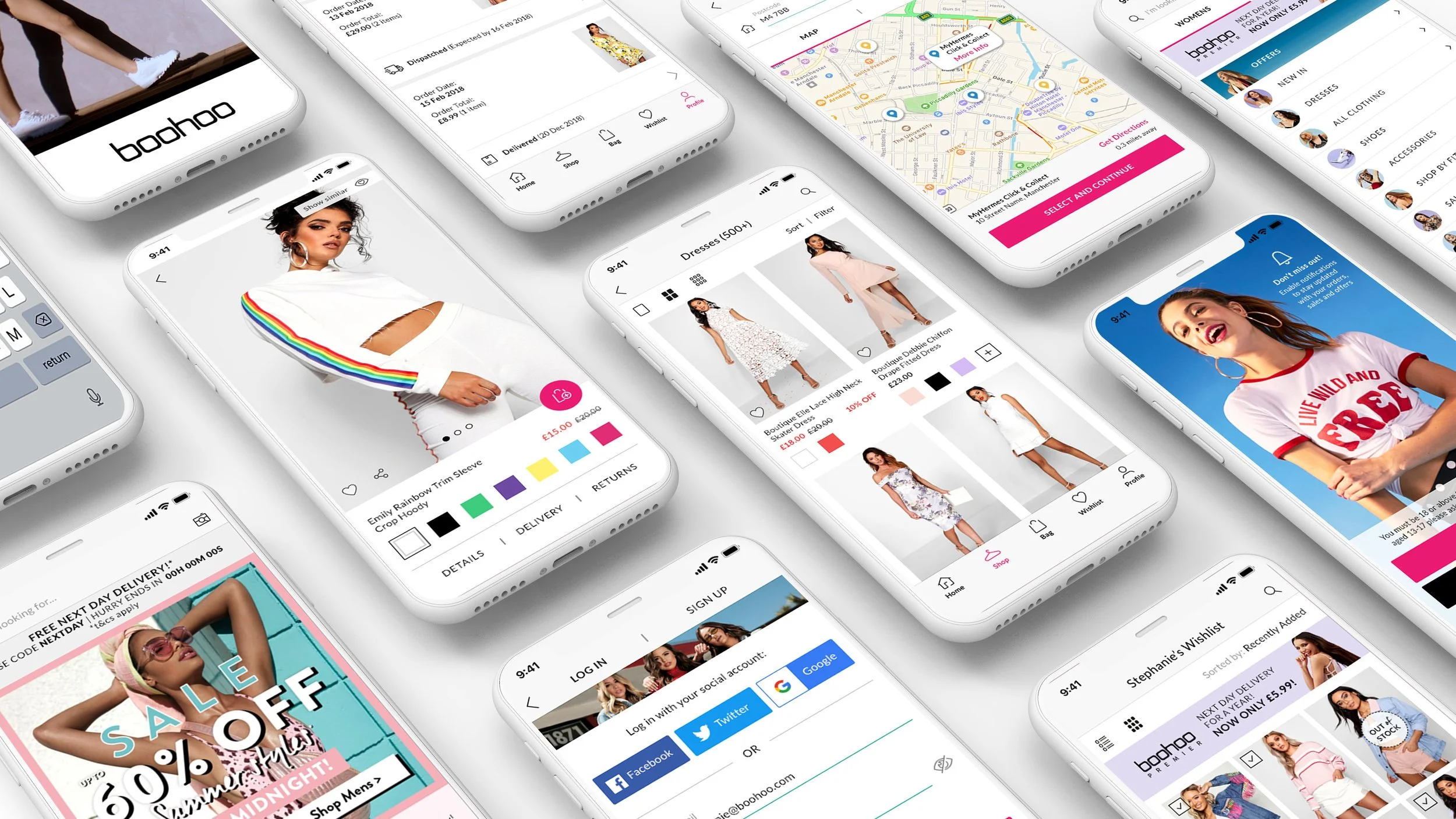
Boohoo App
Discovery Phase (1+ months):
- User Research (survey, NPS + recommendations, user reviews)
- Project Plan (goals, pain points, prioritisation, scope, timeframe and success metrics)
- Data (analytics of the current app and of boohoo.com on mobile)
Design Phase (3-4 months):
- Competition research
- iOS / Material design guidelines
- User journey mapping (screens diagram), wireframing
- Interactive prototyping
- Speccing behaviour/functionality
- UI work (mocks), asset export via Zeplin
Implementation Phase (5-6 months):
- Upkeep and support of all provided specs/designs on both platforms
- Running weekly catchups with R&D for questions, clarifications, amends
- Raising and managing UX/UI tickets on Developers’ Kanban board, prioritising them and providing support
Prep for User Testing (1 week):
- Creating and managing user testing scenarios, NPS and SUS scores
Prep for Release (1-2 months):
- Post-release strategy & next phase planning
Result, post-launch:
- Significant increase in app ratings both on AppStore and GooglePlay (from 3.9 and 3.5 to 4.7 and 4, respectively)
Thomas Cook Airlines - Homepage Redesign
Among the projects I was tasked with, Homepage took the most priority. The business required an updated “face” to the site, both visually and functionally. The initial analysis resulted in a number of goals:
- Gather business requirements and prioritise content
- Uncover relevant analytics data on the page’s performance and usage
- Get users’ feedback on the page, on its preferred structure, content and design
- Research the competition, perform a landscape analysis
- Present the design plan according to the research; approve it with stakeholders and plan the execution with all relevant departments
Defining the problem
In addition to the obvious need of a “face-lift”, there was an expectation from the business for the Homepage to increase conversion both of booking flights, and other promoted services. At the starting point, there was not a lot of user data (except comments on Usabilla), which meant a lot of reliance on new user research, to uncover what does and doesn’t work, as well as what would work and how.
Basically, we wanted to improve the page, according to internal and external feedback, and measure the success in conversion uplift and positive user comments.
So research was where my work began.
Discovery
Running multiple research channels, I had to absorb, summarise and present a lot of information. Planning a timeline with the team helped us all be involved in the process. I found cooperation crucial, whether it be the design and competition workshops I facilitated in the UK and Germany, or the feedback my peers left on the design drafts on the office wall - I made sure everyone was on board and understood what we’re doing and why.
Given just enough autonomy and budget, I’ve used multiple testing methods, e.g. lab, guerilla and remote card testing, to bring as much quantitative and qualitative knowledge as possible of how customers use our homepage and why.
Design
The initial wireframes of the new homepage were very well received internally, thanks to the continuous involvement of the Product Management, Marketing, Development, SEO etc. in the discovery phase. After making sure the proposed functionality was possible back-end-wise, I’ve validated the preferred design via a guerilla testing.
The result was just one design direction that had the most consensus, as the most promising to improve both the revenue and user satisfaction.
Next steps
Development has begun and I’ve started to move on to the high fidelity designs, and planning the search and book flow, following the work above. But unfortunately our time at Thomas Cook was cut short, as the company ceased to exist…
Summary
Even though the Homepage was only one of the site’s areas I was responsible for design-wise, it felt like of the most important to the business. I found it crucial to make my work visible at all times and liaise with all other departments, and was pleasantly surprised just how much they wanted to be involved - whether it’s my update on users feedback, or a design workshop where everybody sketched their ideas. It was also very freeing to have autonomy, budget and enough time (3-4 months) for a proper research, as we all felt that was crucial to understanding what we’re trying to achieve.
It was a shame our vision was not fulfilled in time, but I’m ready to take what I’ve learned and apply my motivation to a new project!
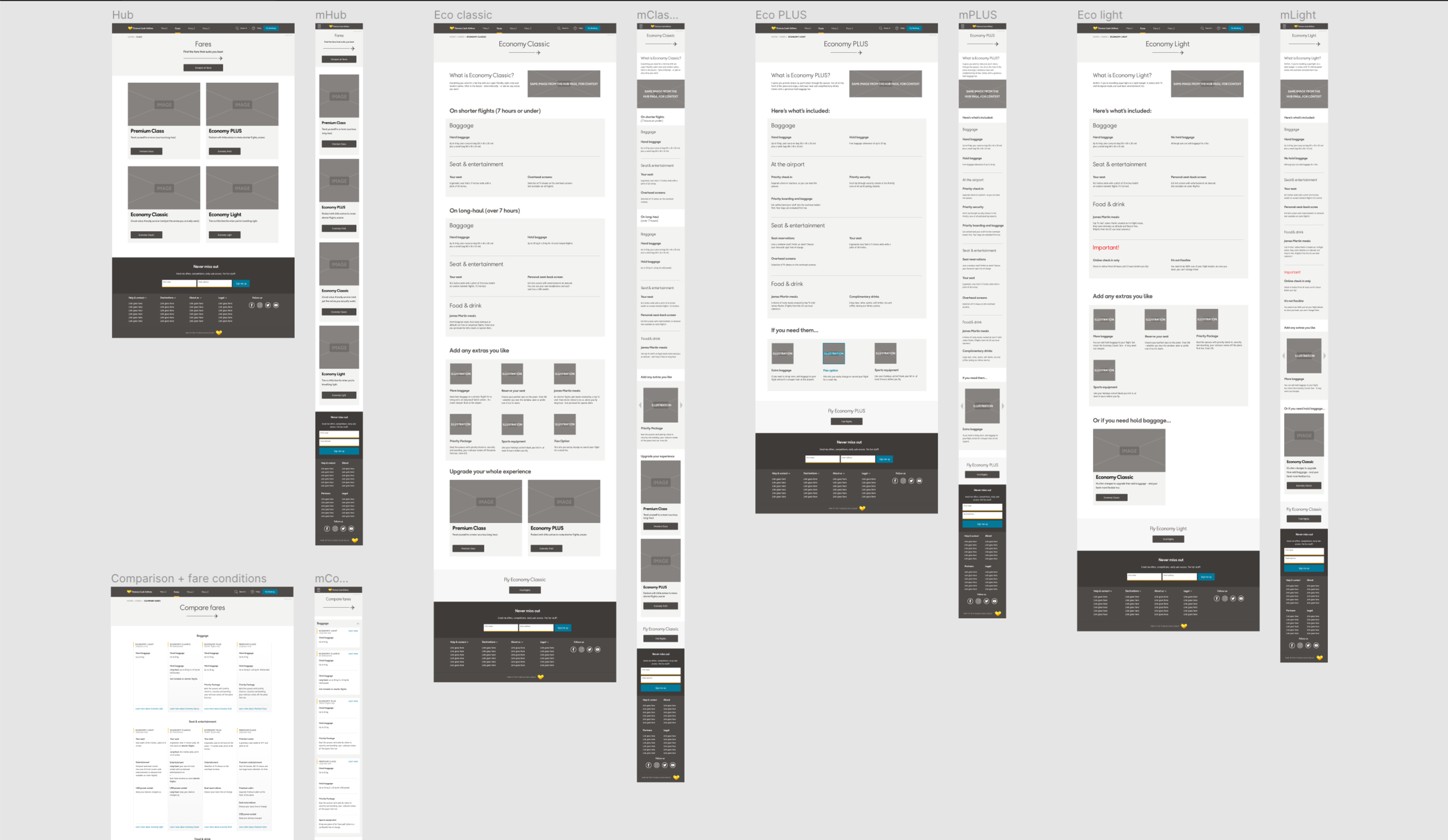
Thomas Cook Airlines - Classes Redesign
Travel Classes are usually deemed important for customer segmentation of revenue in the airline industry, and Thomas Cook Airlines were no exception. The existing Classes and Fares pages that I was tasked to redesign, suffered from a number of problems, which the initial heuristic analysis uncovered:
- pages were lacking a consistent structure
- there was a sub-navigation on some (!) of them
- one page (Flex Fare) could only be accessed via the top menu, even though it was mentioned in other pages
- Copy was convoluted and content was confusing in places
The initial analysis resulted in a number of goals:
- Gather business requirements and prioritise content
- Focus on one of the classes (PLUS) in the research, to uncover its potential success with customers
- Get users’ feedback on the page, on its preferred structure, content and design
- Work with copywriters on improving the copy
- Research the competition, perform a landscape analysis
- Present the design plan according to the research; approve it with stakeholders and plan the execution with all relevant departments
Defining the problem
As with any project that comes without a clear brief, I started by working with the Product Owner on anchoring the goals (per above), defining the scope and the roadmap. This was also an opportunity for 2 other projects we had initiated simultaneously to be incorporated and tested. Those were:
1. The new design system (new UI language)
2. The new headless CMS (Kentico) we were transitioning to
So, we’ve agreed to tackle the problem of the unclear and complicated presentation of content (UX), while testing design directions for our new visual language (UI) and working closely with developers to ensure the new structure can be efficiently built as components in the new CMS.
Discovery phase
My plan for research focused on 3 main channels:
1. Current features of each class, with emphasis on Eco PLUS, as the business was unsure about it (the method I chose was a remote card sorting exercise with 50+ participants)
2. Gathering internal feedback from Management, Product, Development and Marketing, incorporating all in a new flow of wireframes, to be tested with real people (the method: guerilla testing in a library)
3. Collaborating with a UI Designer on the cosmetic layer to the wireframes, to be tested as well (the method: guerilla testing)
In parallel to the research insights that propelled us forward, I was making sure I document and share as much additional user data as possible, be that regarding demographics (to feed into our personas) or their preference of other airline businesses (competition).
Being aware of the problematic terminology the industry used, I put extra emphasis on uncovering the “human” language the people preferred, while testing face-to-face. This helped me convince Product to start changing the way we communicate information (e.g. “long-haul”, “short-haul” were changed to “over 7 hours”, “7 hours or under”; dimensions were added to baggage; sections were visually separated for clarity, etc.)
Design phase
While wireframing, I kept the two main goals in mind - consistency and clarity. Fortunately, this aligned with all internal feedback the departments left on each design iteration I put on the wall for them to see. The successful design we’ve agreed on meant customers could easily find what they’re looking for (regardless of their journey) and the information would not be partial and would make sense to them.
There was a sense of a greater responsibility working on this, since these pages were agreed to be the basis for:
- structure of all informative pages of the site
- the new design system
- the way we’d build components for the new CMS
After tweaking the UI according to the internal feedback, and taking the 3 versions of designs to people to test (both on desktop and mobile), we’ve come up with a clear winner that had an internal consensus with all the relevant departments as well.
Summary
This project was a good example of just how much clarity UX planning can bring into the business. A haphazard brief and lack of goals and success metrics meant it was up to UX to define the problem and uncover the benefits to the business, to plan, test and execute the improvements, and to collaborate with other departments, sharing data and gaining their requirements - all within a tight deadline.
As we got closer to the handover to development, I was particularly happy that the business understood that its needs here aligned with the customers’ needs.
Management and Reporting System
3 phases of the product:
Mocks 1-8: The suggested design - A
Mock 9: The suggested design - B
Mocks 10-12: The chosen design - C
Mocks 13-26: The specced design - C
Registration-as-a-service
RaaS is Gigya's functionality, that "provides a complete, flexible set of online registration tools for integrating an end-to-end registration system across your web properties and mobile applications, complete with user validation, profile management and responsive design."
Redesigning it with its several flows and about 20 screens presented several challenges:
- responsiveness
- clean and clear new UI
- improved, engaging and fluid UX
Responsiveness was new to the product, so a clear and simple logic needed to be created, taking into account touch devices, breaking points, and overall cohesiveness across all platforms. The solution was 2 main breaking points, with the first one switching from a horizontal to a vertical layout (desktop to tablet), and the second one using the vertical layout at full width (mobile).
I've deliberately chosen large, flat and minimalistic elements, to work well both in desktop and mobile touch devices, and to preserve the same look in any size.
After development and QA, it was time to dive into the user research. Using Usertesting's tool, I've worked with several unbiased users, asking them to go through the flows, describing their experience. And although the product looked simple and the experience was somewhat expected, we've uncovered and improved quite a lot, consequently to the feedback.
The product was recently featured on Yahoo, along with its UI building tool (mock #2).
BEAT
A social (community) app, after full stages of:
- prototyping & specs
- wireframing
and on-going work on:
- UI
- screens interaction and flows
Adidas Riders
A suggested app to help mountain bike enthusiasts, pros and amateur, organise, join and compete in custom races, while encouraging them to win and receive prizes from the brand.
The app's emphasis is on the social circle of the user. It traces the personal progress, while encouraging the user to share (brag, if you will:)
Facebook app re-envisioned
For a while now I've asked myself, as a frequent Facebook user on mobile: why does the app need to look so overwhelmingly web-like? Isn't there a specific flow of actions, beyond the latest post on the news feed? A clearer path to update on myself and others?
For some reason, it made more sense to me to always start with the user himself/herself.
After all, the platform is ego-centered, so why shouldn't the user start with a more "you are here" approach, before he/she wanders away into the jungle of friends' updates, posts from groups he/she barely remembers subscribing too, and, of course, the ads?
The project is another personal brainstorming of mine, as an endeavor to find answers to the questions that arise while I use the app.
I still need to tackle more screens, but I will try to be very selective, for I still believe that not everything the web Facebook has should be cramped into the user's hand.
Music Player for iOS
A Music Player (iOS, iPhone5)
Zipper.co.il
A fully responsive design of a showcase site.
Final (mock 1) and Alternative versions (the rest of the mocks).
Smart Home Multiplatform App
A Multi-Platform (iPhone/iPad) app for a smart home.
(Personal Project).
Includes a promotion site.
IGY.org.il
A full multi-platform UX work I've volunteered for.
Included a profound user research, using a questionnaire, and layouts for web and mobile.
Healthy Meals App
An application, suggested for a local food manufacturing company.
Focuses on a parent's (the user) need to supply healthy food choices for the children, based on their preferences, while promoting the brand.
Has multiple features, like a smart shopping list, an updated profile for every kid and a social feed, for exchanging ideas.
Car Salesman Helper App
An app to help a car seller to organise and keep track of meetings, past, present and future.