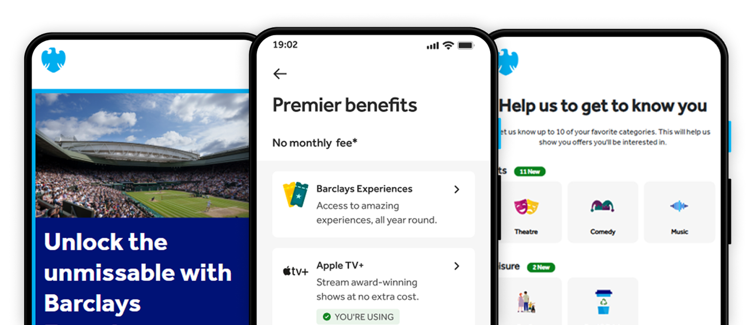
Project: Barclays Experiences
Role: Lead Product Designer
Impact: Engagement: +17.3% CTR on event promo | Optimal entry point placement validated | 87% submission rate post-click | Circa 30-40% increase in interest in future experiences.
Skills: User Research | Cross-team (Barclays vs agency) Design Leadership | Strategic UX Design
—
Context:
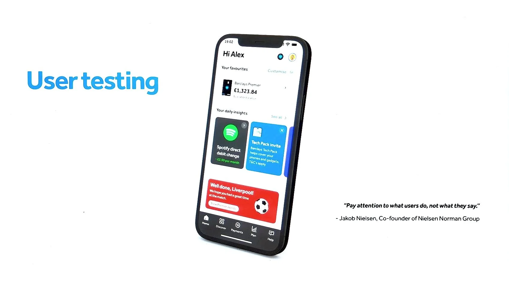
Barclays Premier is the bank's premium tier, serving high-net-worth customers. The Premier banking page https://www.barclays.co.uk/premier-banking is one I designed myself - and the case study below covers the broader Experiences platform built to support and extend that proposition across digital touchpoints.
🔍 Deep, multi-market user insight
Conducted research to uncover how Premier customers discover, evaluate, and engage with lifestyle benefits.
🧠 Clear value proposition for Premier customers
Ran a series of design sprints with the stakeholders to digitalise and reframe complex, underused benefits into a more intuitive, compelling and scaleable experiences-led proposition.
📐 Validated UX direction before build
Used experimental iteration to de-risk key journeys early, aligning teams around evidence rather than assumptions, introducing Barclays’ to the mindset of agile delivery.
🤝 Strong stakeholder alignment across teams
Brought product, marketing, content and development into a shared vision, reducing friction and accelerating decision-making, influencing roadmap decisions.
🚀 Future-ready foundation for a premium platform
Delivered a clear UX and content framework designed to scale, evolve and support future Premier offerings.
—
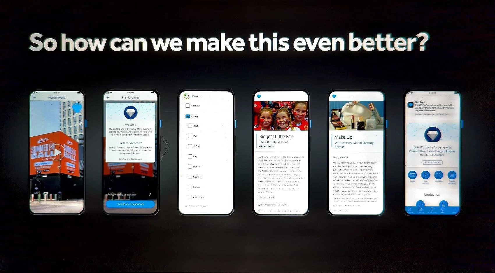
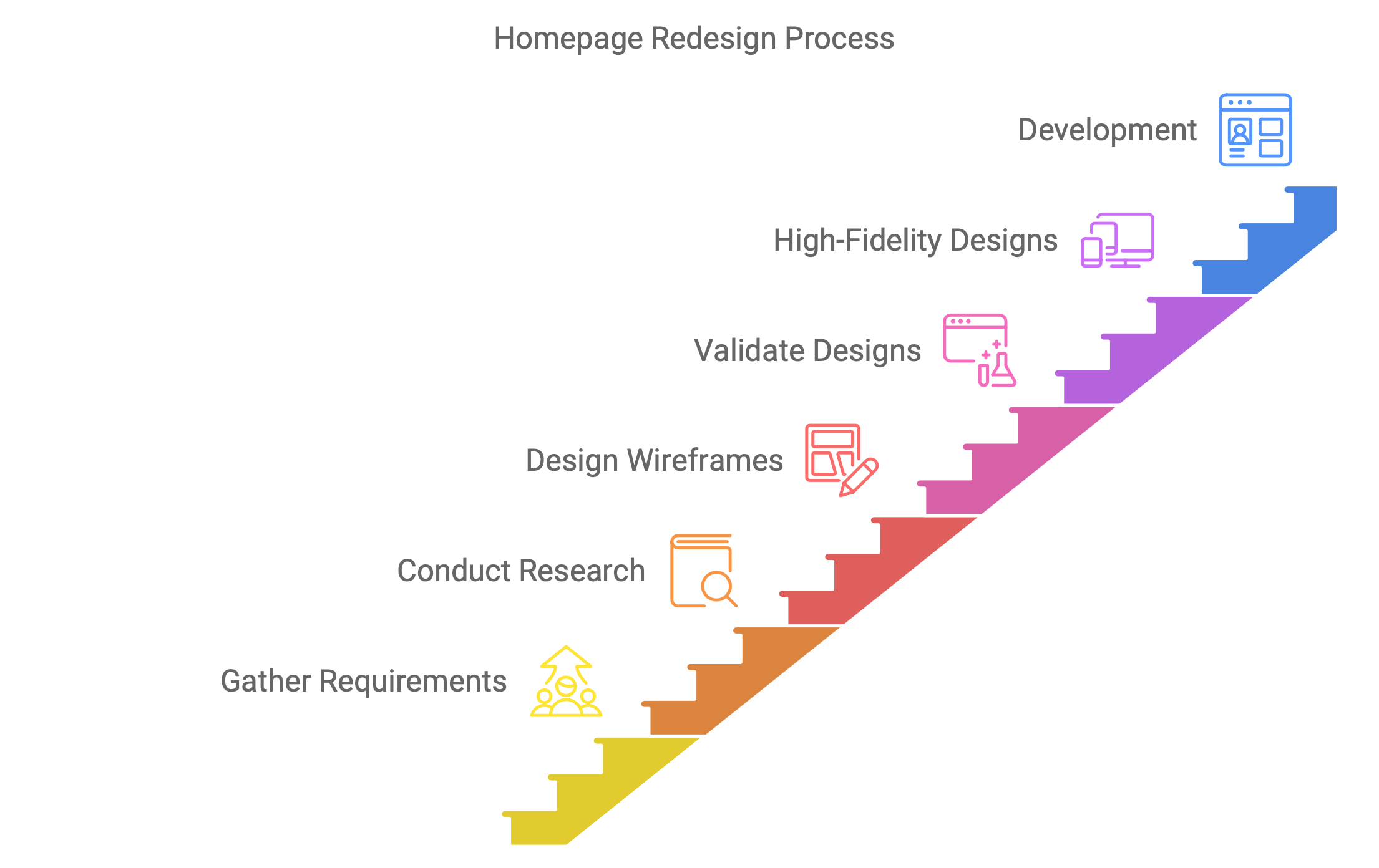
1. Background
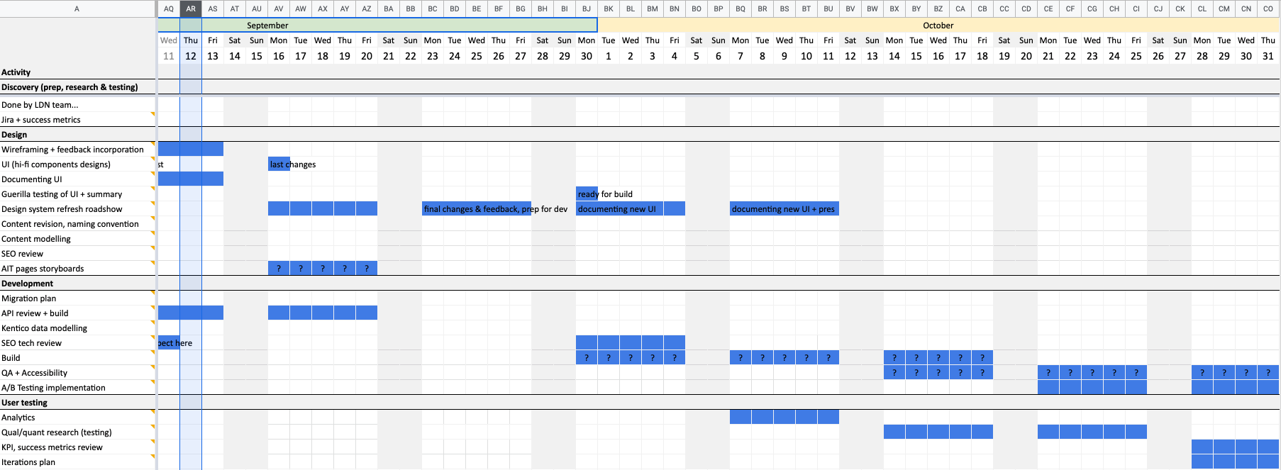
This project addressed visibility and scalability challenges around exclusive Premier customer events. I used it an opportunity to lead a cross-functional initiative grounded in Design Thinking and experimentation. This opened space for rapid idea testing, helping stakeholders embrace iteration over perfection.
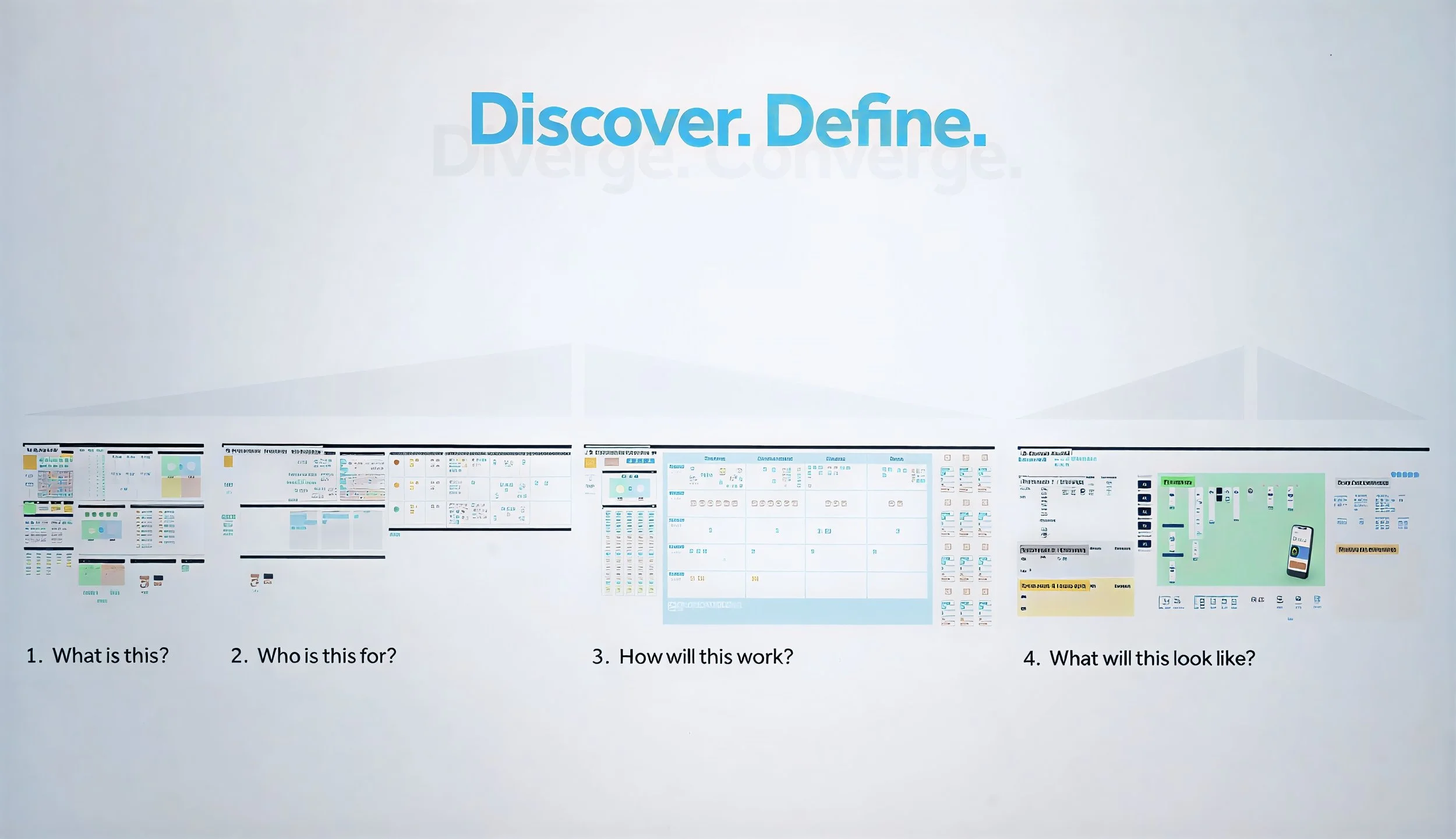
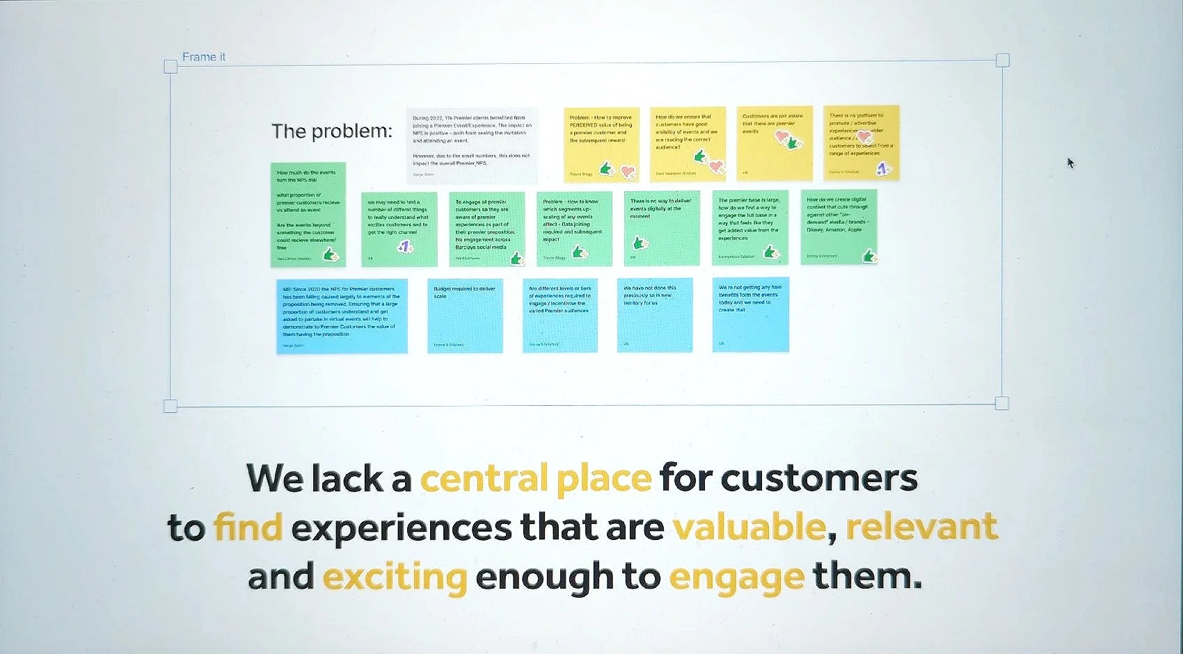
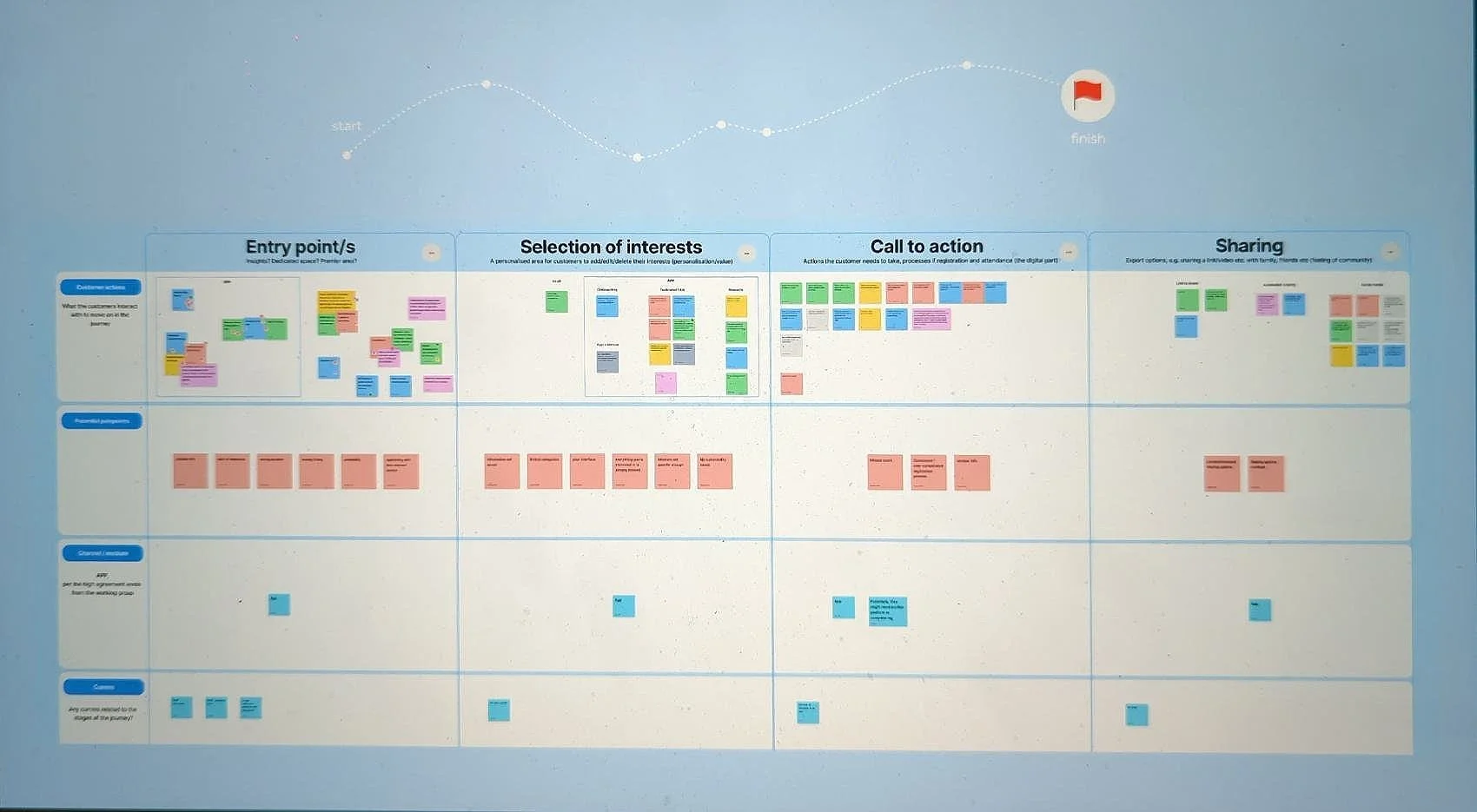
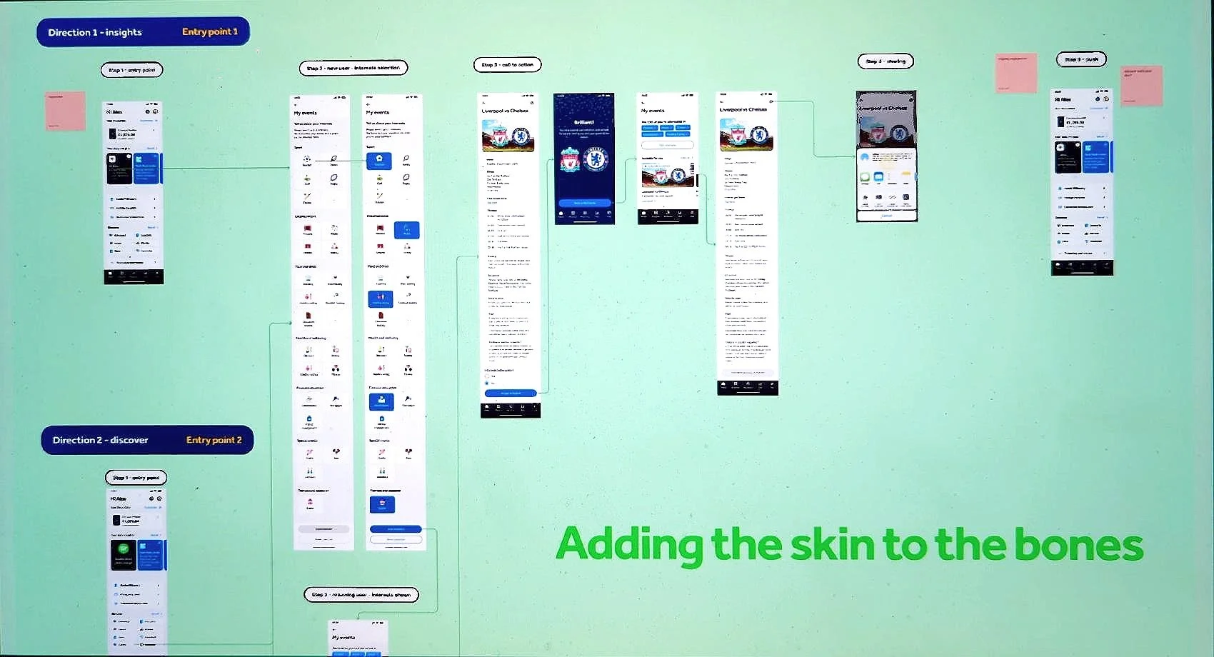
2. Design Sprint
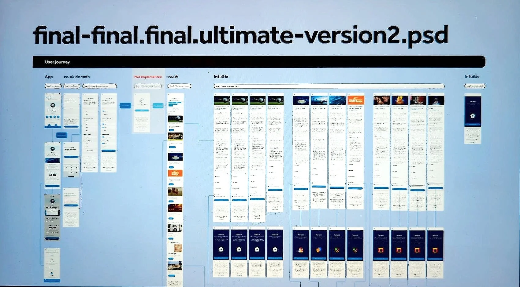
I facilitated a remote, three-week design sprint (inspired by Google’s model) that involved stakeholders from across the business. Using FigJam and structured exercises like persona creation, experience mapping, and wireframing, we defined the following Problem: Premier customers lacked a central, personalised, engaging platform for events. The sprint culminated in an interactive prototype and a delivery plan, approved within two weeks.
3. Technical Delivery
With just two months for build, I provided continuous design support to development, copy, analytics, and third-party teams. We worked in agile sprints with daily standups, solving issues around secure data capture, multi-channel scalability, and legacy brand integration. Design was actively involved in risk assessment, iteration, and efficient handovers.
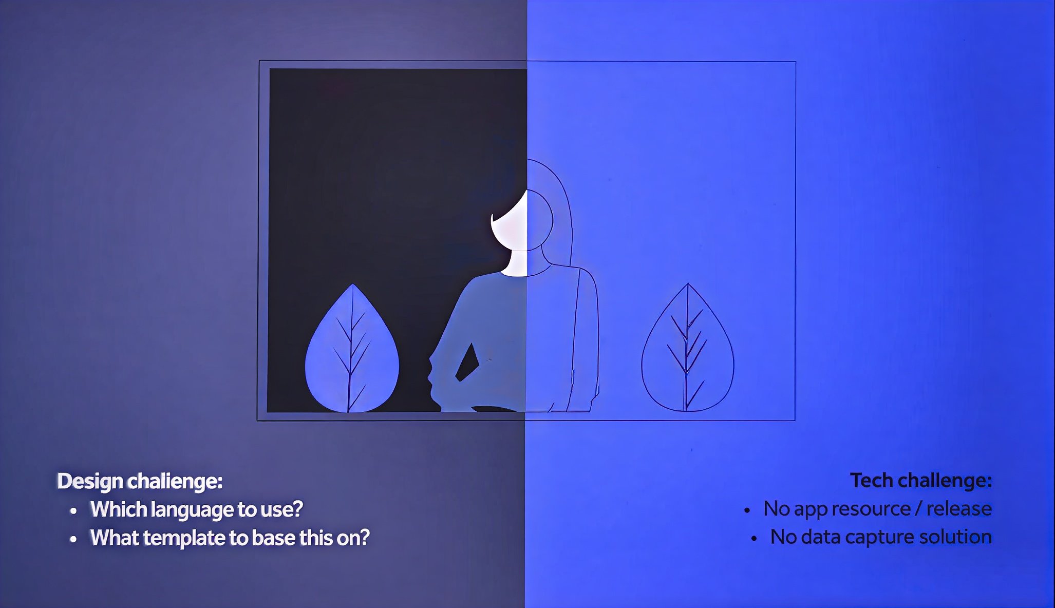
4. Challenges & Solutions
Key blockers included:
- App release limitations → solved by deploying a demo micro-site.
- Data capture complexity → solved via cookies + third-party data mapping.
- No existing templates → I built the flow from scratch, creating a future-proof blueprint.
Despite shifting brand timelines, I adapted designs across systems and led UI delivery using Figma, supported by my team for faster output.
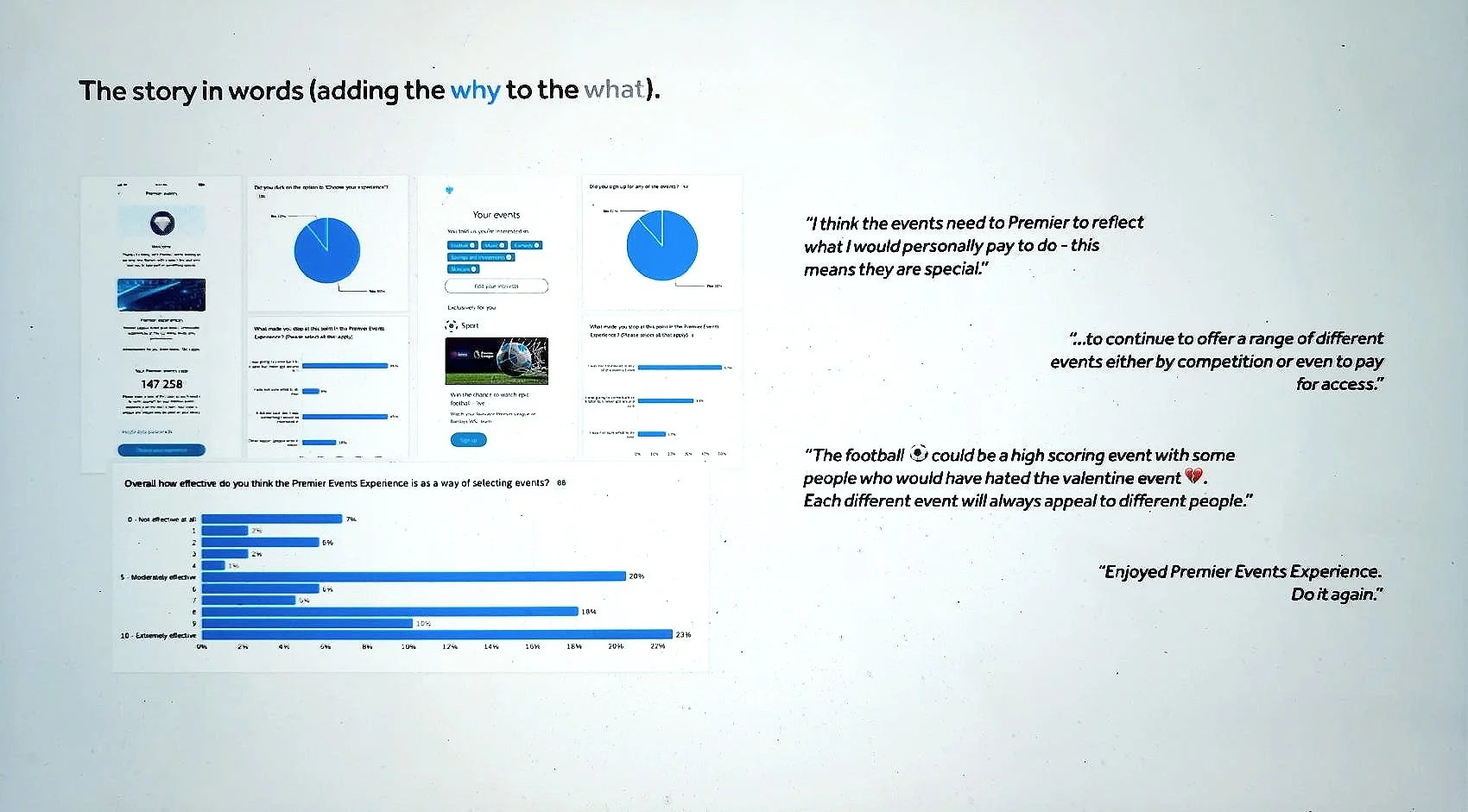
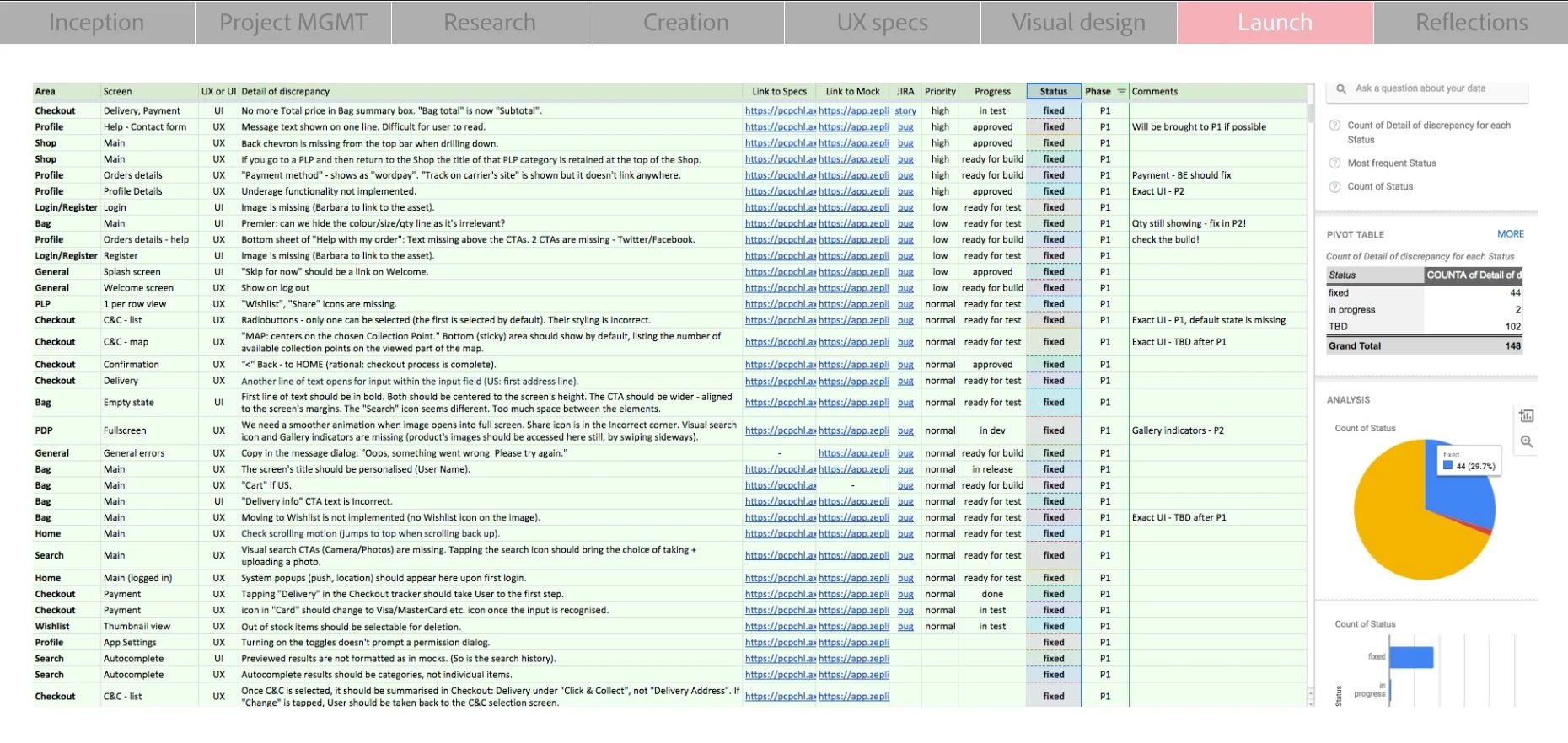
5. Testing & Analysis
User testing validated the solution’s UX. I then initiated both quantitative and qualitative post-launch analysis:
- Quant: Funnel tracking revealed drop-offs and validated key engagement points.
- Qual: Surveys uncovered user sentiment and pinpointed weaker screens.
Both sets of insights directly informed iteration and future planning.
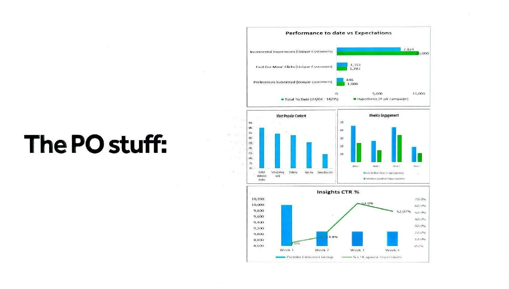
6. Performance Metrics
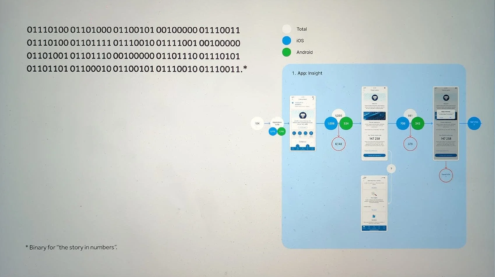
- 7,824 customers reached
- 1,282 clicked through from 1,351 impressions
- 846 completed preference submission (87% of engaged users)
- CTR grew from 4% to 64% over 3 weeks
- “Coming Soon” content drew 40% (football) and 34% (tennis) interest
- 15-35% returned weekly to explore new content
These metrics confirmed strong appetite and willingness to engage, especially with relevant, tailored offers.
7. Hypotheses Validation
- Engagement: 17.3% CTR on event promo; optimal entry point placement.
- Willingness to share preferences: 87% submission rate post-click.
- Interest in future events: 30-40% chose “coming soon” categories.
- Retention: Weekly return behaviour inconclusive but promising.
Hypotheses around relevance, trust, and personalisation were largely validated, showing high potential for scale.
8. Outcomes & Key Findings
The project proved the value of design-led, cross-functional experimentation. We saw rapid delivery, strong engagement, and deep collaboration across new and existing teams. My team became a go-to for innovation pilots, and we reframed expectations around speed, ownership, and what design can deliver beyond UI. This is one of the fastest product rollouts in my Barclays tenure, with strategic impact across sponsorship, marketing, and analytics.
9. Launch
The platform debuted in July 2025, allowing all Premier customers to access and sign up to the full range of events and experiences, according to their personal preferences.
—-
(Please note: Some visuals are blurred for confidentiality reasons.)
Project: Amazon Instalments checkout integration
Role: Lead Product Designer
Impact: 4,500+ daily applications | Major revenue driver
Skills: UX Strategy | Stakeholder Management | User Testing
—
A strategic UX partnership between Barclays and Amazon to embed a seamless instalments experience in a regulated banking app.
📈 4,500+ instalment applications per day
Within the first three months post-launch - strong early adoption and validation of the experience.
🛍️ Seamless Amazon checkout integration
Instalments fully embedded in the Barclays app, matching Amazon’s UX expectations and reducing user friction.
💡 True self-serve financing
Customers could apply, get approved instantly, and manage repayments in-app — no hand-offs, no confusion.
📊 New engagement vector for Barclays
Introduced a high-frequency use case within a regulated product environment, expanding both user value and business opportunity.
🤝 Strategic credibility
Strengthened partnership with Amazon and shifted design into a central, evidence-driven role within a complex cross-functional delivery.
—
This project marks a personal career milestone. As the Design Lead I developed UX strategy, liaised with Amazon’s design team, fostered cross-team alignment and built a user-first approach in a heavily regulated space. Its success has solidified Design’s place at the stakeholder table at Barclays.
1. Inception
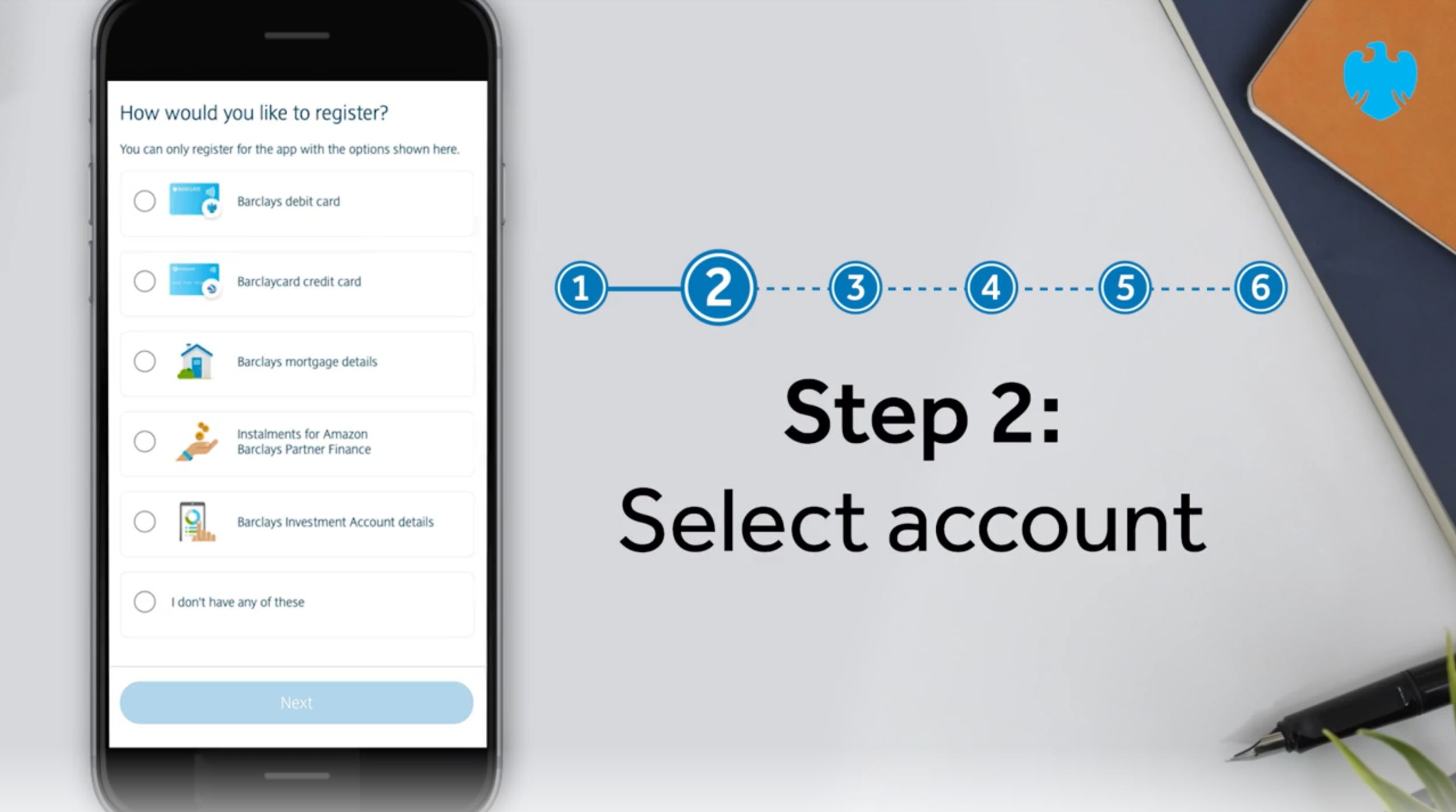
The project began as a natural evolution of Barclays Partner Finance’s (BPF) collaboration with Amazon, following an earlier successful proposal for an instalment product. From the outset, I served as the key design liaison for BPF, navigating the complex dynamics between internal financial compliance and external retail demands. I worked on early prototypes to adapt existing account servicing for use in the Barclays app, laying the groundwork for what would become a scalable shopping credit line product.
2. Ideation
The core challenge was defining a product still abstract internally, in a way that made sense to users and was scalable to retailers. Amazon’s high UX standards (e.g., 1-click purchase) demanded lean, streamlined journeys, driving us to embed UX into the strategy. I initiated cross-functional collaboration, mapped early end-to-end flows, and embedded myself across multiple product teams. Iterative feedback from Amazon, combined with Barclays’ own constraints, made for a highly adaptive, design-led process - pushing UX into a more strategic role than usual within the organisation.
3. Creation
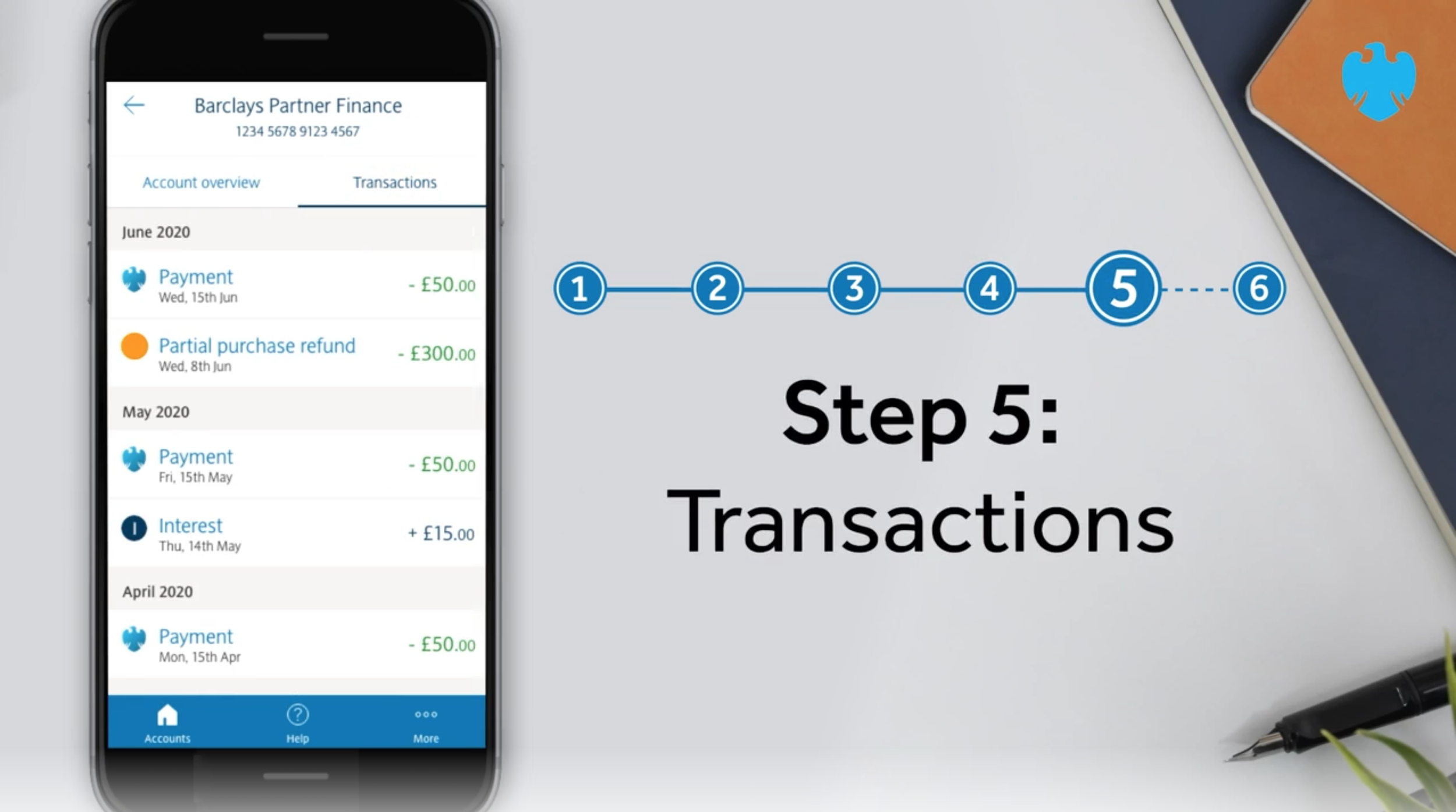
While the checkout integration was still under review, I focused on designing the in-app MVP for servicing the product. The challenge was making complex financial concepts (like credit limits) intuitive and user-friendly. I advocated for early collaboration with copywriters, integrating clear, testable messaging into design. I facilitated testing sessions and coordination across design, product, and compliance, balancing stakeholder needs with user clarity. My role evolved into design leadership, making UX a central, evidence-driven voice in decision-making.
4. Testing
I ran ten in-depth interviews with both Barclays and non-Barclays users. Key friction points emerged around early-stage messaging, especially at the point of selection and checkout. Many users hesitated due to confusion about reusability and commitment. However, the servicing experience within the Barclays app tested strongly - even among new users - validating much of the design direction and helping us course-correct the messaging in time for launch.
5. Iteration
Following testing, I led refinements to clarify proposition messaging and user flows. This visibility and domain knowledge led to my appointment as manager of one of our Component Libraries. I used this opportunity to share templates and enforce design consistency across Barclays teams. As with any live product, iteration didn’t stop at launch - I continued to refine the experience based on analytics and user feedback.
6. Collaboration
This project was deeply collaborative, requiring coordination with multiple product squads, legal teams and other designers. I facilitated remote workshops and fostered broader participation. I also adapted to developers’ workflows, ensuring clean specs handover. These soft skills helped us streamline delivery while building a shared language between disciplines.
7. Results & Impact
📈 4,500+ instalment applications per day
Within the first three months post-launch - strong early adoption and validation of the experience.
🛍️ Seamless Amazon checkout integration
Instalments fully embedded in the Barclays app, matching Amazon’s UX expectations and reducing user friction.
💡 True self-serve financing
Customers could apply, get approved instantly, and manage repayments in-app — no hand-offs, no confusion.
📊 New engagement vector for Barclays
Introduced a high-frequency use case within a regulated product environment, expanding both user value and business opportunity.
🤝 Strategic credibility
Strengthened partnership with Amazon and shifted design into a central, evidence-driven role within a complex cross-functional delivery.
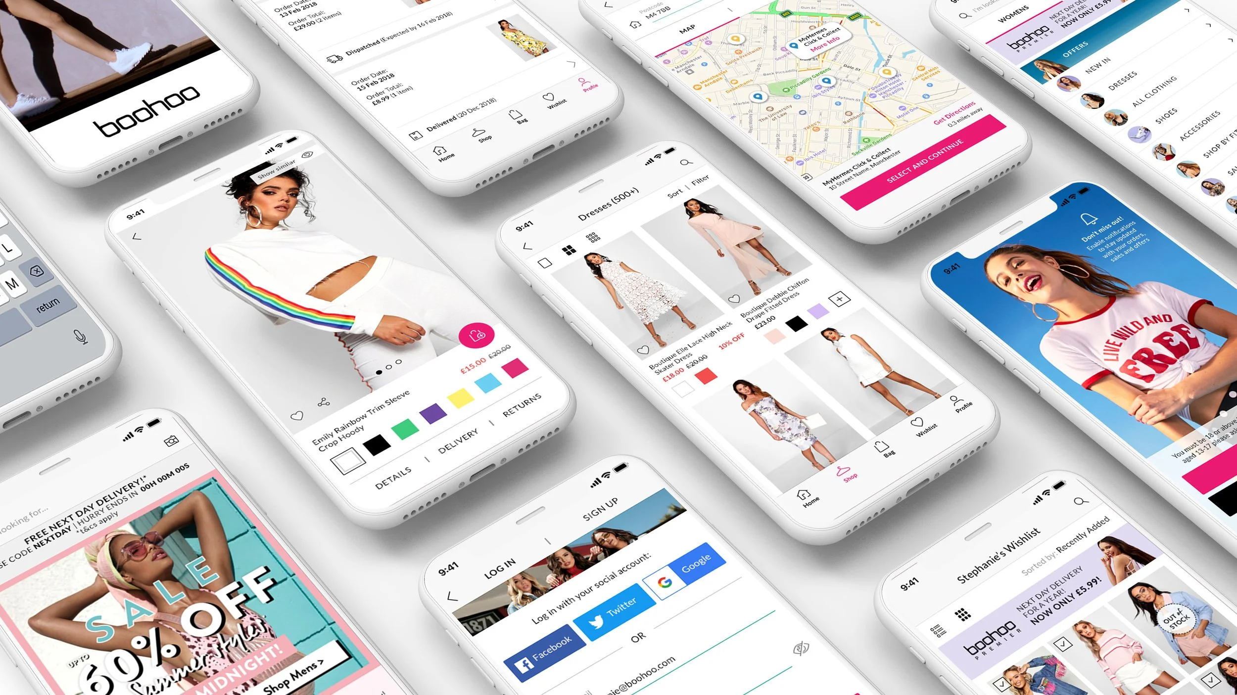
Project: Boohoo Mobile App Redesign
Role: Lead Product Designer
Impact: App Store 3.9 → 4.7 ★ | Google Play 3.5 → 4.0 ★
Skills: User Research | Mobile UX | Design Systems | Dev Collaboration
—
⭐ App Store rating jumped from 3.9 to 4.7
A clear signal of improved usability and customer satisfaction post-redesign.
⭐ Google Play rating climbed from 3.5 to 4.0
Reflecting stronger experience and polish.
🔍 Better UX, fewer frustration points
Research-driven discovery and testing informed every decision, lowering friction and sharpening flows.
📱 Full design + implementation collaboration
From benchmarks to prototypes to weekly dev support, ensuring high fidelity delivery.
📊 Usability validated through NPS & SUS scoring
Not just a redesign - a proved impact with real user measures.
—
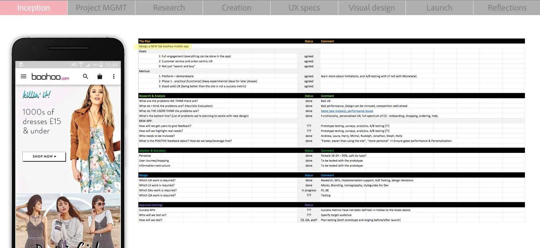
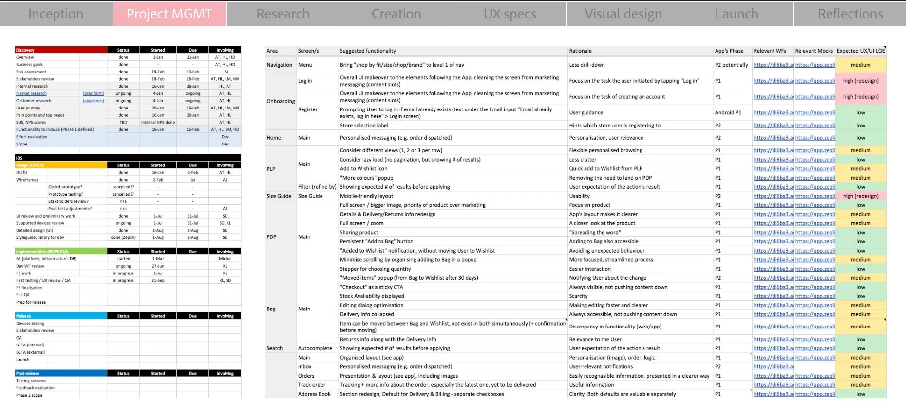
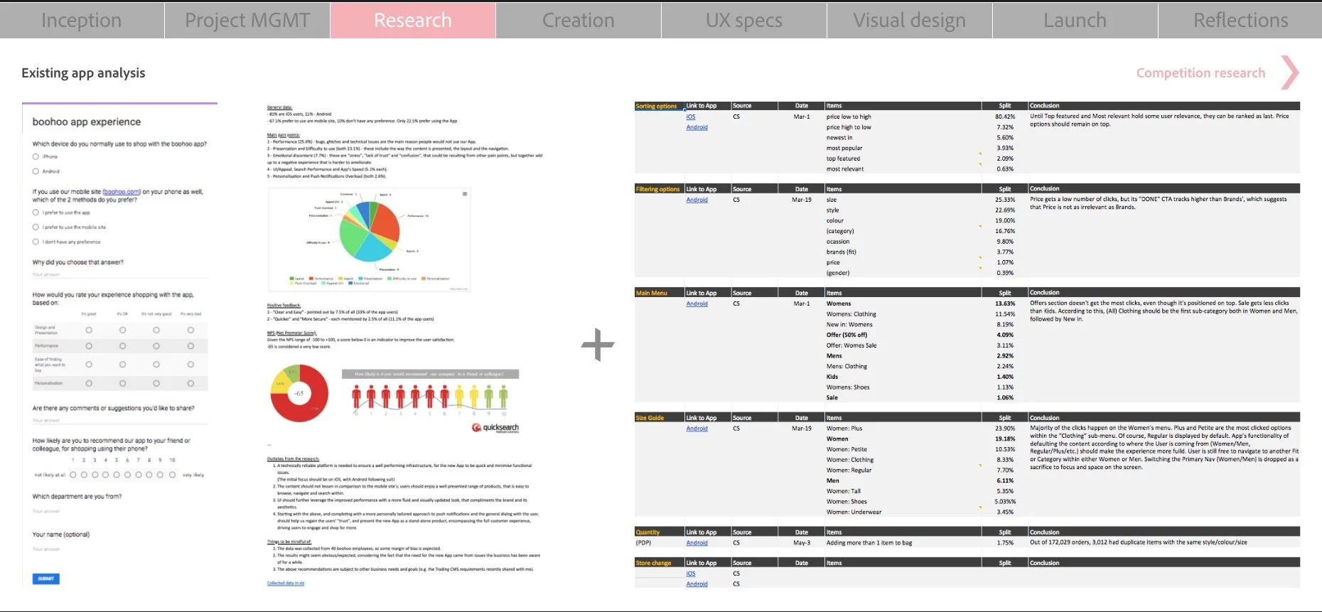
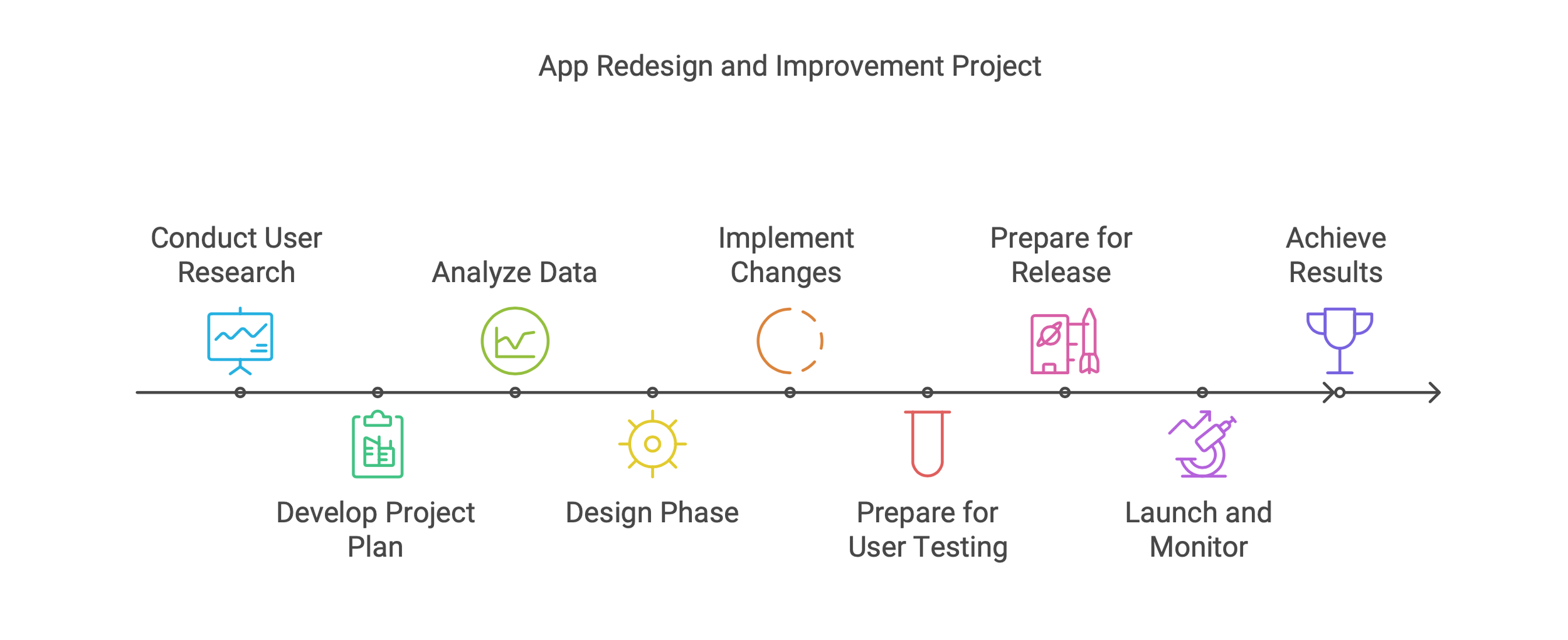
1. Discovery
Over the course of a month, I ran a comprehensive discovery process to define the project scope and surface key user pain points. This included qualitative and quantitative user research (surveys, NPS feedback, reviews), as well as analysis of mobile usage data from both the previous app and boohoo.com. The insights informed a clear project plan, with defined goals, prioritised features, timeframes, and success metrics.
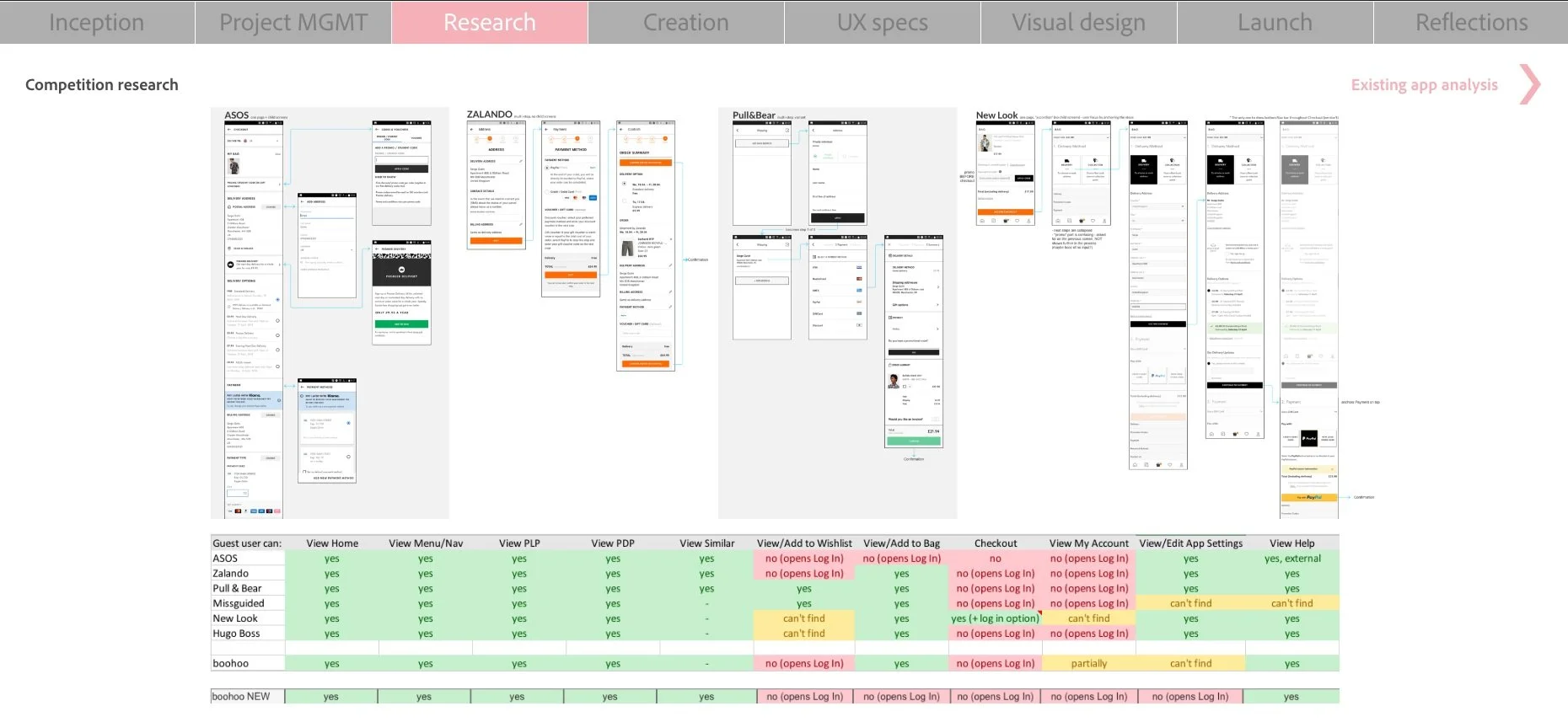
2. Design
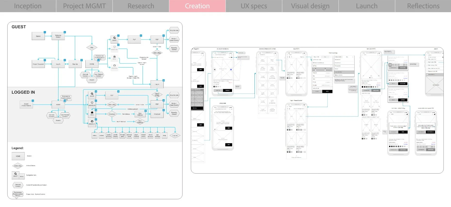
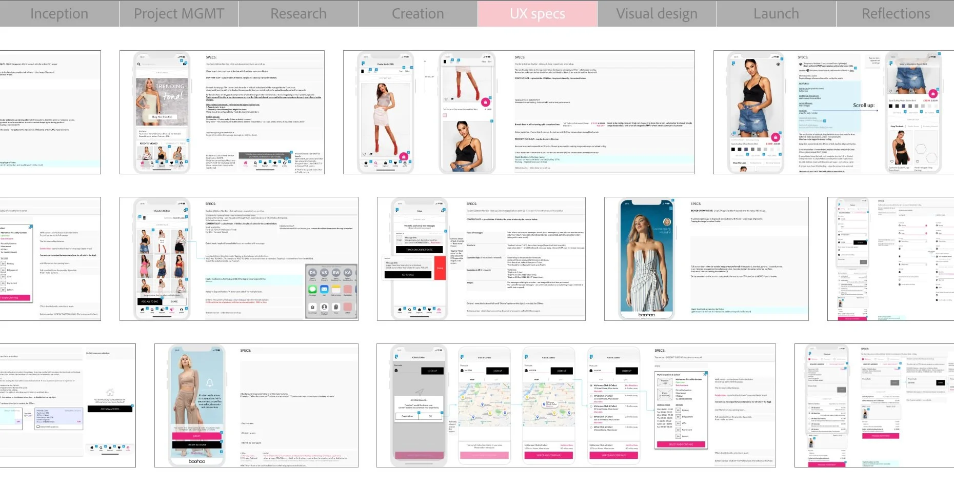
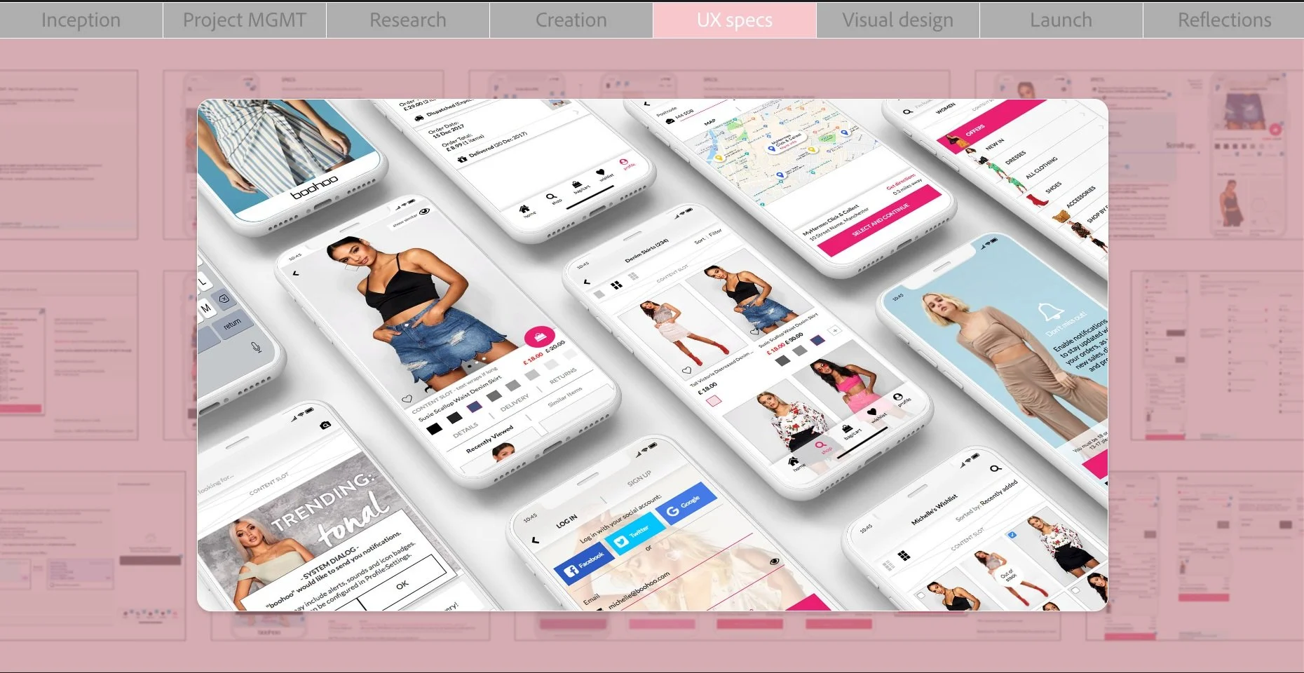
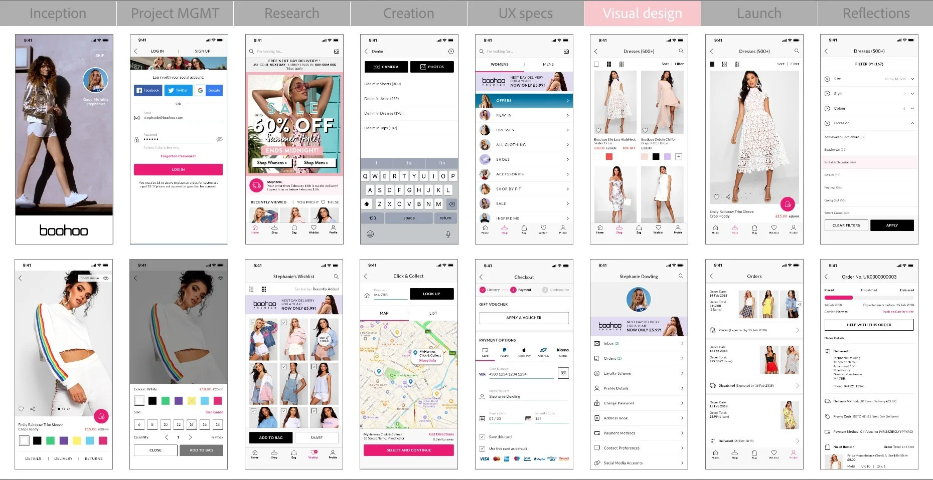
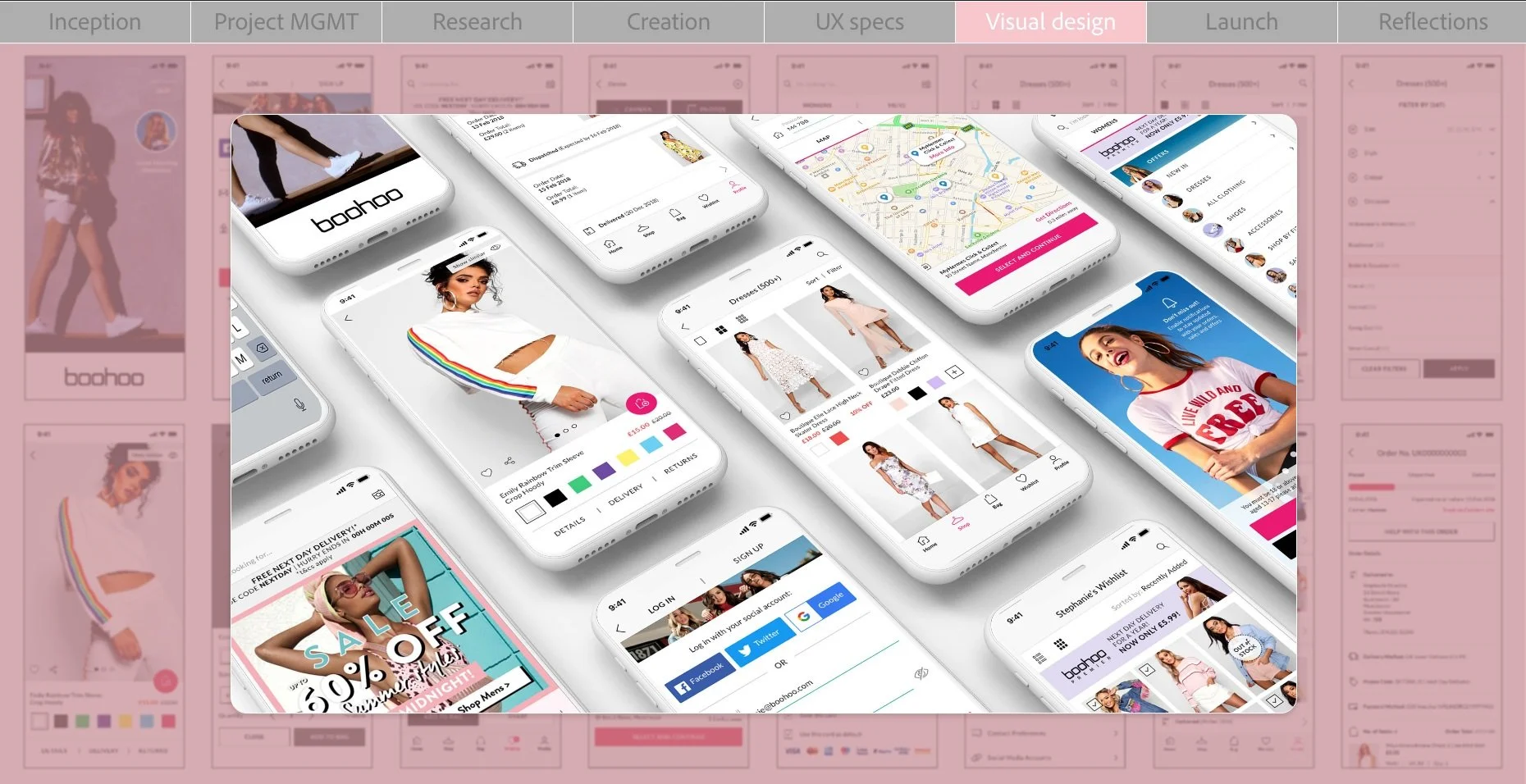
During a 3-4 month design phase, I benchmarked competitor experiences, aligned with iOS and Material Design guidelines, and mapped out the full user journey. This led to iterative wireframes and interactive prototypes to validate flows and functionality. Final UI designs were delivered via Zeplin, along with detailed specs covering both behaviour and interaction design.
3. Implementation
I provided ongoing design support throughout the 5-6 month development cycle, including weekly check-ins with R&D, clarification sessions, and continuous backlog management. All UX tickets were raised, prioritised, and maintained on the Dev team’s Kanban board to ensure smooth delivery.
4. Testing & Validation
Before launch, I created realistic user testing scenarios and measured usability through NPS and SUS scoring, helping validate and fine-tune key interactions.
5. Post-Launch & Next Steps
Alongside the release, I developed a post-launch strategy and roadmap for the next phase, focusing on iterative improvement based on new user feedback and behavioural data.
6. Results & Impact
⭐ App Store rating jumped from 3.9 to 4.7
A clear signal of improved usability and customer satisfaction post-redesign.
⭐ Google Play rating climbed from 3.5 to 4.0
Reflecting stronger experience and polish.
🔍 Better UX, fewer frustration points
Research-driven discovery and testing informed every decision, lowering friction and sharpening flows.
📱 Full design + implementation collaboration
From benchmarks to prototypes to weekly dev support, ensuring high fidelity delivery.
📊 Usability validated through NPS & SUS scoring
Not just a redesign - a proved impact with real user measures.
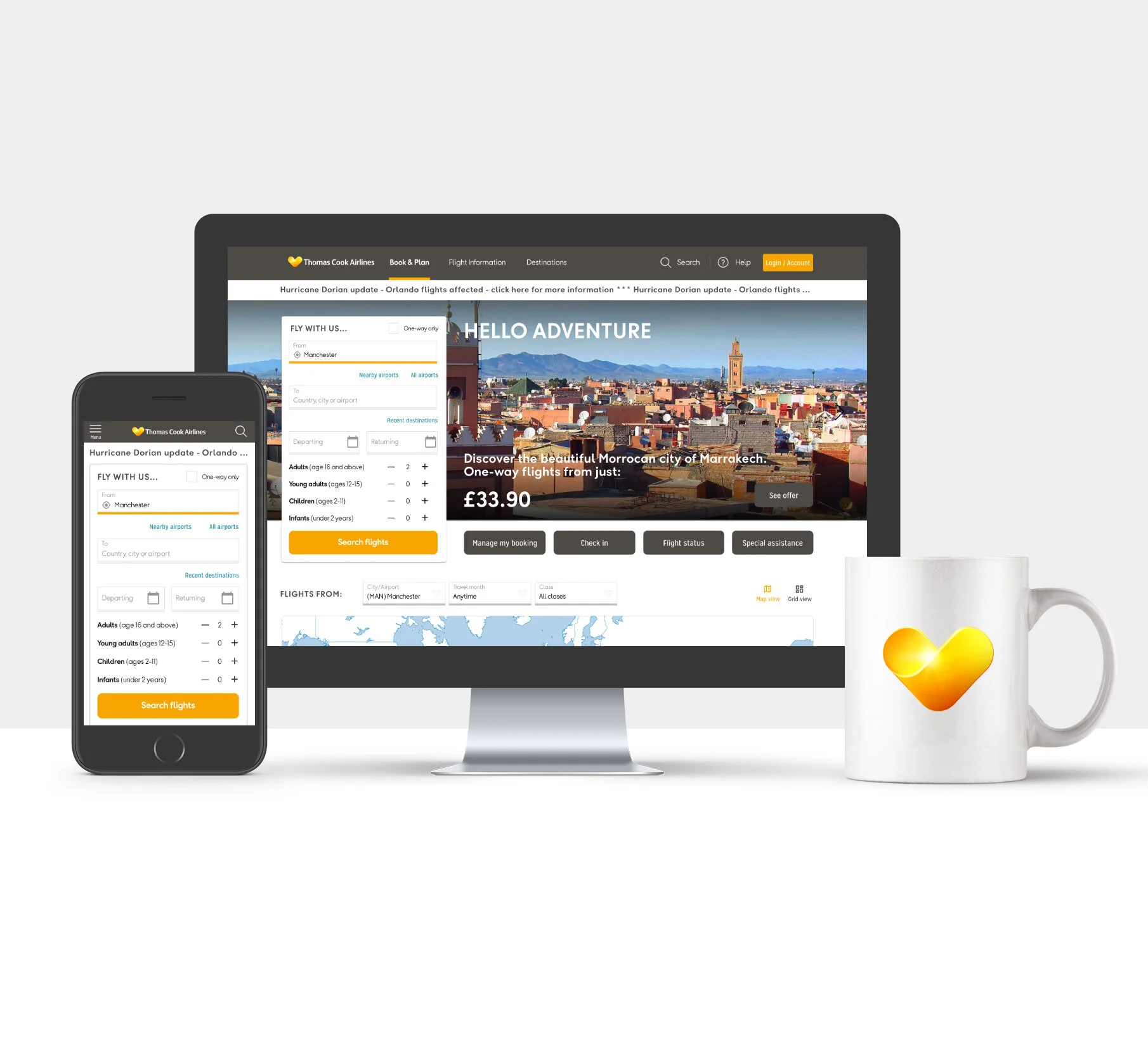
Project: Strategic Homepage Redesign
Role: Lead Product Designer
Impact: Cross-market research | Full stakeholder alignment | Conversion-focused UX output and foundation
Skills: User Research (Lab, Guerrilla, Remote) | Cross-functional Leadership | Strategic Design
—
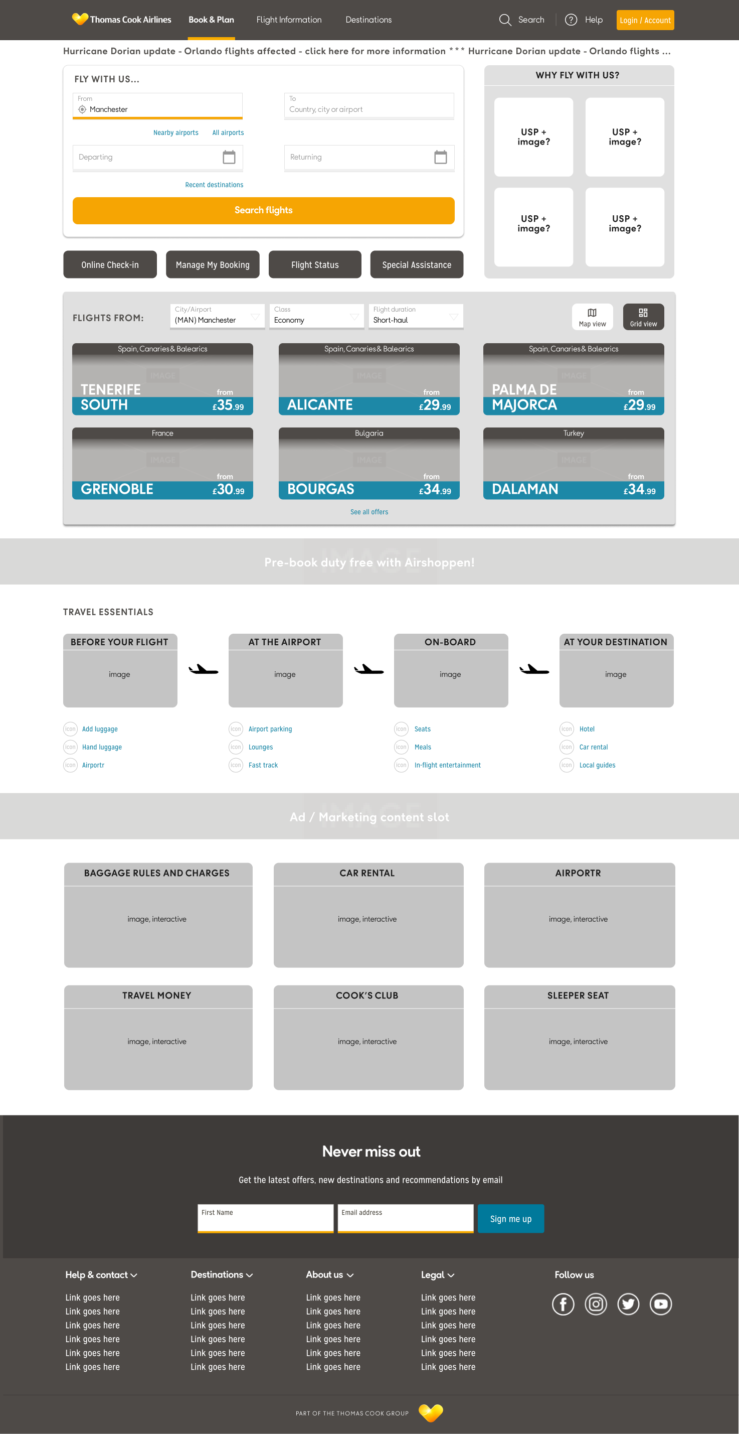
🎨 Strategic homepage redesign
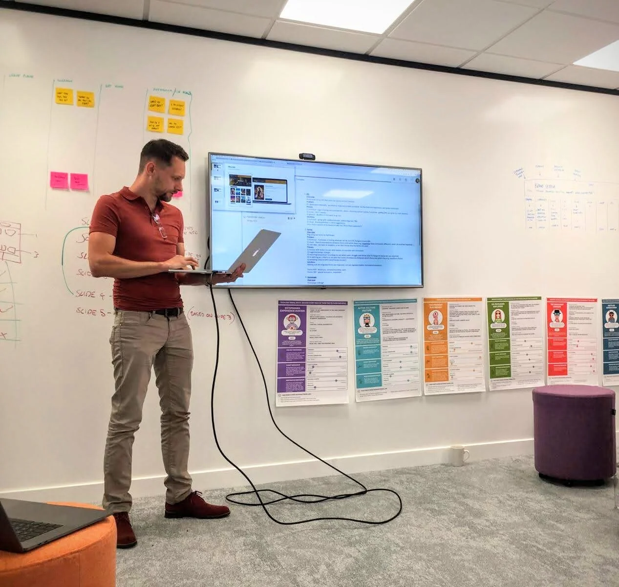
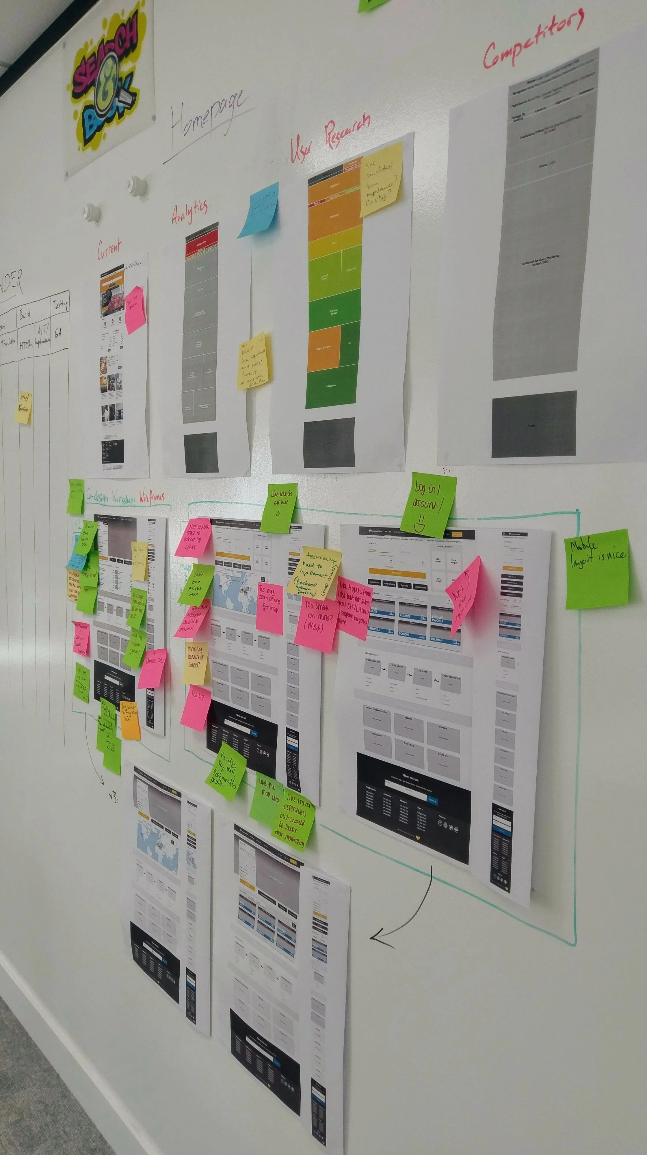
The homepage took precedence over all other initiatives. The brief was clear: create a stronger visual identity, sharpen the strategy, and improve conversion. I led the project from concept through validation.
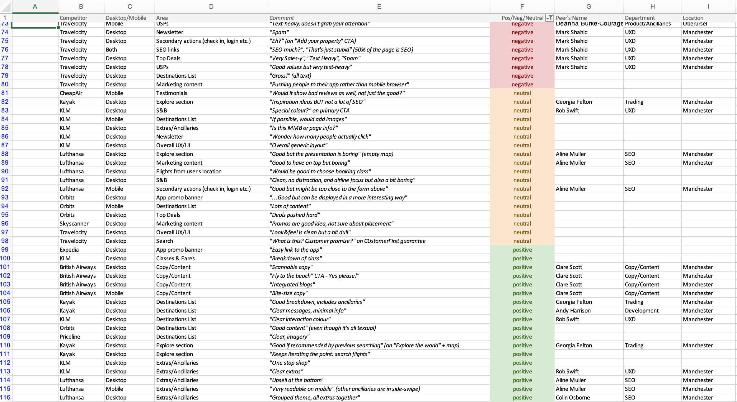
🔍 Deep user research across markets
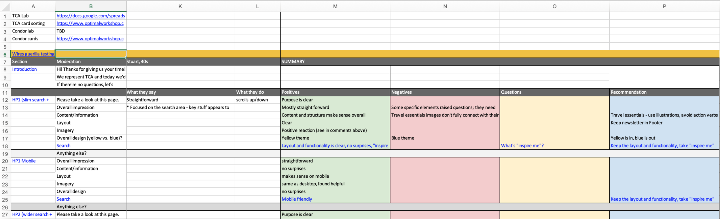
I’ve used lab, guerrilla, and remote testing in the UK and Germany to uncover core pain points and validate design directions.
📐 Clear, consensus-driven design direction
My iterative process of wireframes and prototypes won alignment across product, SEO, and development before build.
🤝 Cross-functional collaboration boosted buy-in
Stakeholders from multiple disciplines had shared ownership of the vision and metrics, strengthening internal alignment.
🔧 Future-ready UX groundwork laid
Even though the launch didn’t go live, I’ve provided a strong foundation for conversion-oriented UX and tighter content hierarchy via my research, collaboration, design leadership and design thinking methodology.
—
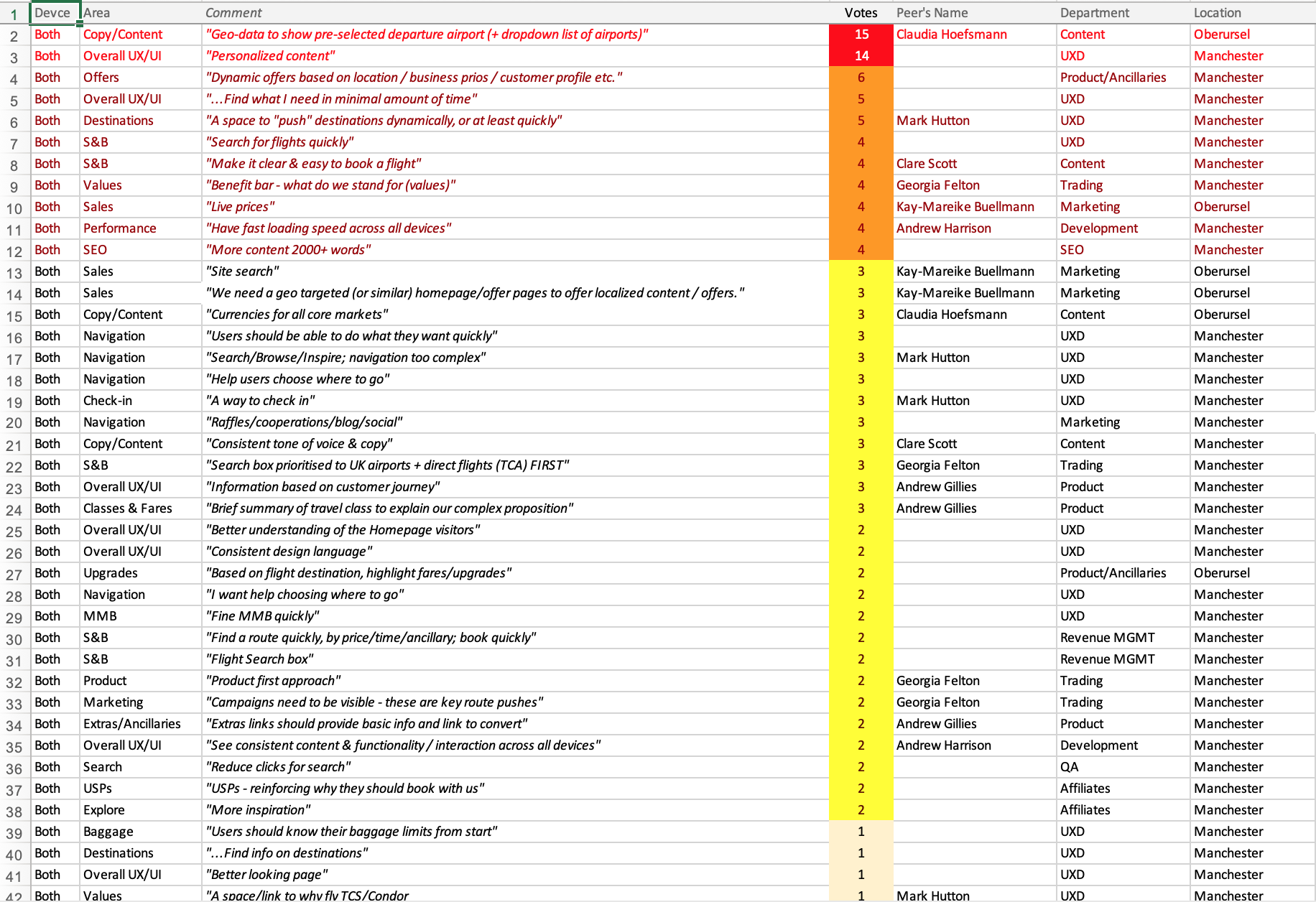
I started with a clear plan, to:
- Prioritise content based on business needs
- Gather analytics on current performance
- Run user research to uncover pain points and expectations
- Benchmark the competition
- Align stakeholders and plan execution cross-functionally
—
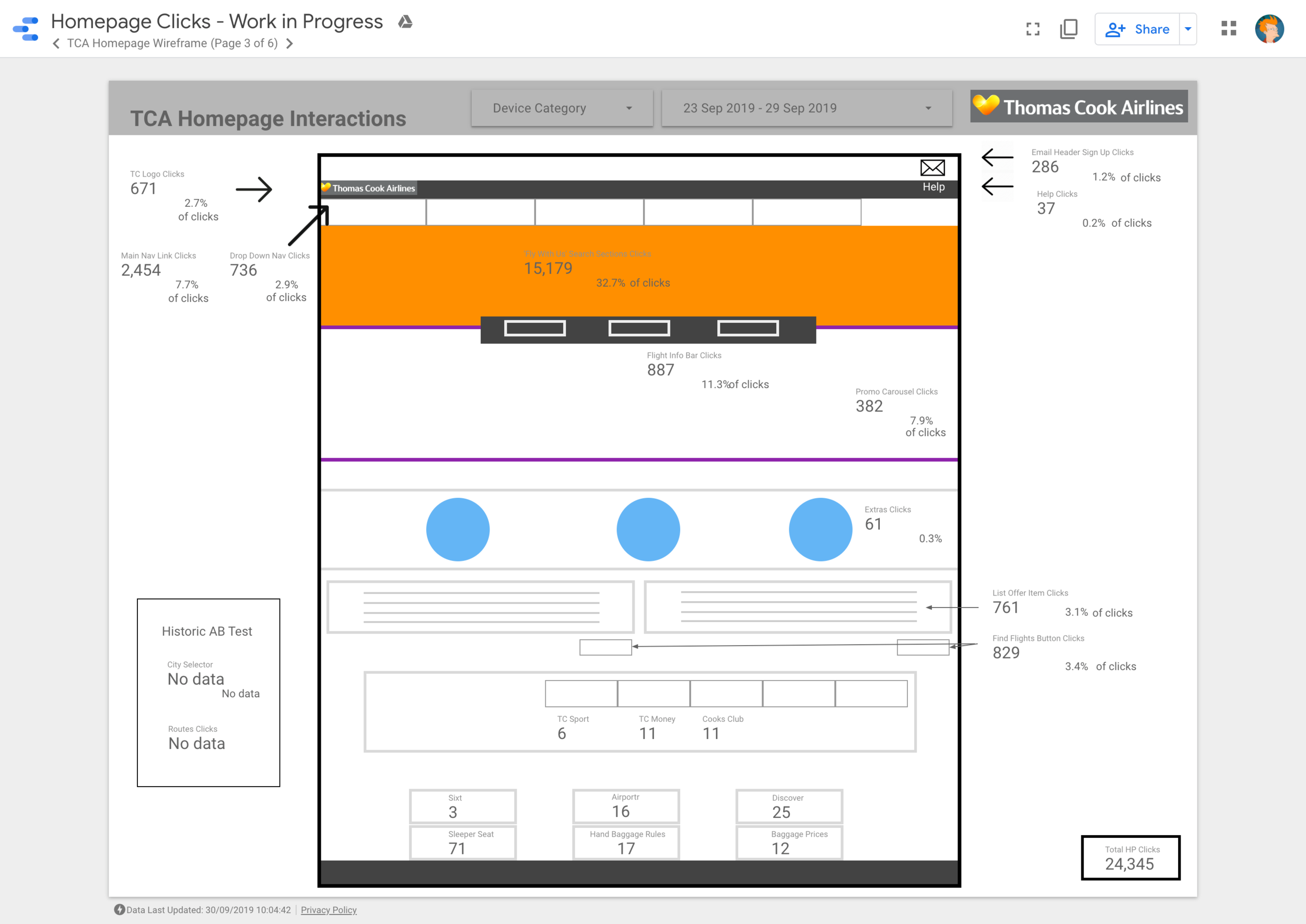
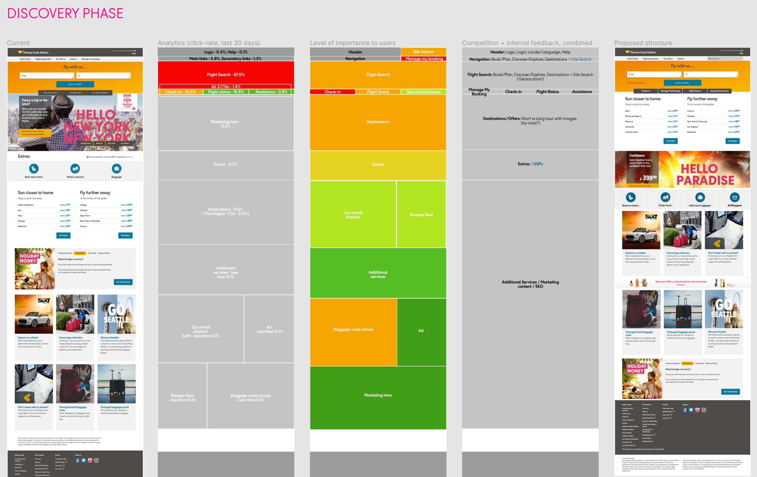
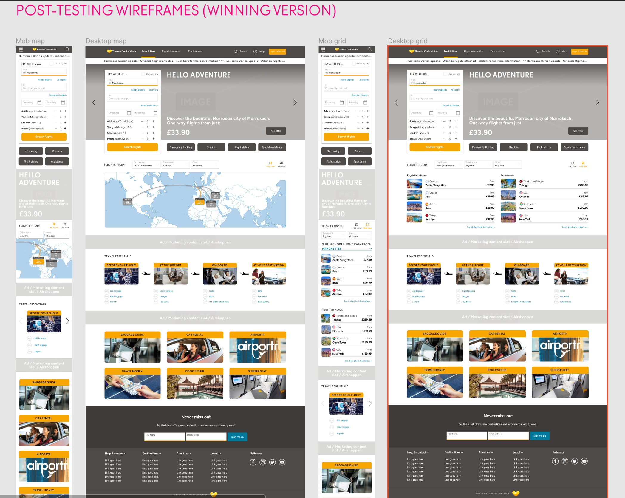
The Problem
Beyond a visual facelift, the Homepage was expected to drive conversions - not just for flights, but for key services. With little usable data to start with, I kicked off fresh research to understand what users needed, what was broken, and what could work better.
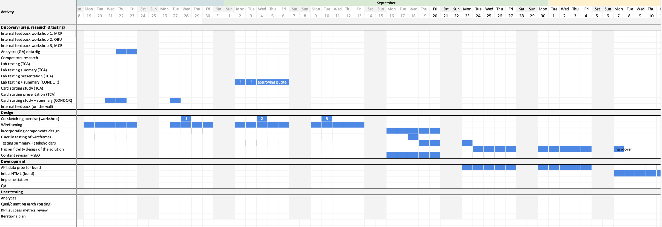
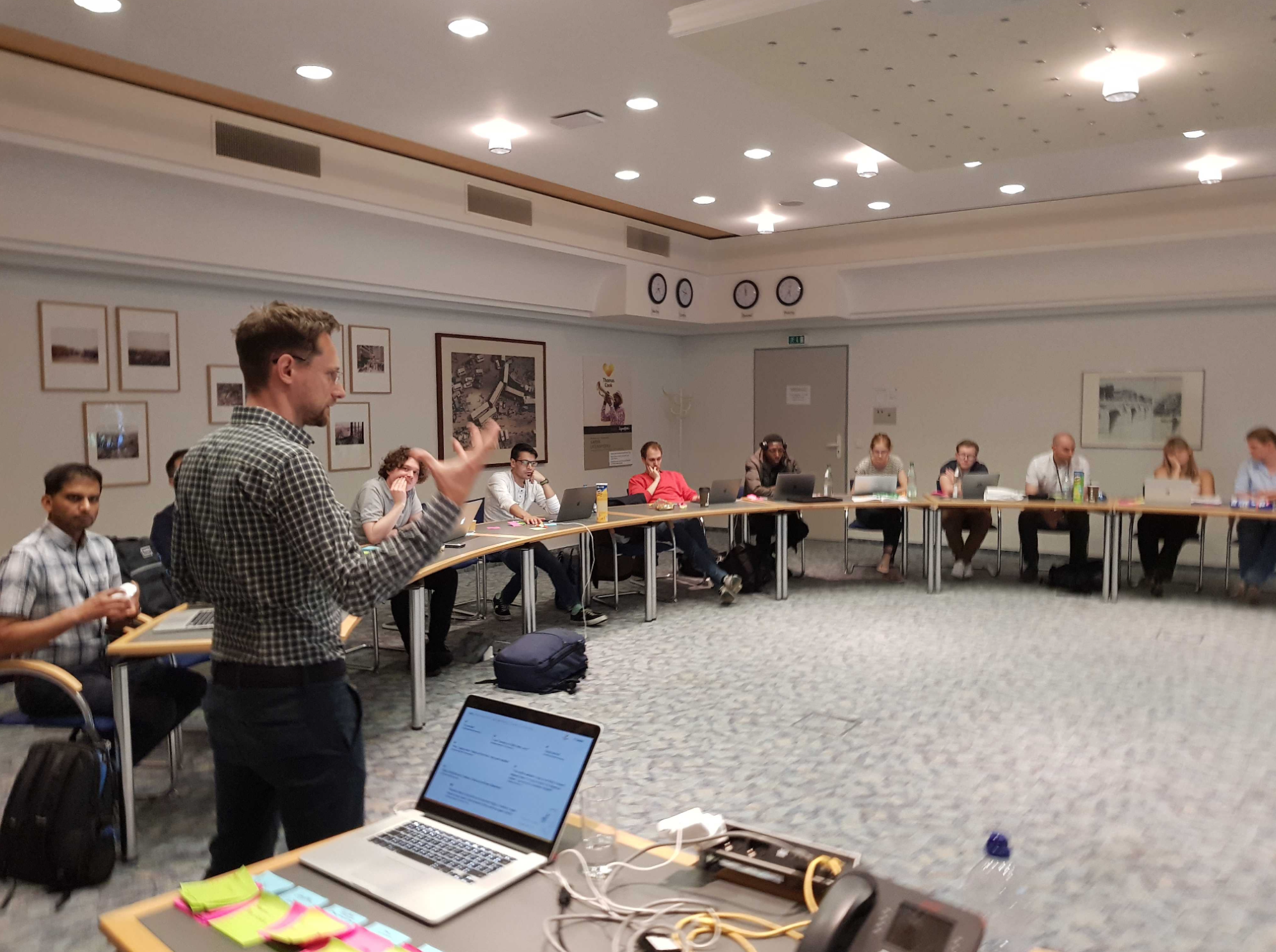
Discovery phase
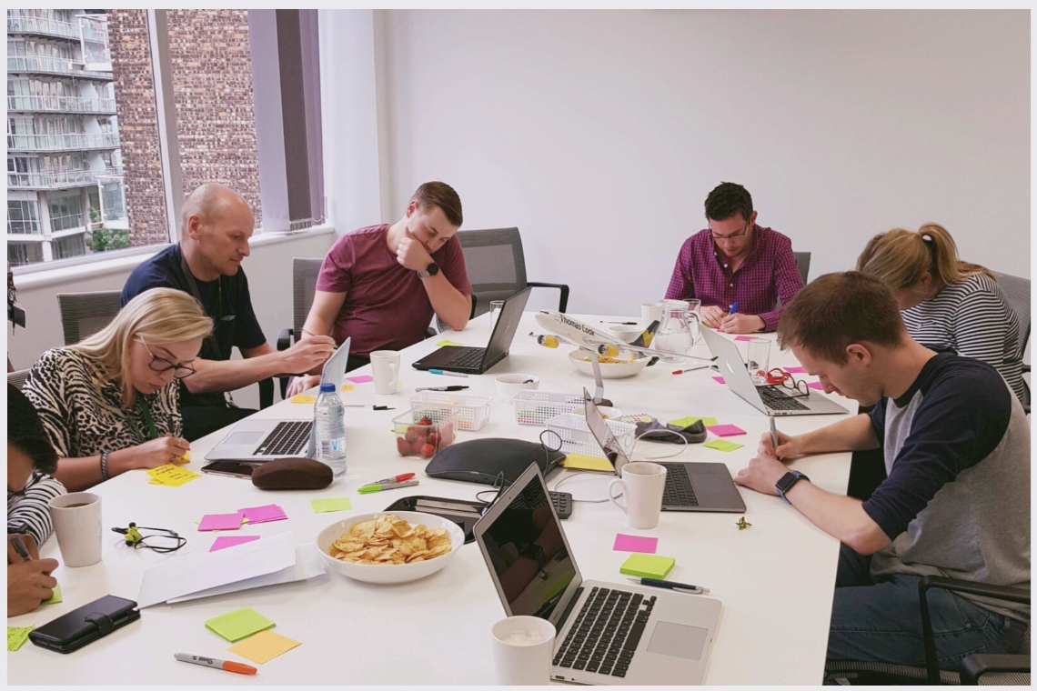
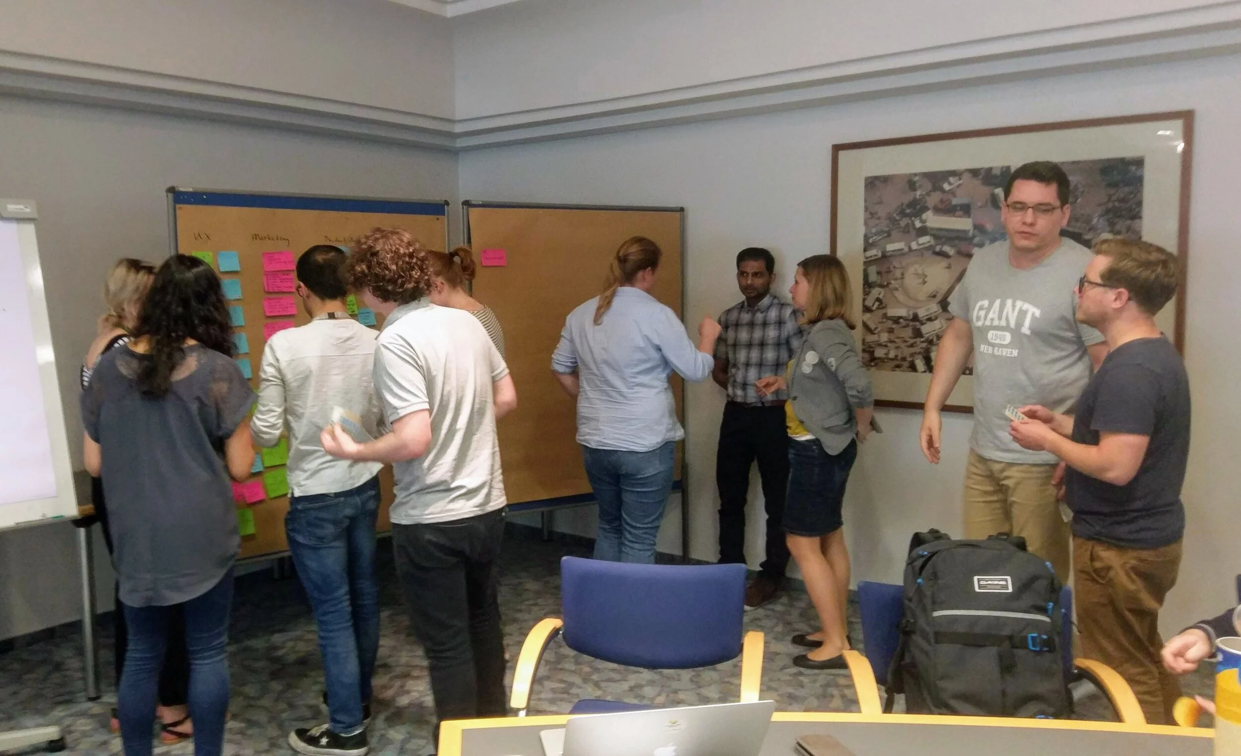
I led a mix of research methods (lab, guerrilla, remote testing) across the UK and Germany, surfacing key insights through collaborative workshops and peer feedback. Cross-team involvement was central - everyone from PMs to SEO contributed early and often.
Design phase
Wireframes were refined through iterative feedback and validated with users. One clear design direction emerged - promising improved conversion and user satisfaction - and gained consensus across teams. With back-end feasibility confirmed, I moved the project into build.
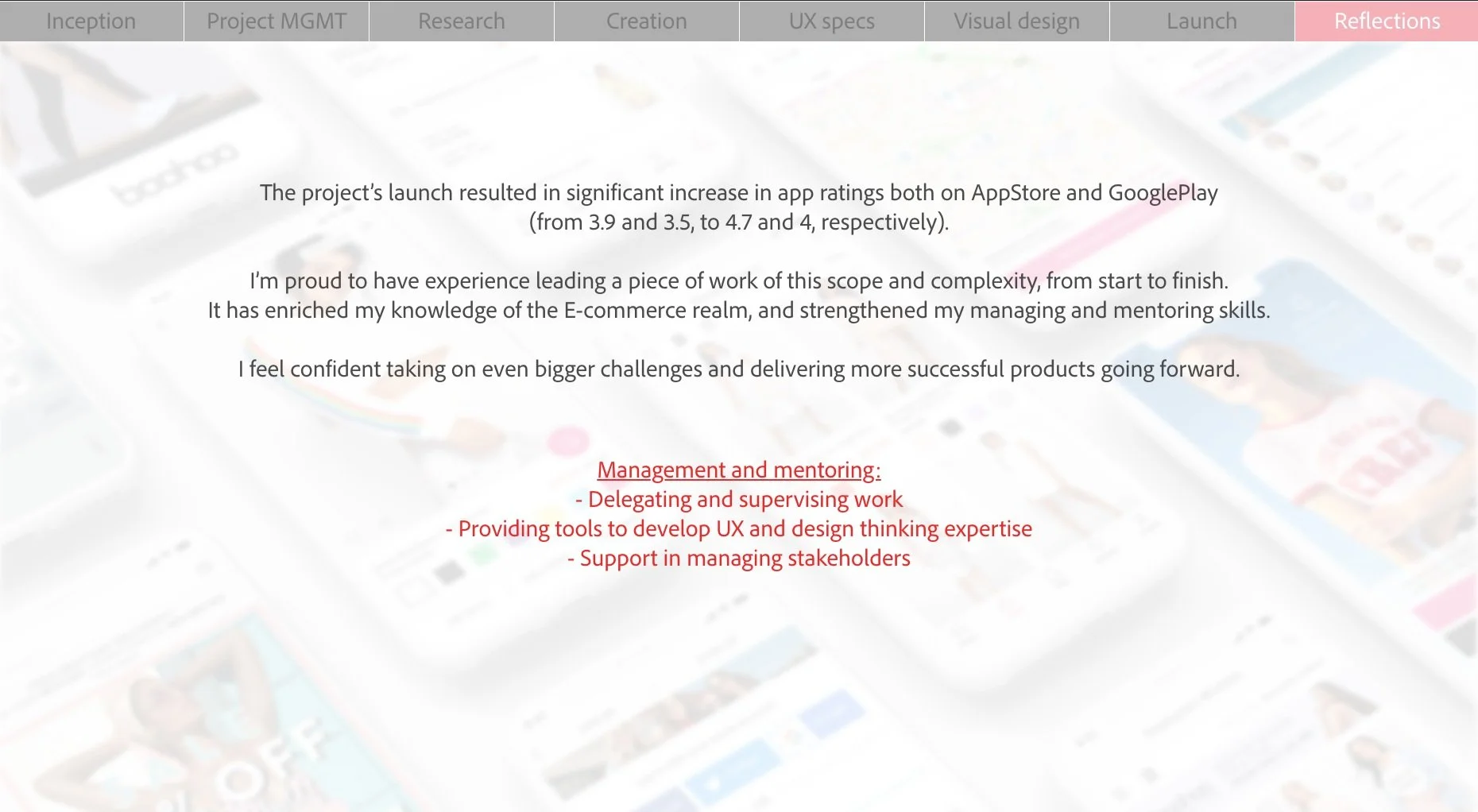
Reflections
Despite the abrupt end to the project, due to Thomas Cook ceasing operation, this was one of the most rewarding projects I’ve led. The collaborative energy, the adequate research deep-dive and the business buy-in - all ensured a powerful design integration into the delivery process.
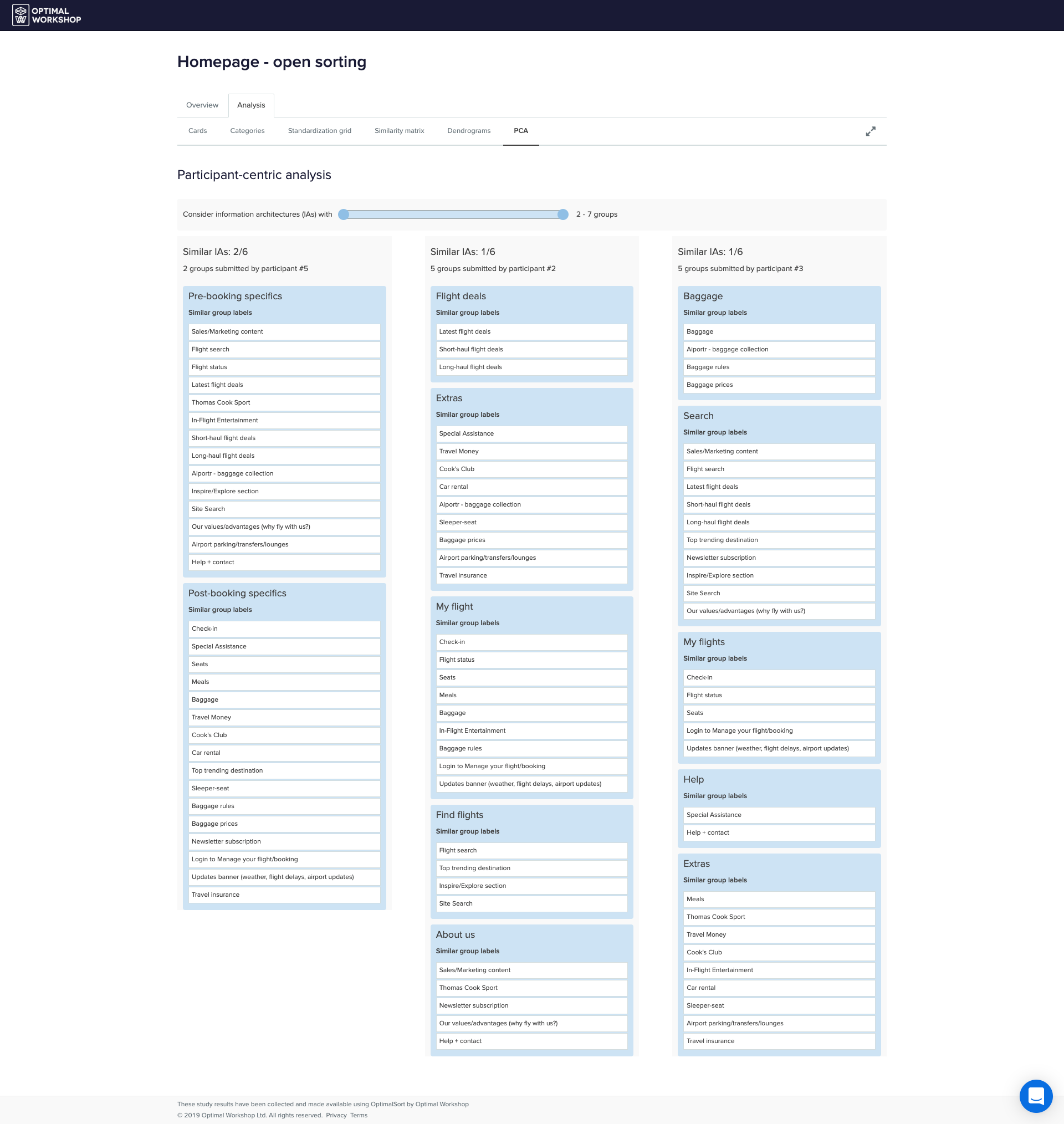
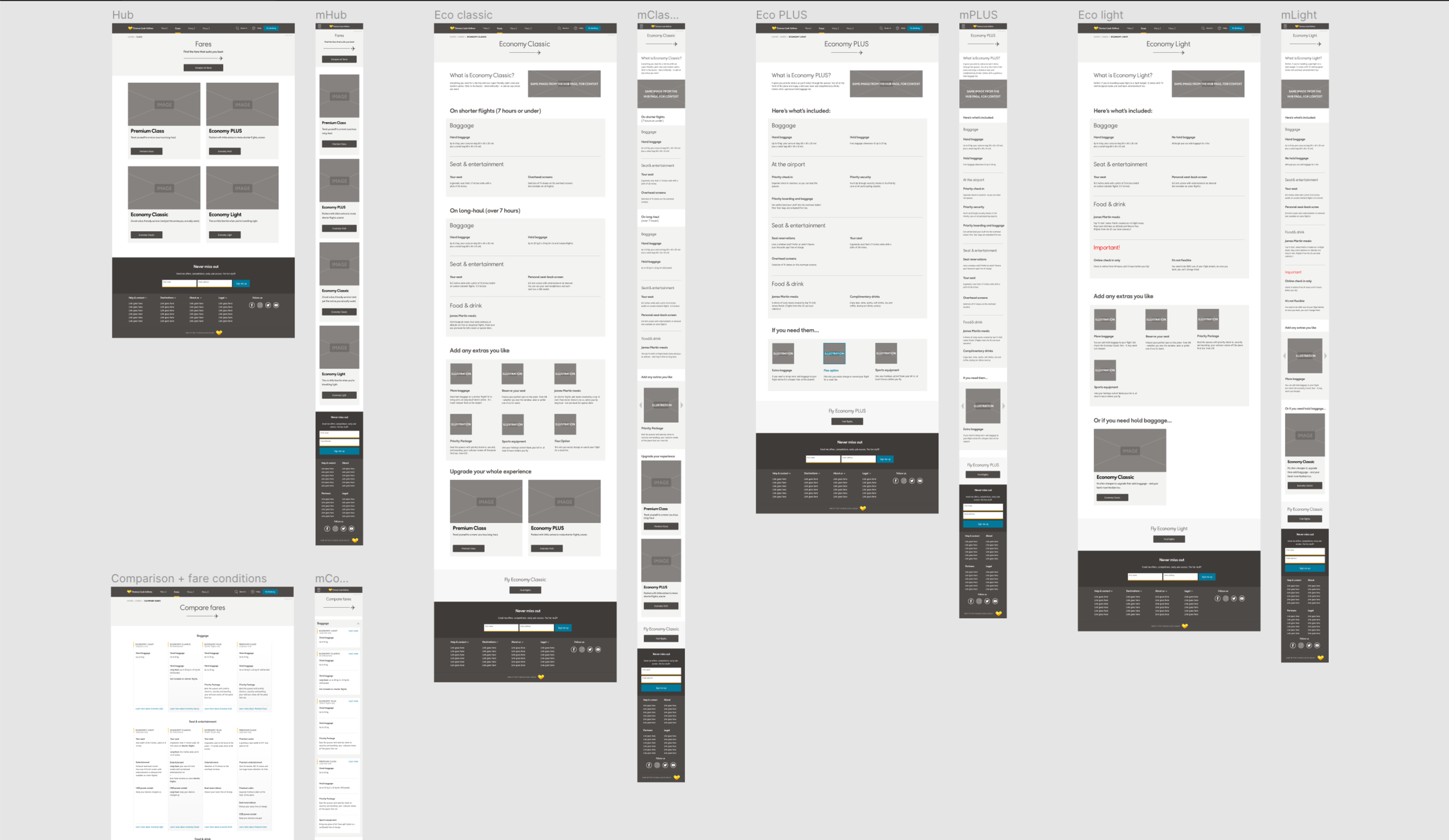
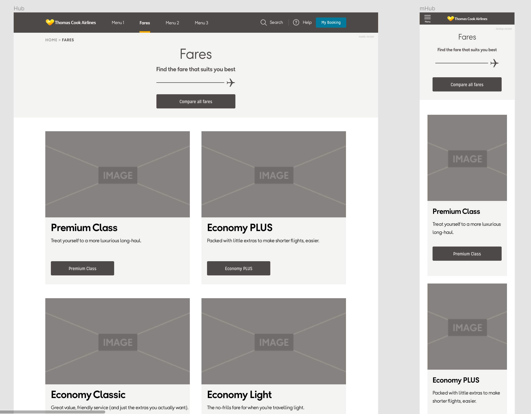
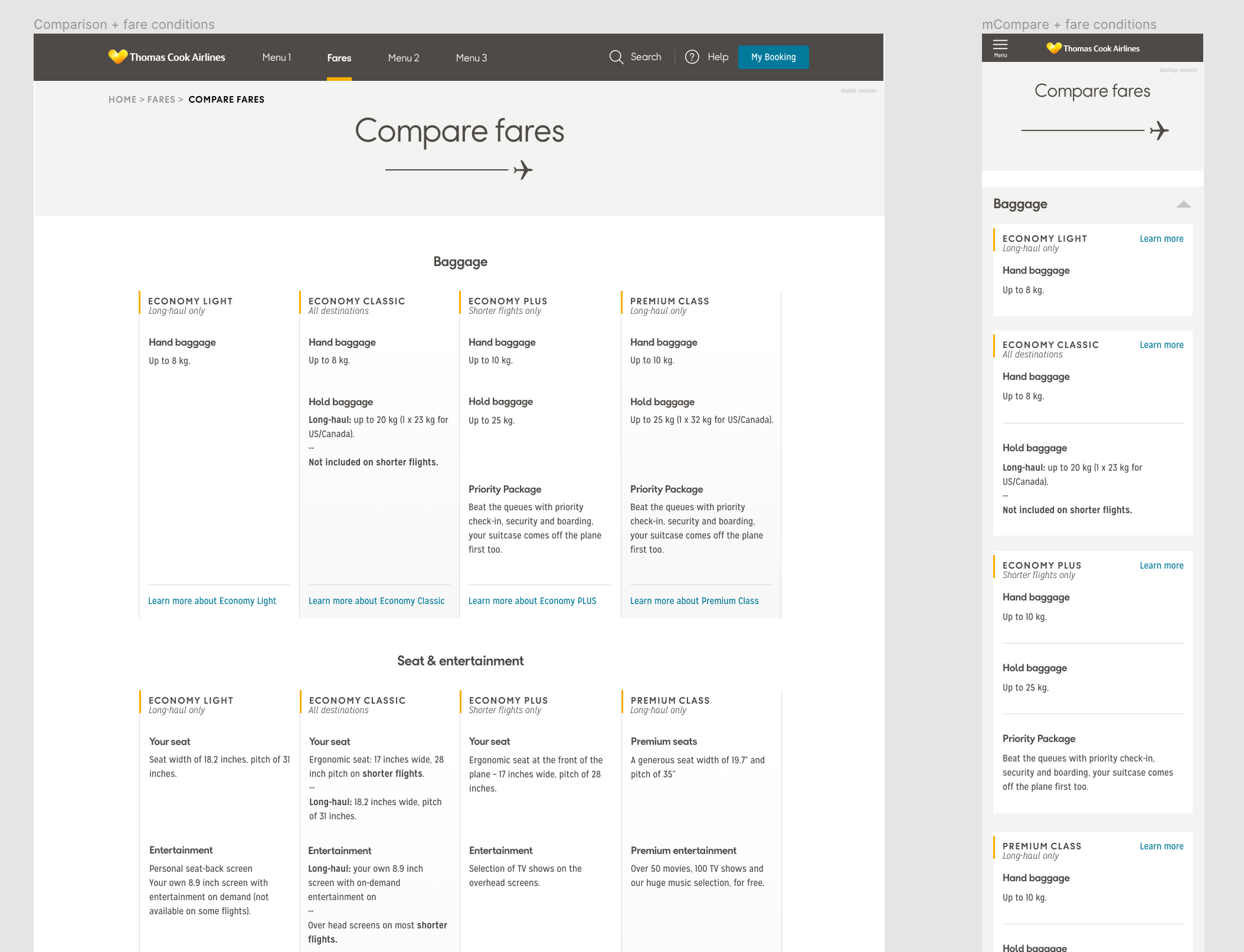
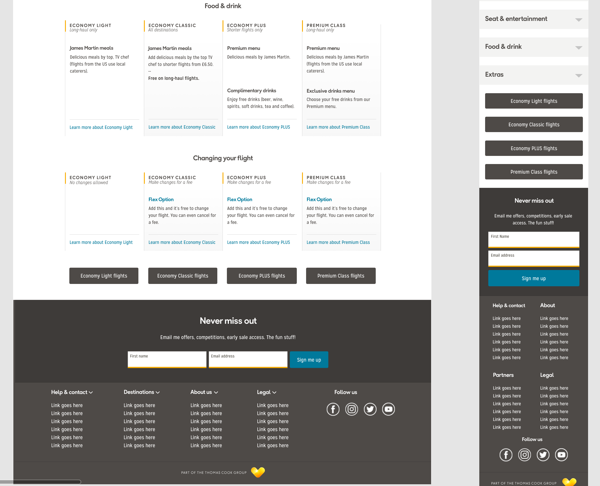
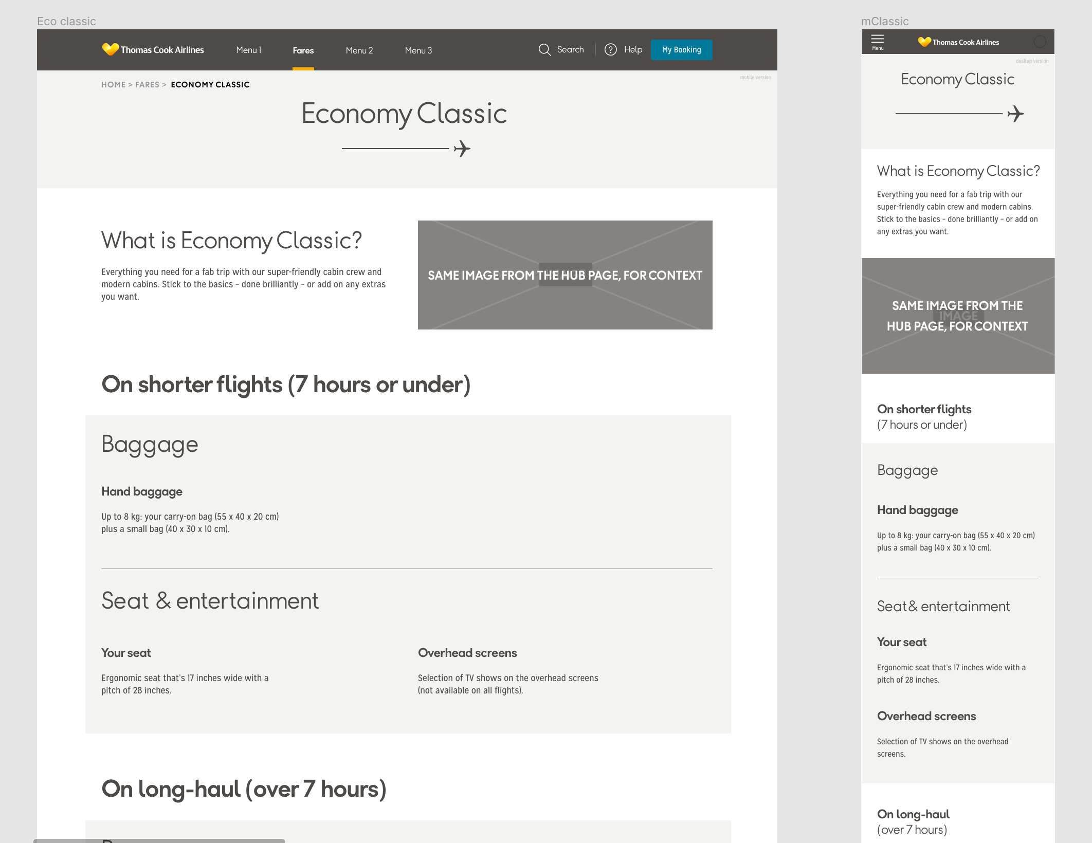
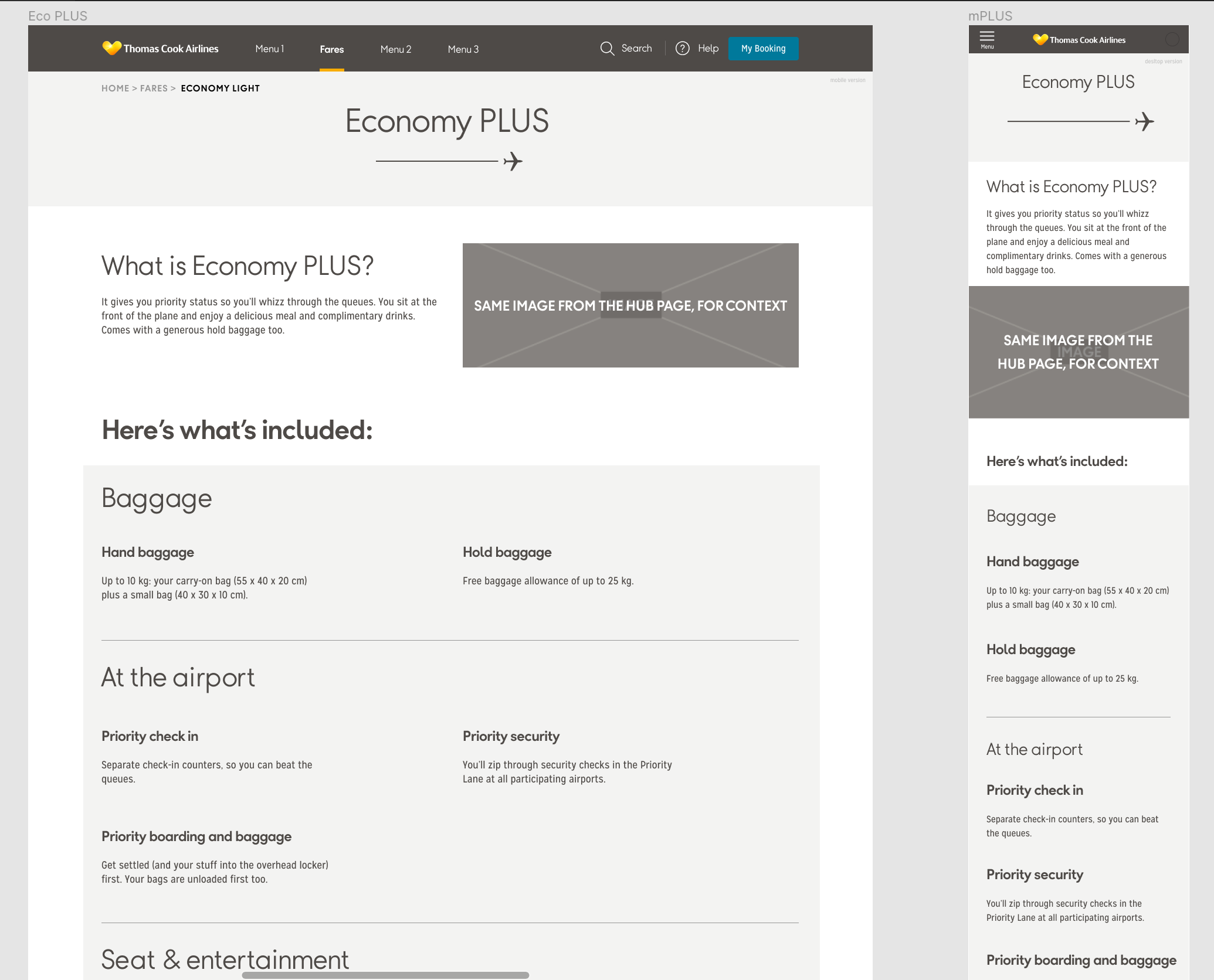
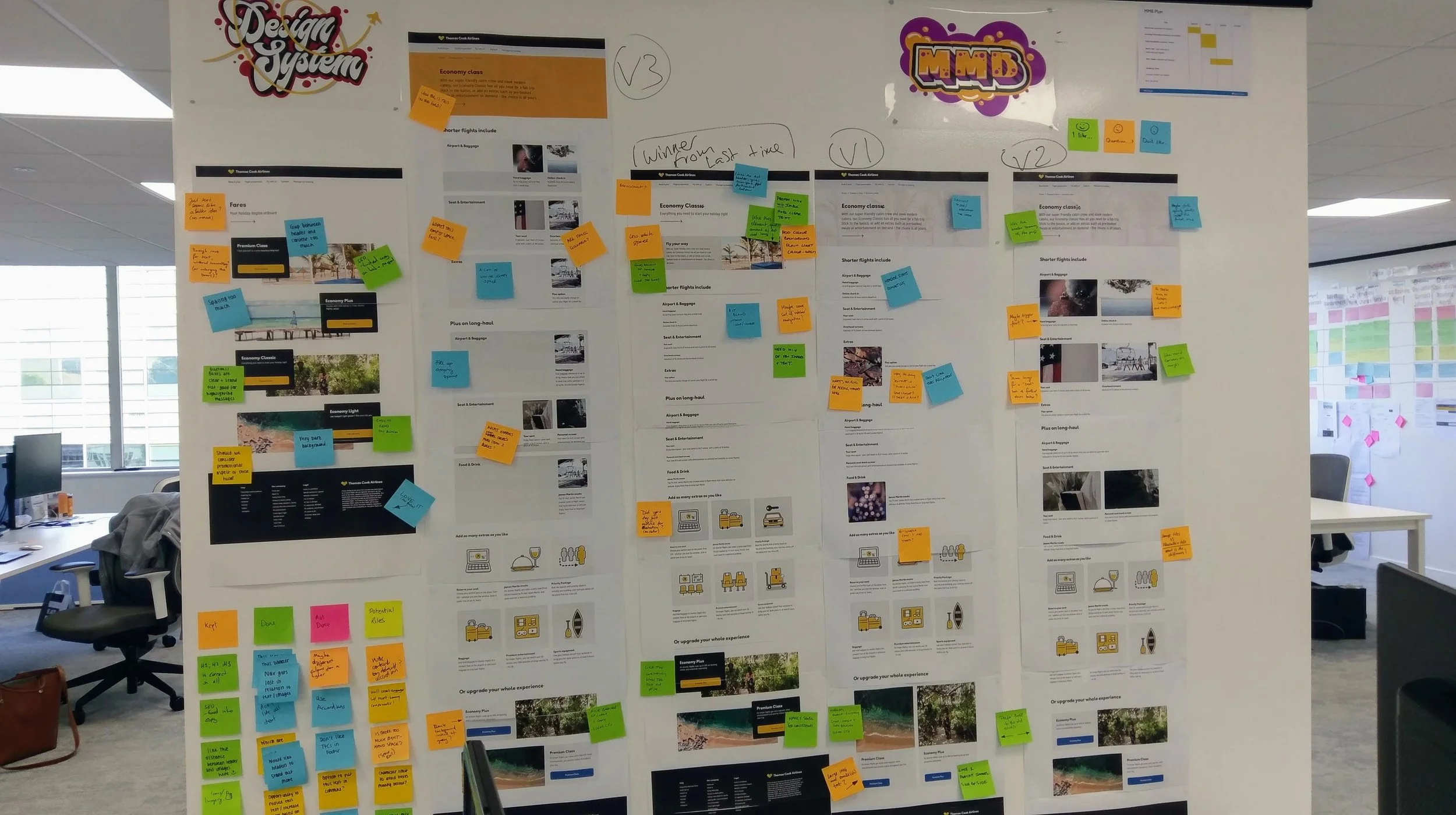
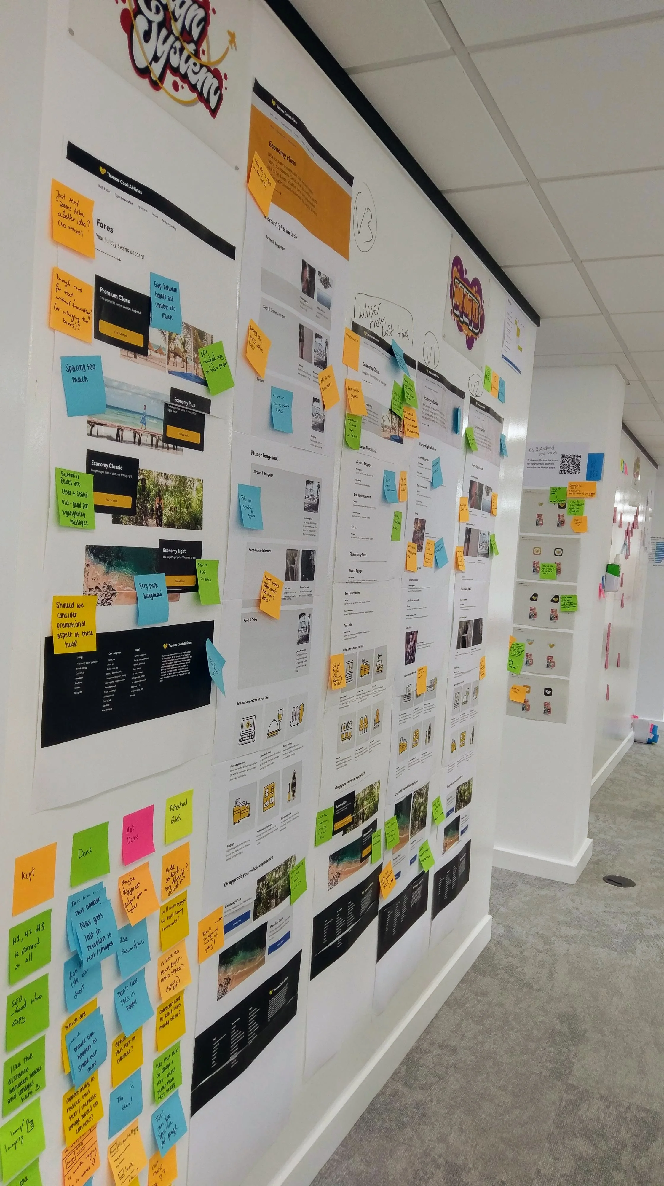
Project: Classes & Fares Experience Redesign + Design System Foundation
Role: Lead Product Designer
Impact: Unified page structure | Design system blueprint | 50+ participant research study
Skills: User Research (Card Sorting, Guerrilla Testing) | Content Strategy | Systems Thinking
—
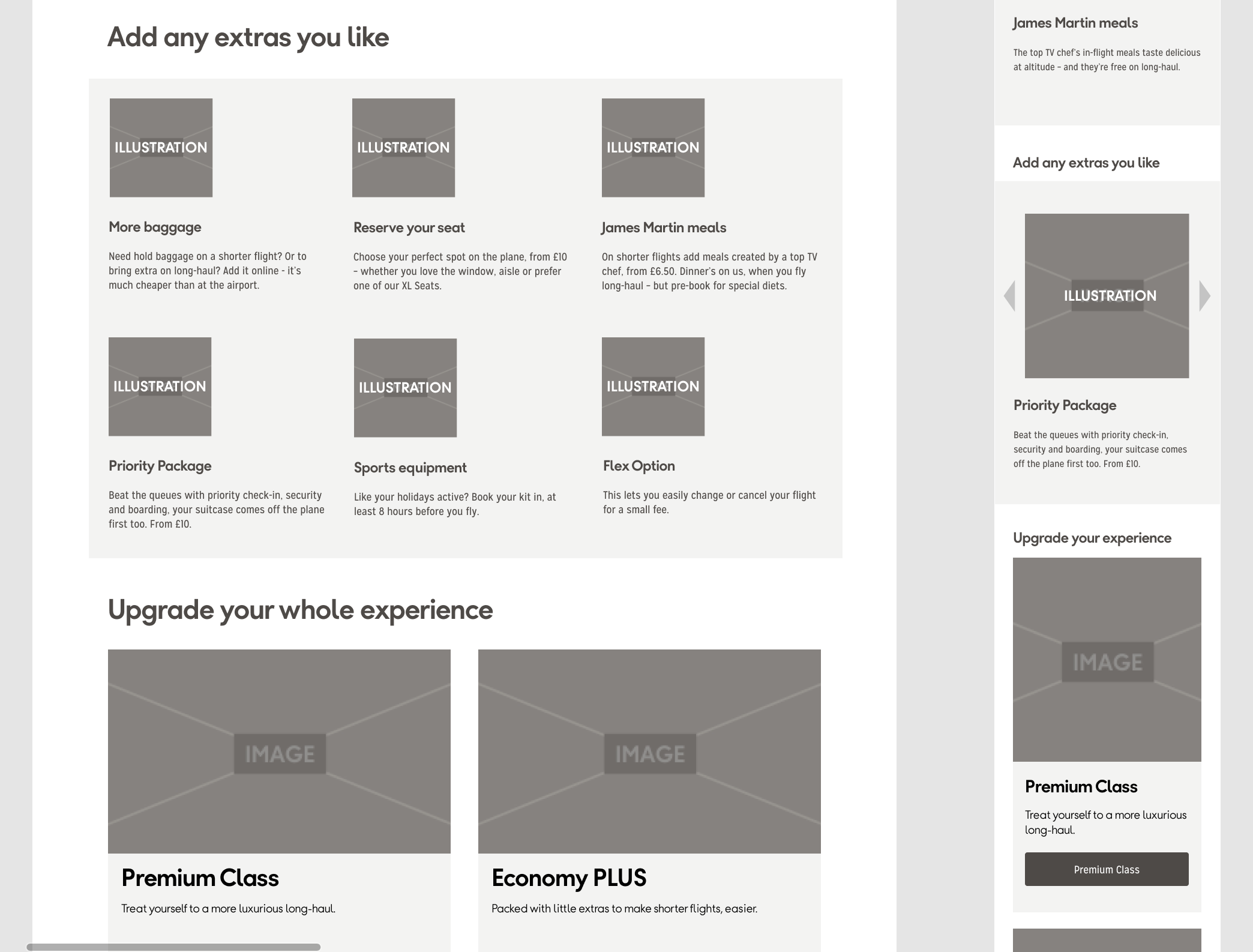
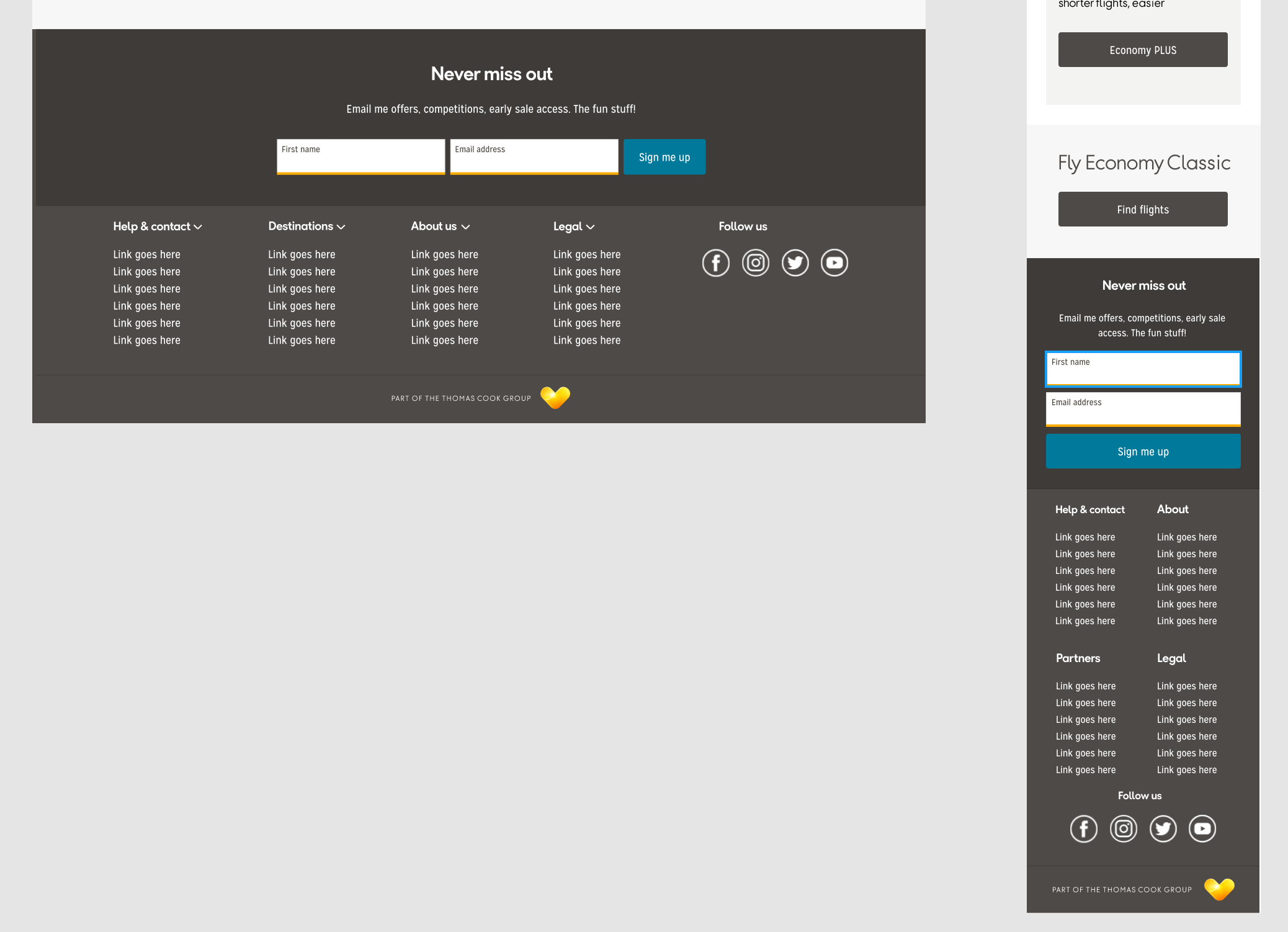
The redesigned Classes & Fares experience introduced clarity, consistency, and a user-focused structure across key pages - resulting in improved usability, easier customer decision-making, and a stronger foundation for future design and content strategy. It also set the groundwork for the site’s new design system and CMS component architecture.
🔹 Unified, user-focused classes experience
I’ve introduced a consistent structure across all key pages, making fare options and class differences far easier to understand.
📖 Simplified decision-making for customers
Clearer hierarchy, better terminology, and reorganised content helped users compare options without confusion.
🧠 Research-informed design decisions
I’ve led user testing and card sorting that resulted in a reshaped language and content placement, leading to clearer communication of value.
⚙️ Future-ready foundation for design system
The new structure became the reference model for future informational pages, the CMS component library and broader system rollout.
🤝 Stronger cross-team alignment
My design leadership not only solved UX issues but also married business goals with internal workflows, making content and development easier to scale.
—
Defining the Challenge
The existing pages were fragmented and inconsistent. A heuristic review surfaced key UX issues
- missing or partial navigation,
- inaccessible content (e.g. Flex Fare buried in the menu), and
- copy that was difficult to follow.
There was no clear brief, so I worked closely with the Product Owner to:
- define goals,
- prioritise content needs, and
- align on success criteria.
This also provided an opportunity to test early outputs from two parallel projects- the new design system and the new headless CMS (Kentico) rollout.
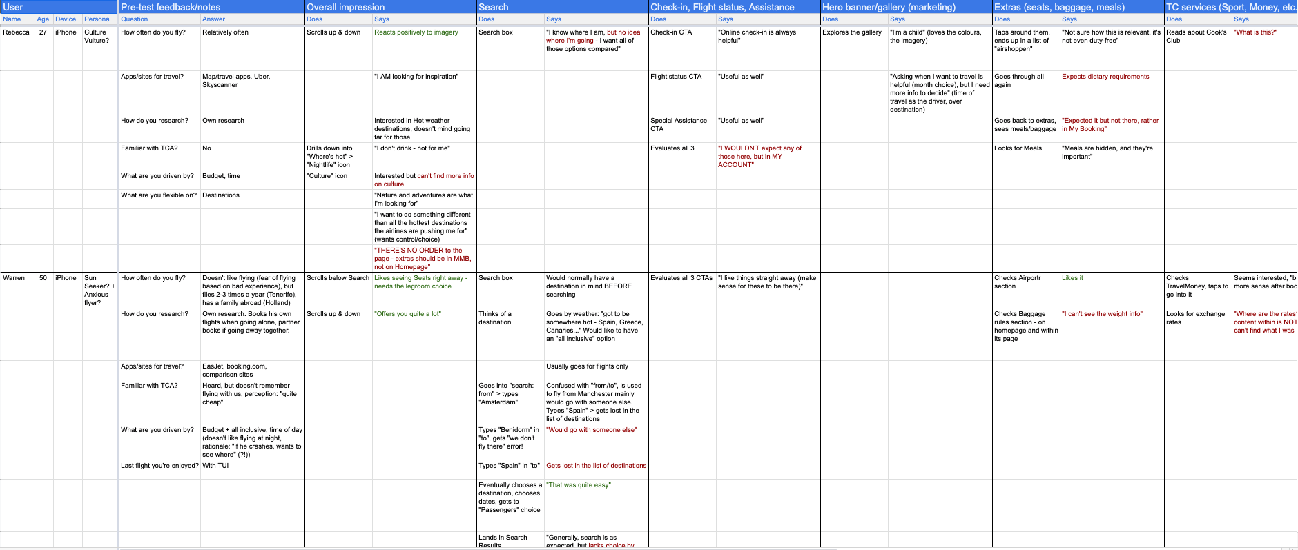
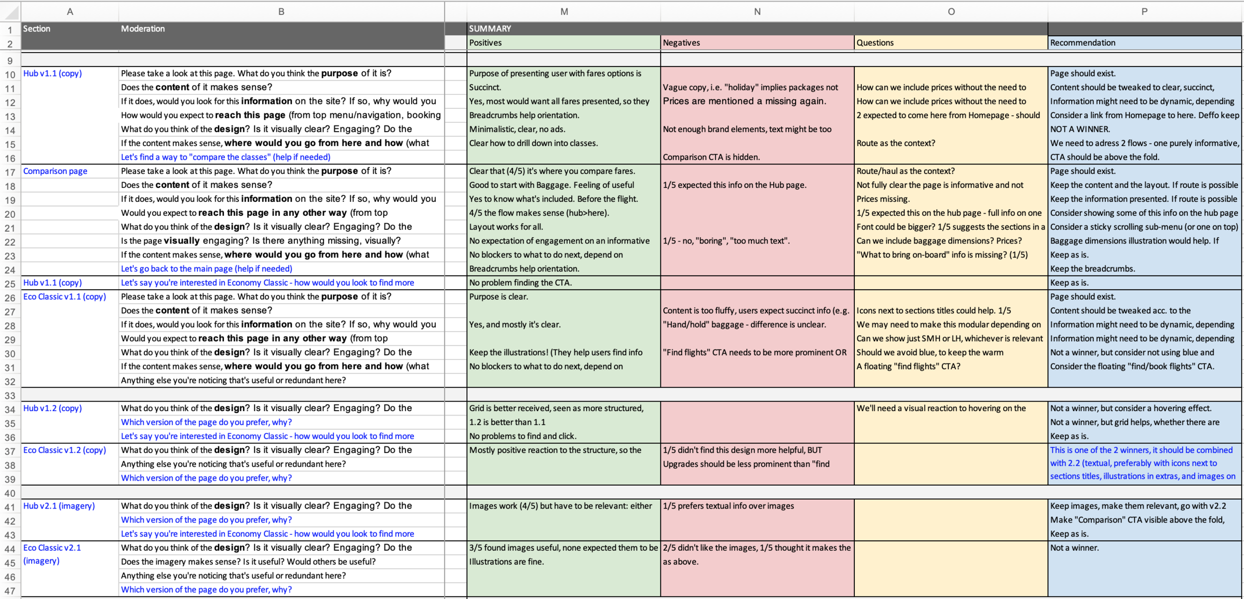
Discovery & Research
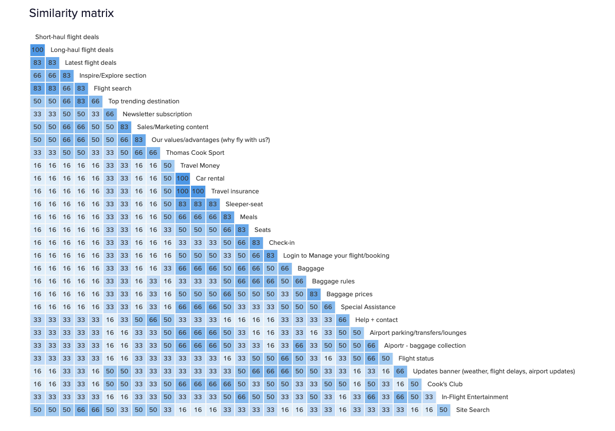
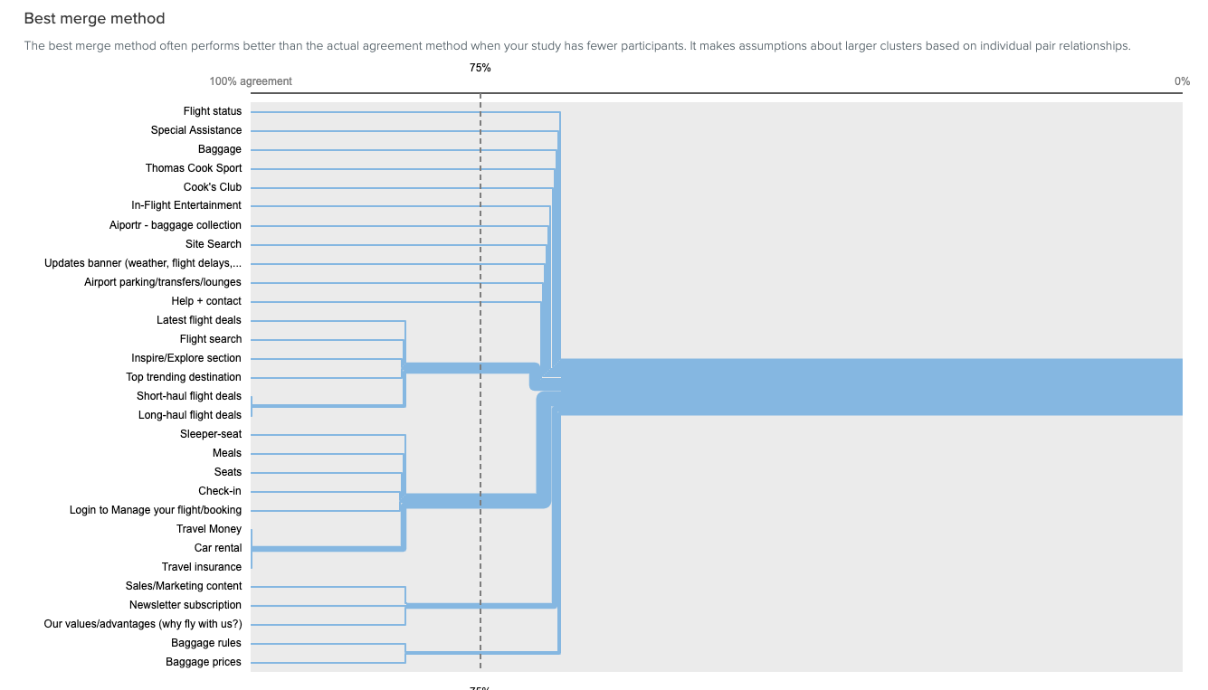
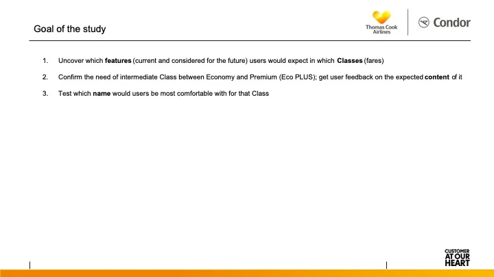
My research approach focused on three tracks:
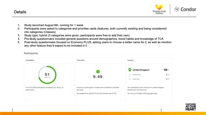
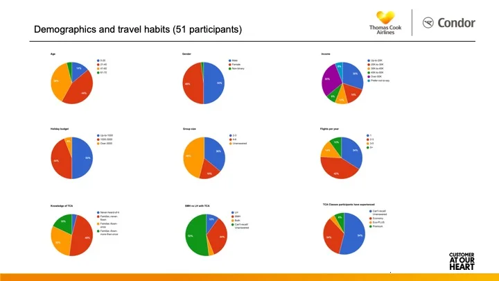
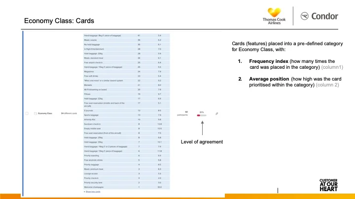
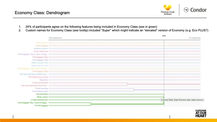
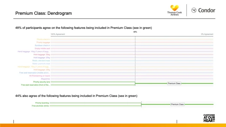
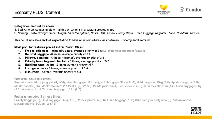
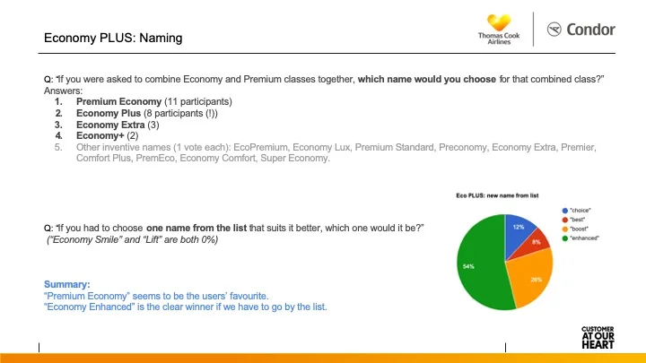
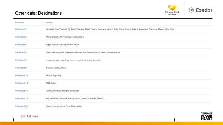
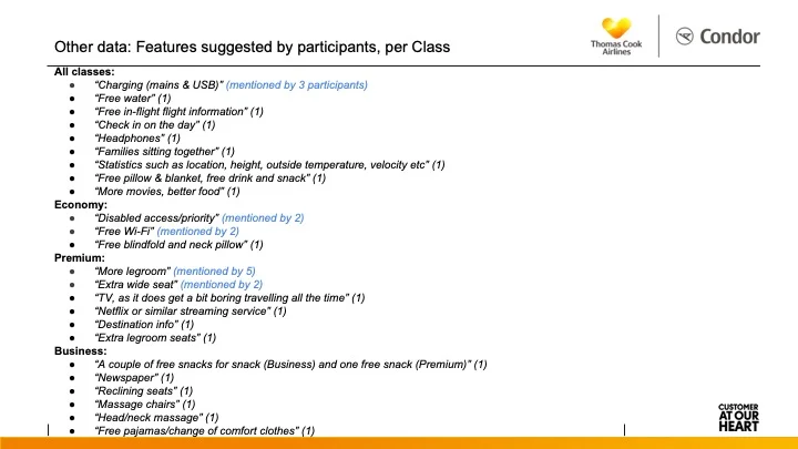
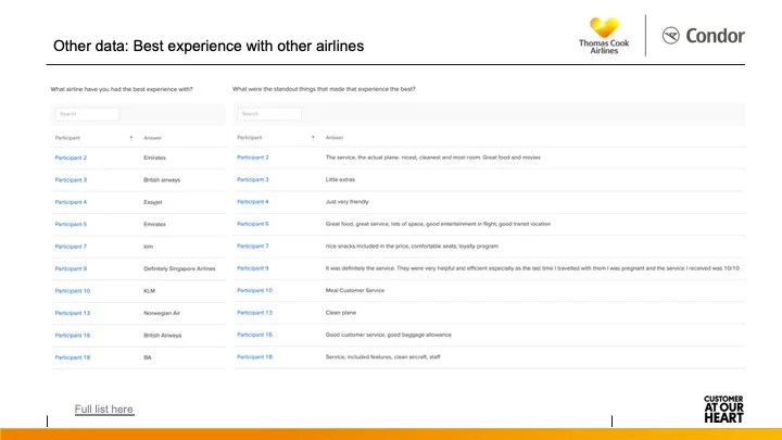
1. User Research: to validate the business’s uncertainty around the Eco PLUS offering, by running a remote card-sorting exercise with 50+ participants.
2. Internal Feedback: to gather input from Product, Marketing, Development, and Management, feeding this into early-stage wireframes.
3. Testing & Language: through guerrilla testing sessions, I explored content preferences and clarity - uncovering how real people talked about features.
This led to:
- meaningful shifts in terminology (e.g. replacing “short-haul” with “7 hours or under”), and
- better visual structure for key information like baggage dimensions.
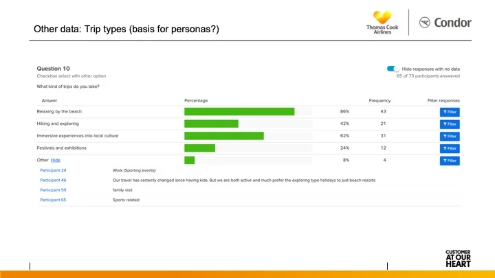
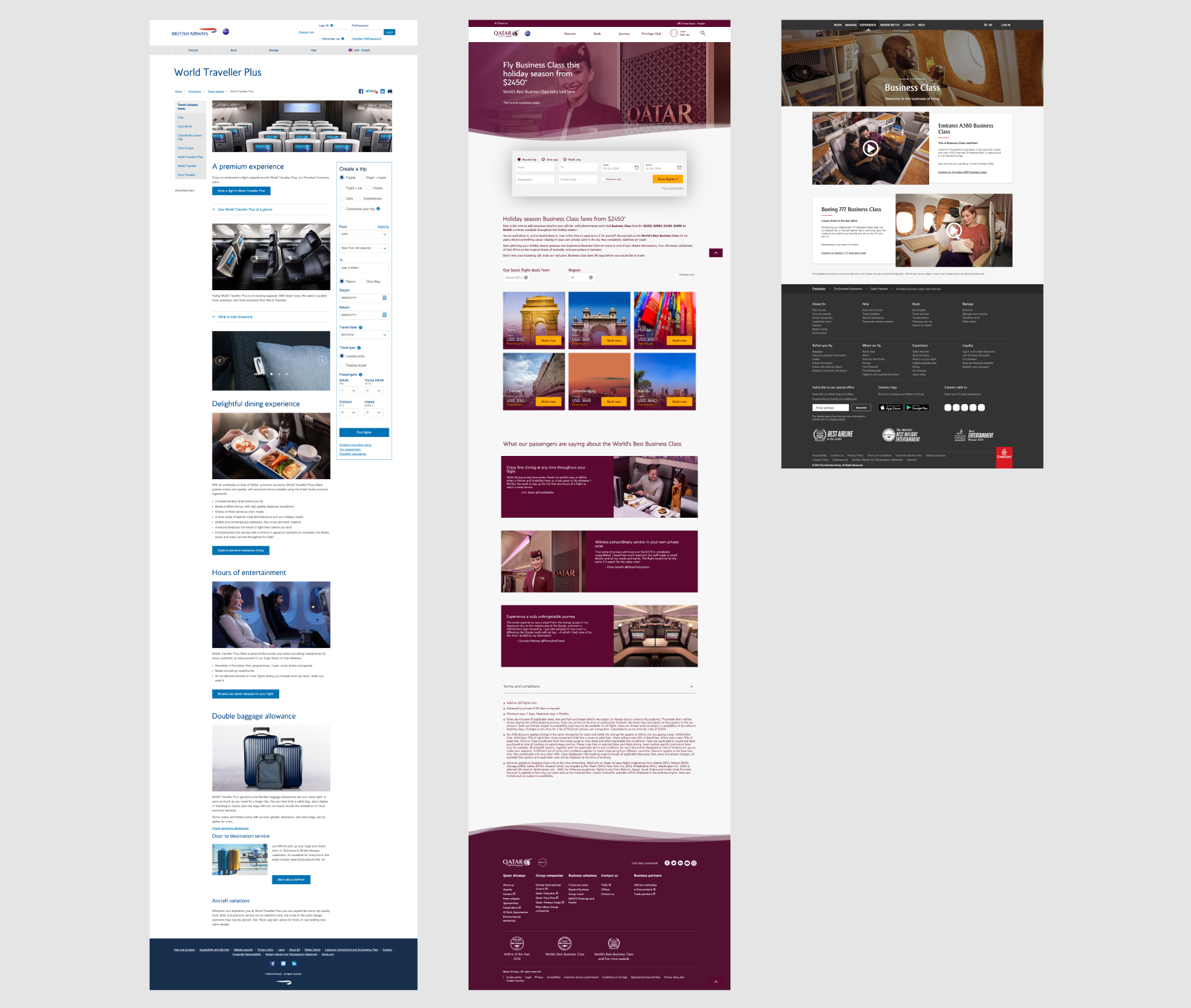
In parallel, I collected insights to support persona development and competitor analysis, helping reframe both content and positioning.
Design & Iteration
The design phase focused on consistency and clarity, both visually and structurally. Wireframes were shared early and iterated publicly, gathering input across departments. Each step fed into the evolving UI in collaboration with a visual designer.
The final design introduced a unified structure across all class pages, ensured accessibility to key content, and simplified comparisons. It was also agreed internally that this structure would become the reference model for all future informational pages, the new component library, and the broader design system.
I tested three design directions (for mobile and desktop), with a clear user and stakeholder favourite emerging as the final concept.
Delivery & Business Alignment
As we moved toward handover, I ensured all designs were compatible with the new CMS component structure, and documented specifications for smooth development.
A key success of this project was aligning business needs with user needs - creating a scalable solution that was not only more intuitive for customers, but more manageable and modular for the internal teams.
PennyWise is a concept finance app, built using the latest AI tools. It’s designed to help everyday users understand and control their spending by translating raw transaction data into clear categories, trends, and actionable insights.
—
💡 Designed to make finances feel human
I reimagined budget tracking so it feels friendly not fear‑inducing, prioritising insights and encouragement over rigid, judgmental UI.
📊 Supportive spending insights first
By placing clear spending visuals and gentle “nudges” up front, I focused the experience on motivation and progress instead of stress.
🧠 Research‑informed journeys
Interviews and persona work would shape flows that meet real users where they are - from overwhelmed spenders to goal‑oriented planners.
🎨 Warm, approachable design language
I chose an inviting colour palette, human micro‑copy, and reassuring visual cues to make financial self‑care feel welcoming.
🚀 Prototype built for action
The MVP concept combines spending tracking, collaborative budgeting, and goal setting in a way that feels intuitive and genuinely helpful - a foundation that could translate into meaningful engagement if taken further.
—
Problem
Many people struggle with financial awareness and budgeting, often finding traditional budgeting tools either too rigid, overwhelming, or judgmental, leading to abandoned financial goals and continued poor spending habits.
Research & Discovery
User interviews with individuals across different income levels to understand pain points with existing budgeting tools would be conducted, to validate if users want personalised guidance without feeling criticised about their spending choices.
User Personas & Journey Mapping
Personas work would be facilitated to distinguish between the user types, e.g. "Overwhelmed Spender," "Inconsistent Saver," and "Goal-Oriented Planner" etc., each requiring different levels of financial guidance and motivational approaches. Journey maps would be used reveal key moments where users typically abandon budgeting efforts, informing intervention strategies.
Information Architecture
The app structure would prioritise spending insights as the entry point, followed by collaborative budget creation, then goal-setting features. This flow would be designed to build user confidence before introducing more challenging financial planning concepts.
Wireframing & Prototyping
Low-fidelity wireframes would focus on presenting spending data through friendly visualisations rather than stark numbers, while prototypes would test various "nudge" mechanisms to encourage positive financial behaviours without creating anxiety.
Visual Design
The design system would employ warm, approachable colours and encouraging, human and light micro-copy to create a supportive atmosphere, deliberately avoiding the cold, corporate aesthetic typical of financial apps.
User Testing
Usability testing would be facilitated to reveal if the encouraging tone and gentle reminders successfully motivate users to engage with their finances regularly.
Development & Launch
The MVP would be launched with core spending tracking, simple budgeting tools, and basic goal-setting features, monitoring adoption in number of downloads in the first month and maintaining a high app rating based on its non-judgmental approach to financial guidance.
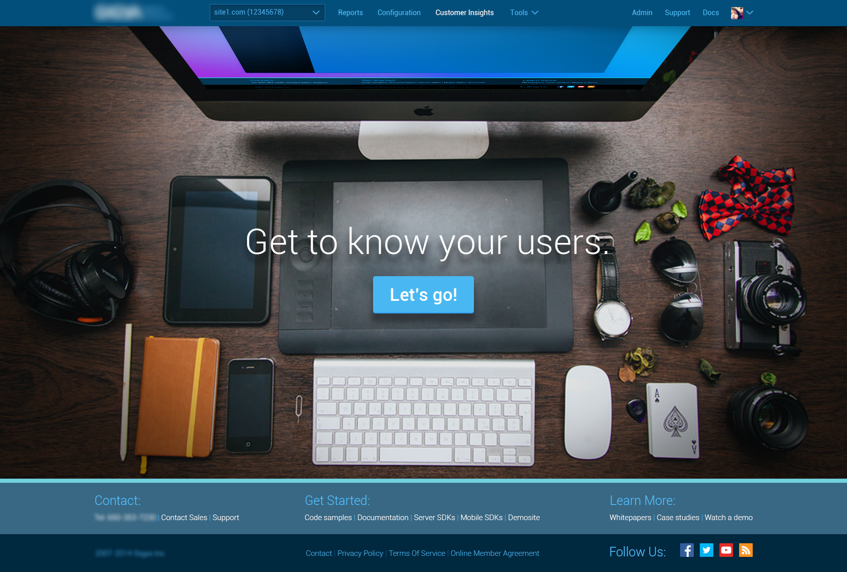
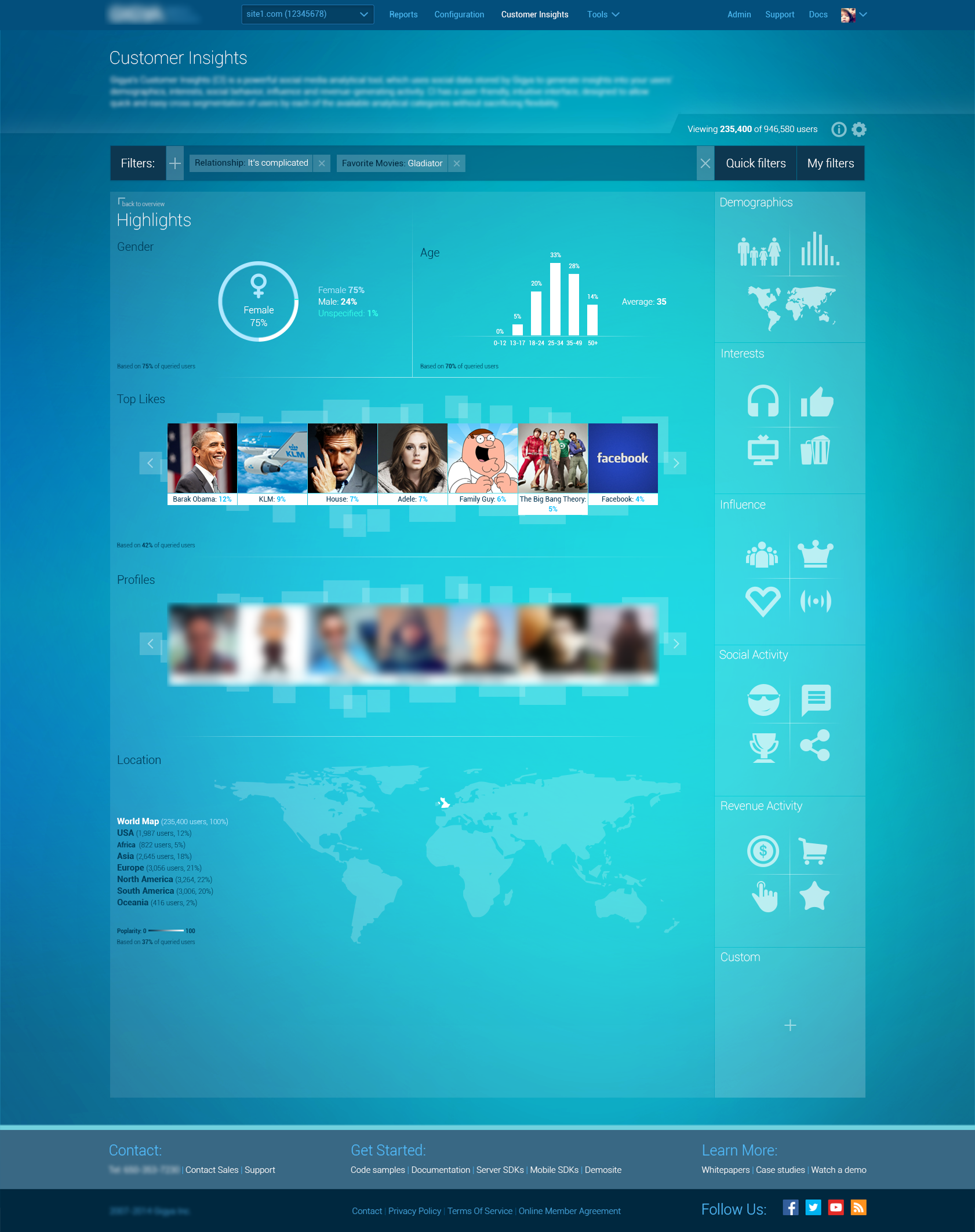
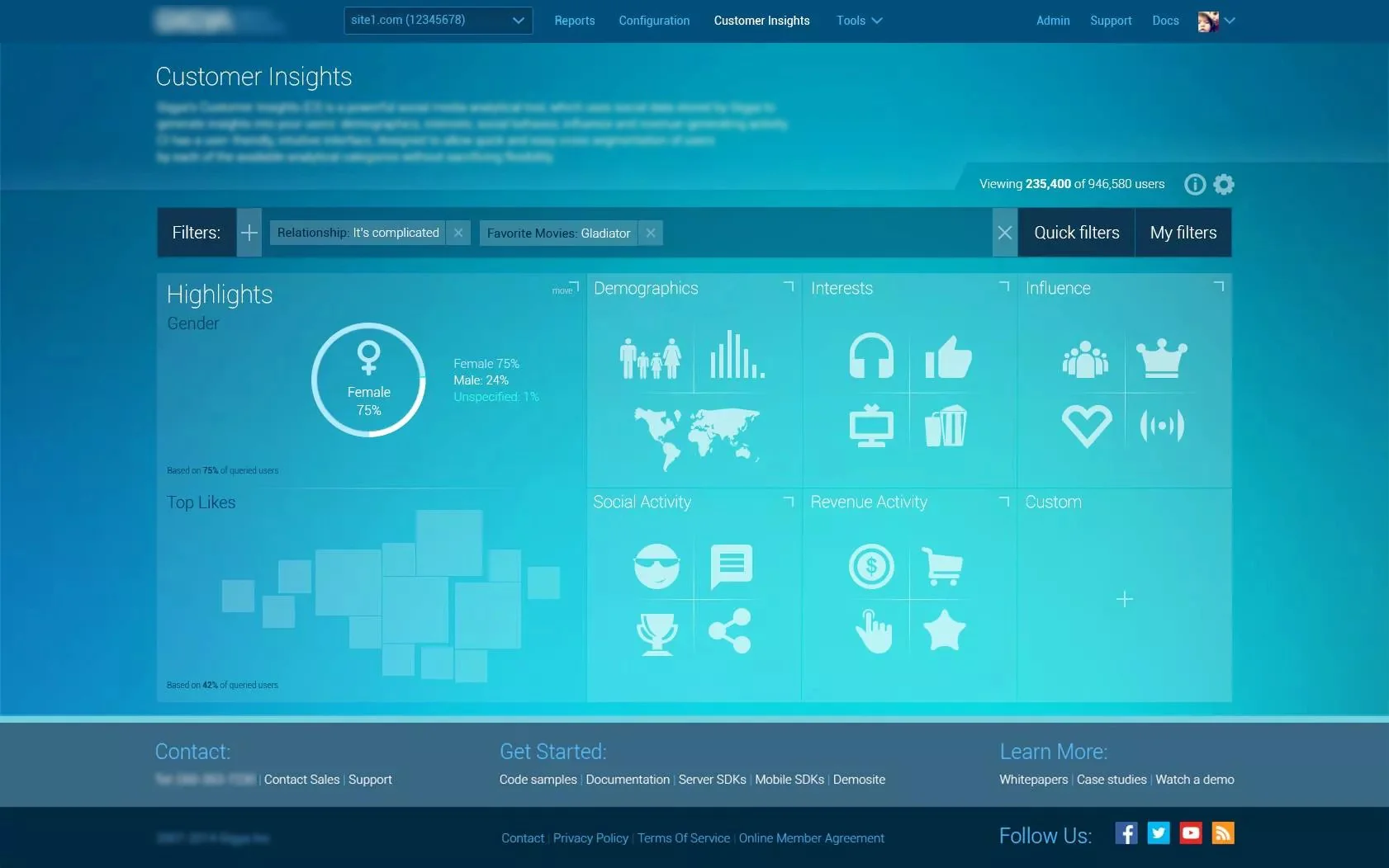
Project: Dashboard & Reporting Console | Identity Management and Reporting B2B Platform
Role: Lead Product Designer
Impact: Increased adoption | Reduced support requests | Defined a scalable component library
Skills: B2B UX | Data Visualisation | Component Design Systems | Stakeholder Management
—
📊 Clear, decision‑ready dashboards
I delivered a modular B2B interface that gave executives and managers fast, intuitive visibility into key metrics - no more fragmented, hard‑to‑navigate reports.
🧭 Intuitive navigation & hierarchy
By refocusing workflows and info architecture, I made it far easier for users to move between data views and reporting modules without confusion.
⚡ Faster access to insights
The design cut through complexity so teams could interpret data quicker and act on insights with confidence - fewer support tickets, more independent use.
🔁 Scalable system & reusable components
I built a responsive, consistent component library and detailed specs that helped development move smoothly and left room for growing the system over time.
🤝 Better adoption across teams
The end result wasn’t just cleaner screens - it strengthened how people across the organisation use data, improved operational visibility, and supported smarter decisions.
—
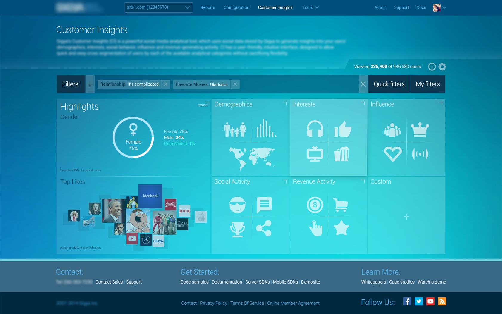
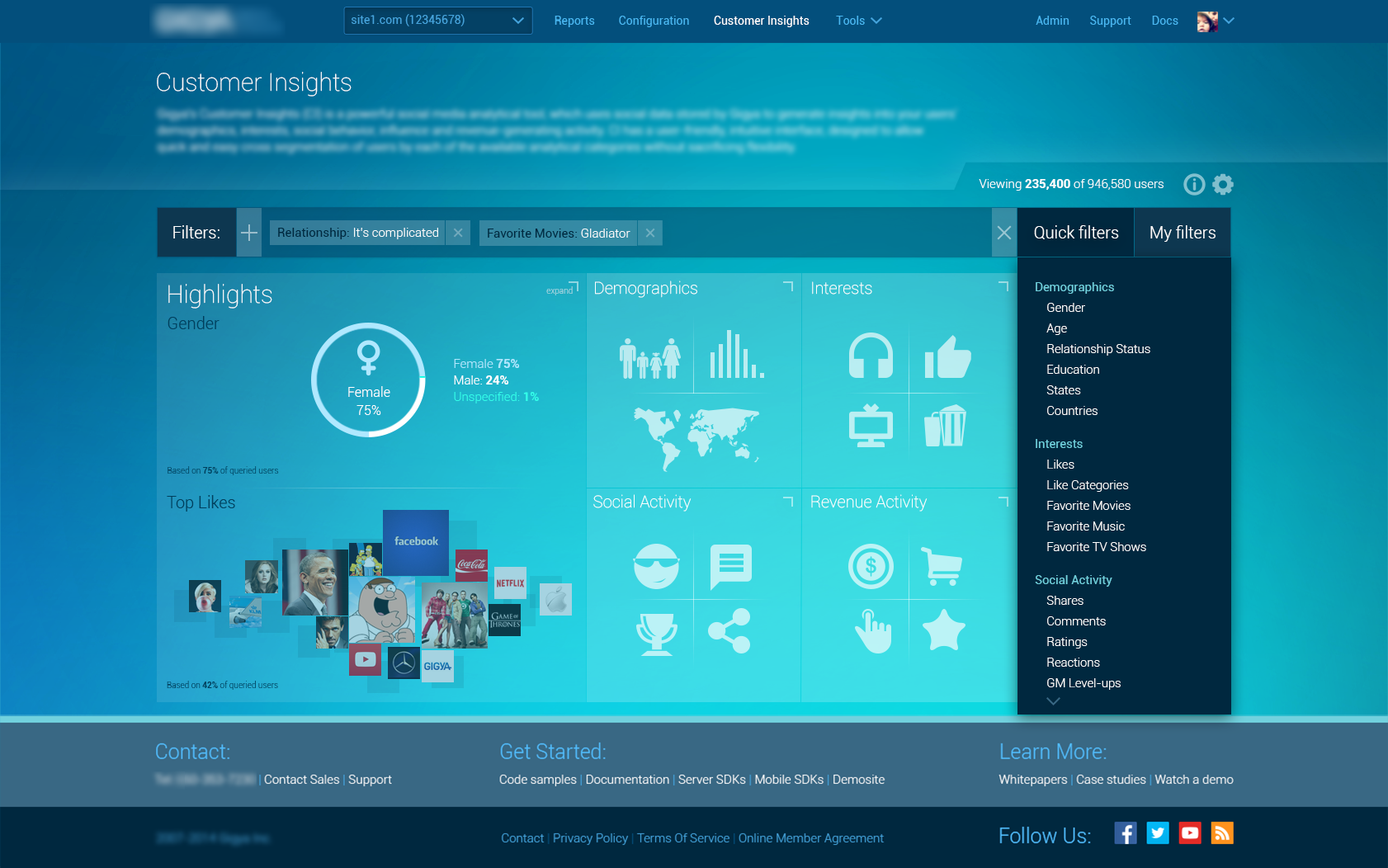
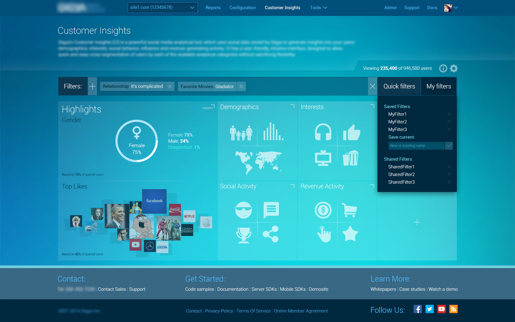
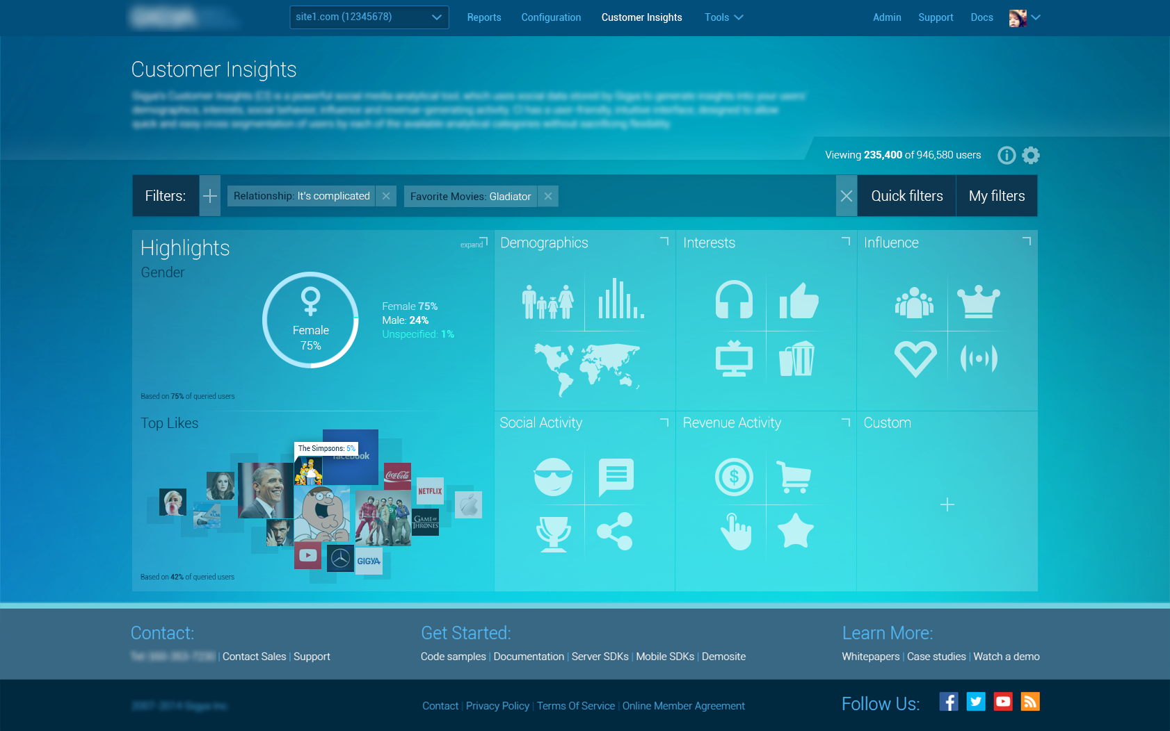
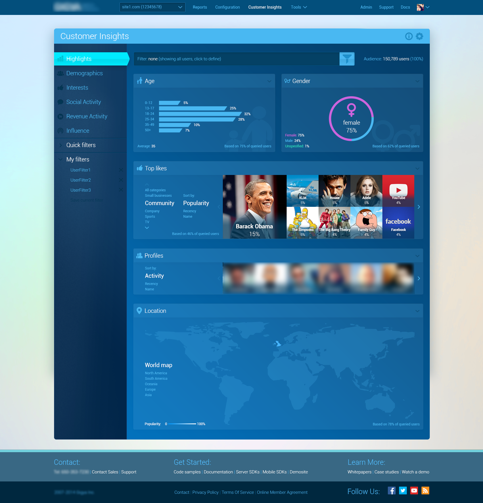
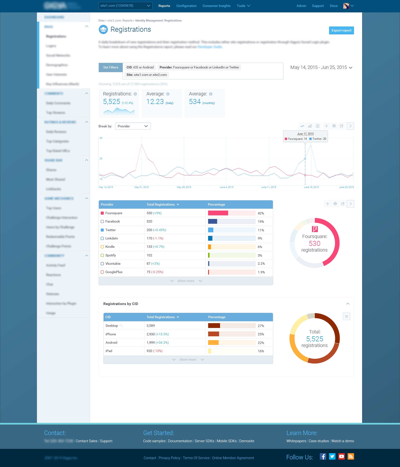
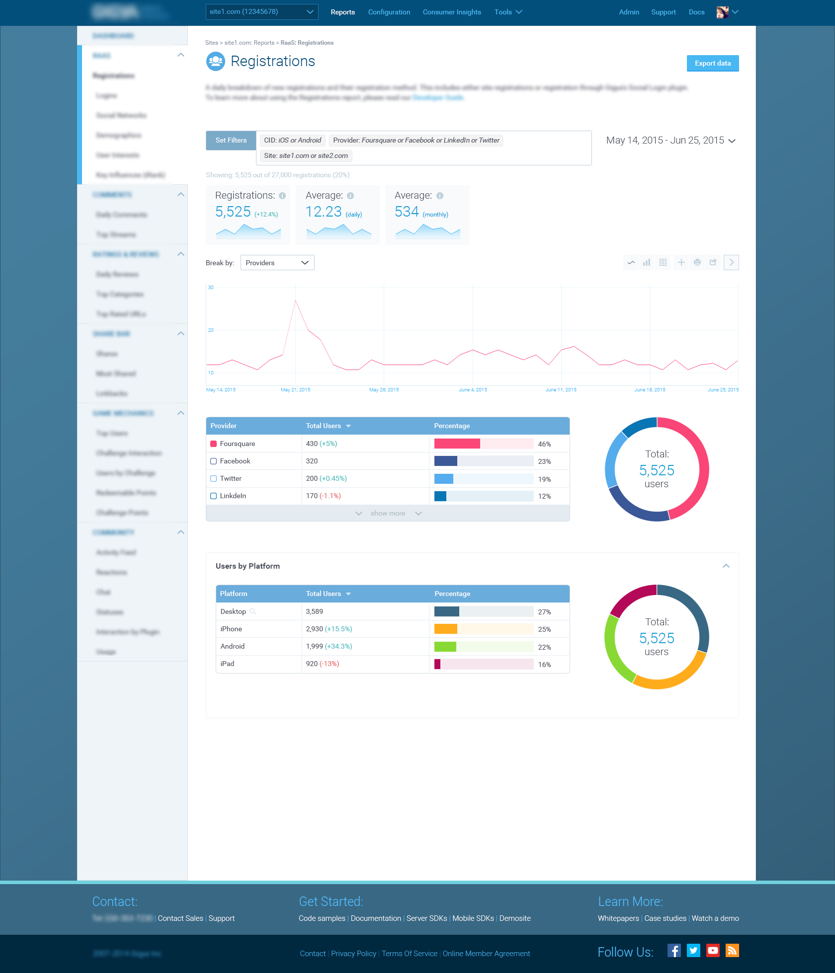
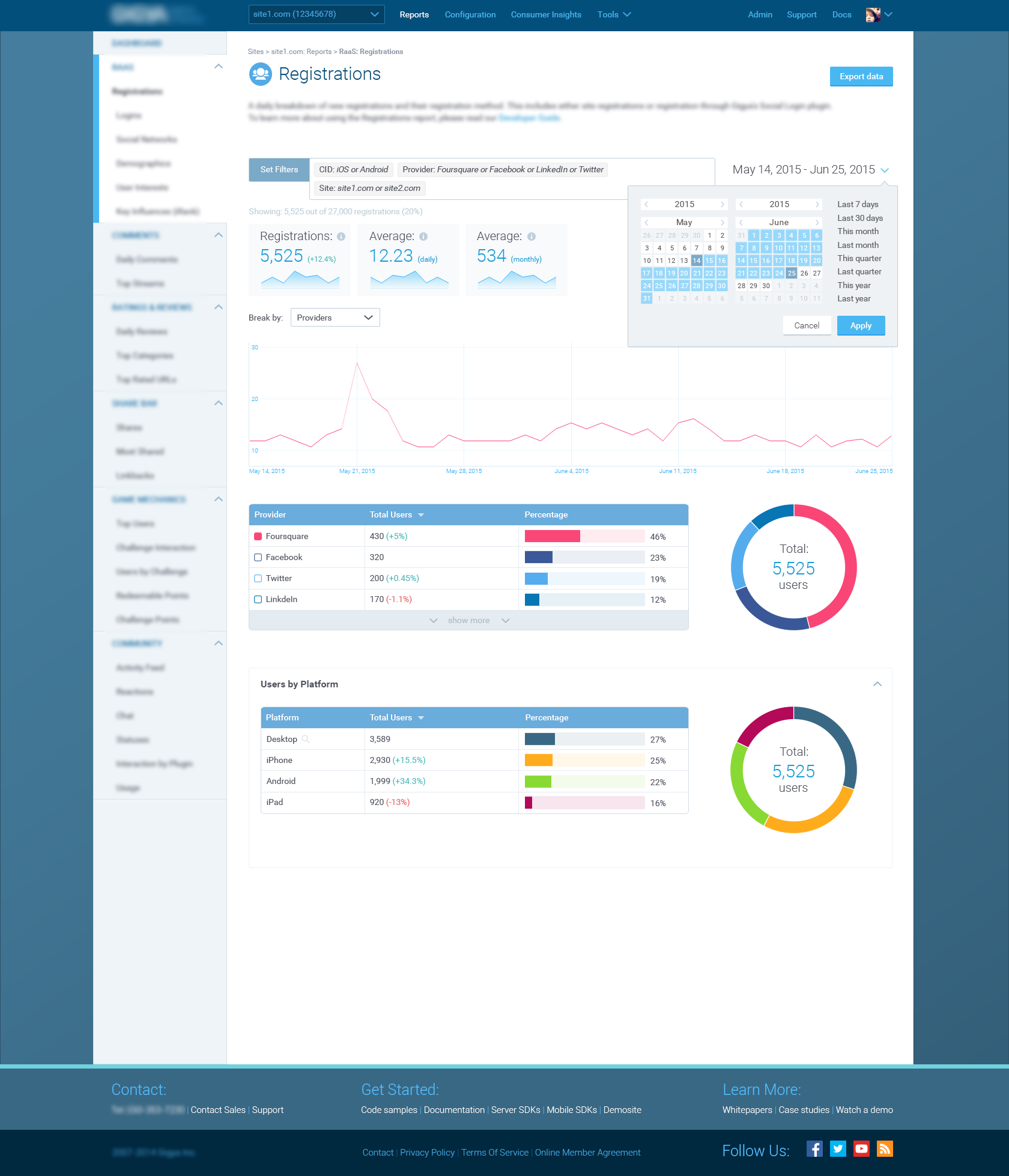
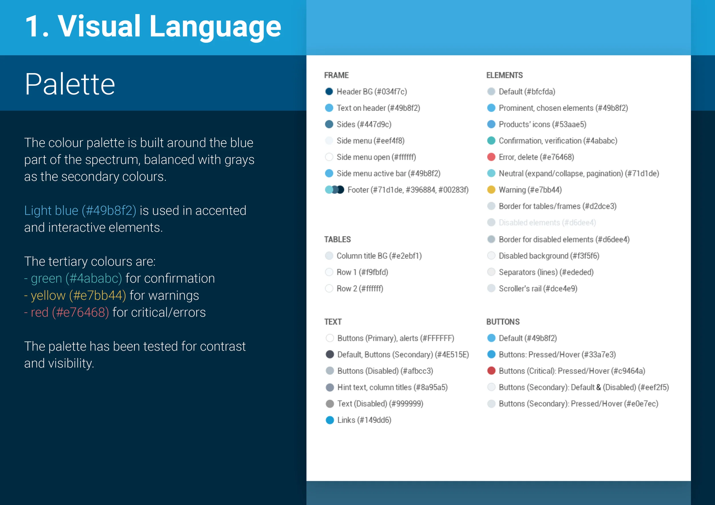
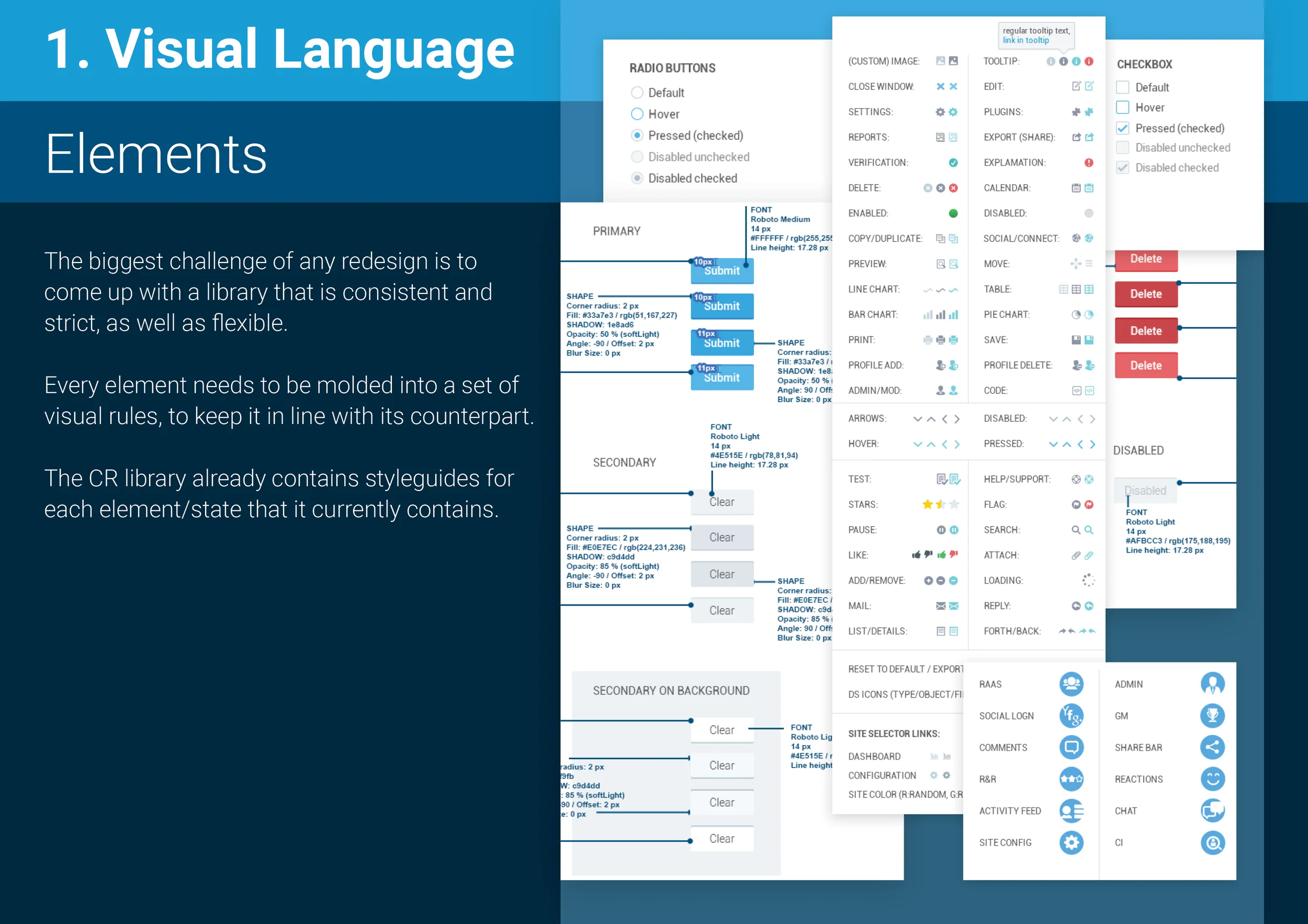
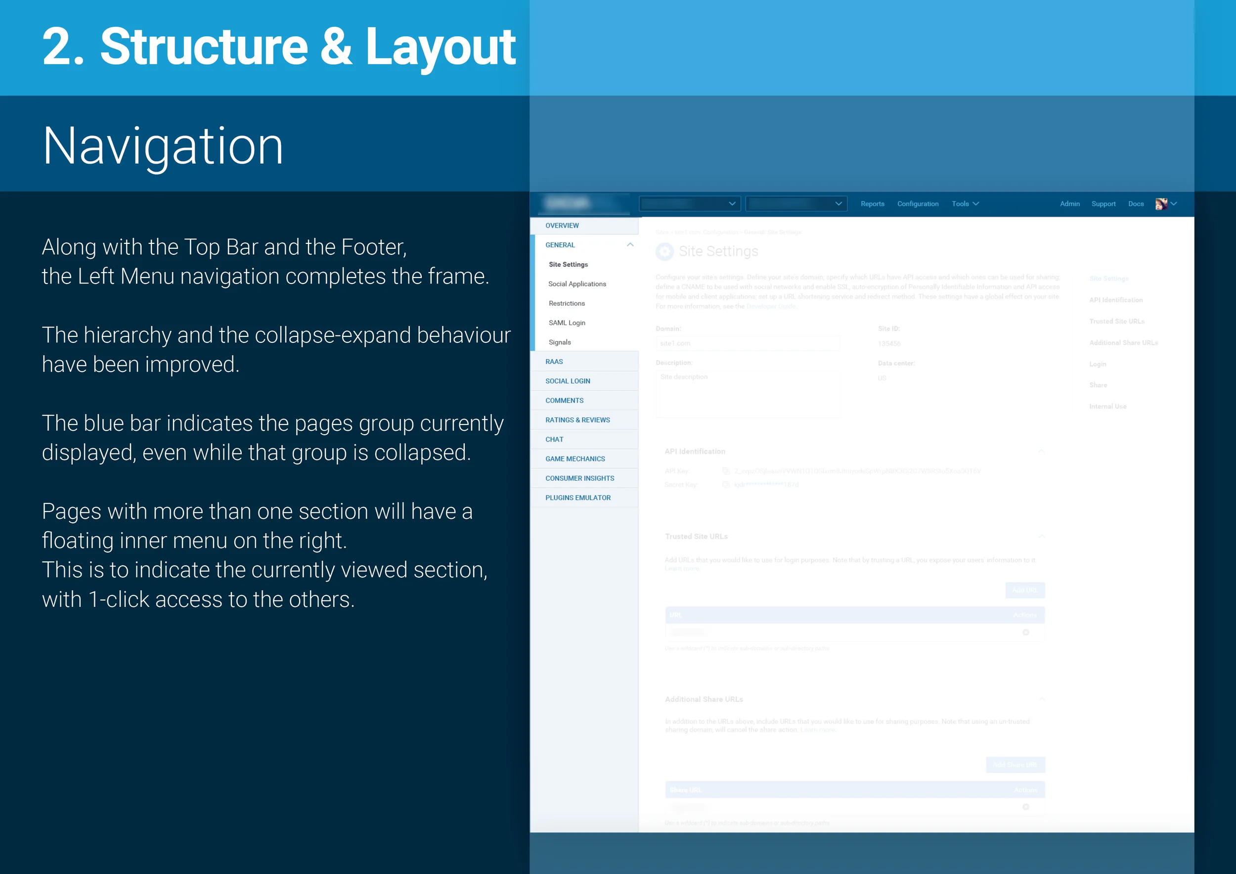
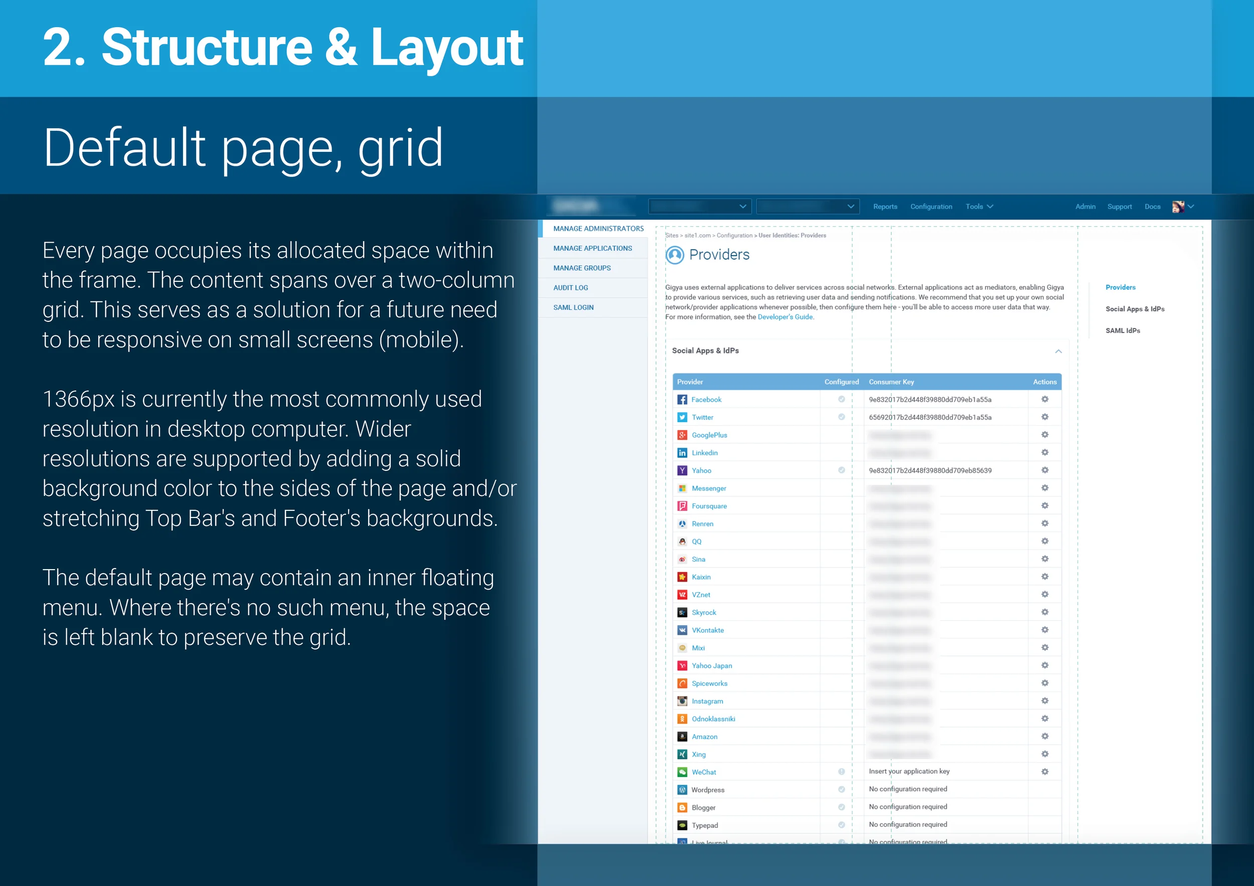
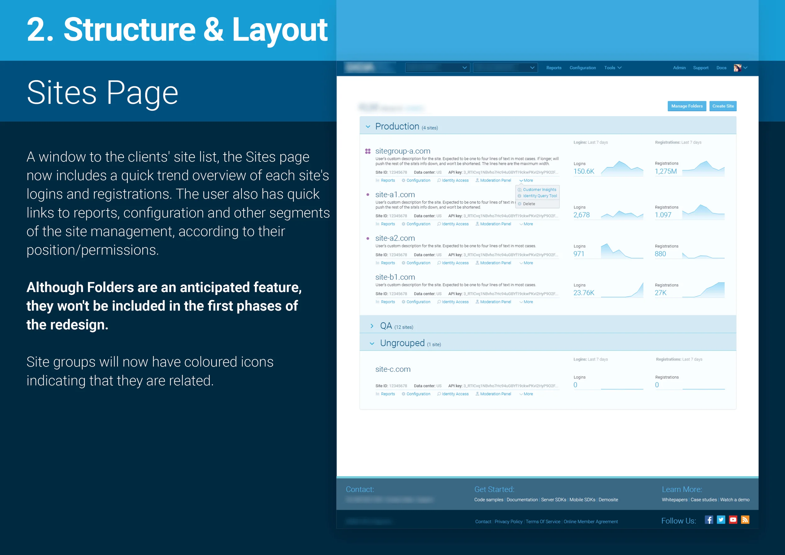
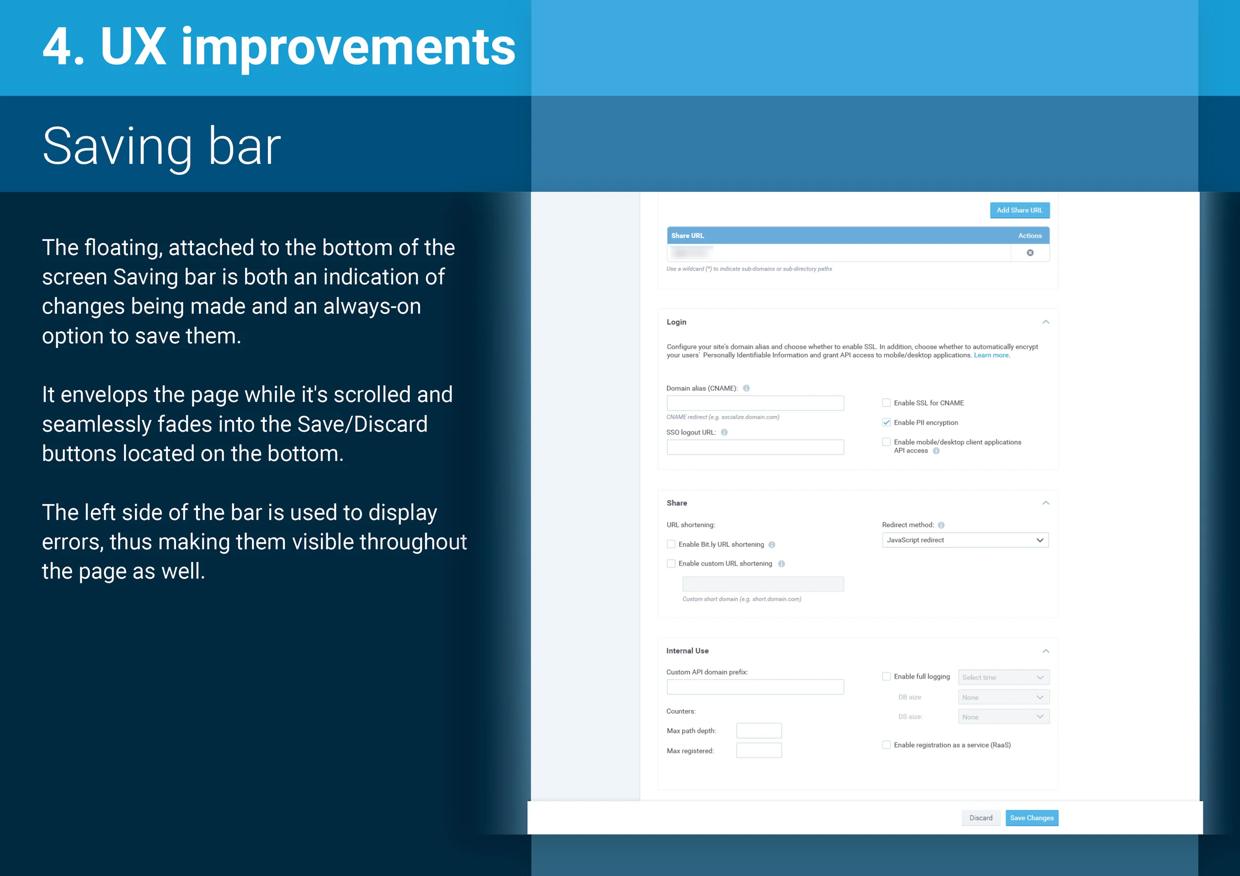
This project was to deliver a clean, modular B2B dashboard and reporting interface that streamlined core business management functions. The chosen design (reflected in images 10-26) offered executives and managers clear visibility into key metrics, intuitive navigation between areas, and interactive visualisations tailored for fast decision‑making.
The design implementation supported efficient development in the client’s CMS and delivered measurable improvements in reporting clarity and user adoption.
The Problem to Solve
GIGYA needed to provide its clients with a unified management system that consolidated fragmented reports and user flows into a single, coherent interface. Existing tools were inconsistent in layout and lacked a clear hierarchy, making it difficult for clients to find critical information about their end users quickly.
The challenge was to craft an experience that offered clarity, scalability, and easy navigation across multiple data views and reporting modules.
Ideation & Discovery
I began by mapping existing reporting workflows and conducting stakeholder interviews to understand priorities and pain points. Workshops and sketch sessions helped define the system’s main sections - dashboards, detail views, filters, and navigation structure. Early wireframes and flow diagrams were iterated with both business stakeholders and target users, ensuring alignment on hierarchy, information architecture, and content prioritization before moving to high-fidelity design.
Design & Handover
Once the visual direction was chosen (seen in images 10-26), I developed responsive high‑fidelity mocks, interactive prototypes, and a comprehensive component library. The design followed style guidelines that supported modular reusability and consistency across screens. Detailed specifications and Zeplin exports were provided to the development team, including behaviours for filters and data tables, visual rules for charts, and state interactions - resulting in a smooth handover and scalable architecture for future features.
Success & Business Impact
By implementing the final design, GIGYA was able to enable its clients to attain a cohesive reporting system that they found easy to navigate and interpret. Adoption increased across departments, with faster access to actionable insights and fewer support requests.
The system’s scalable design allowed for the addition of new modules without disrupting the UI consistency. Overall, the project strengthened the client’s operational visibility and supported better data-driven decision-making across the organization.
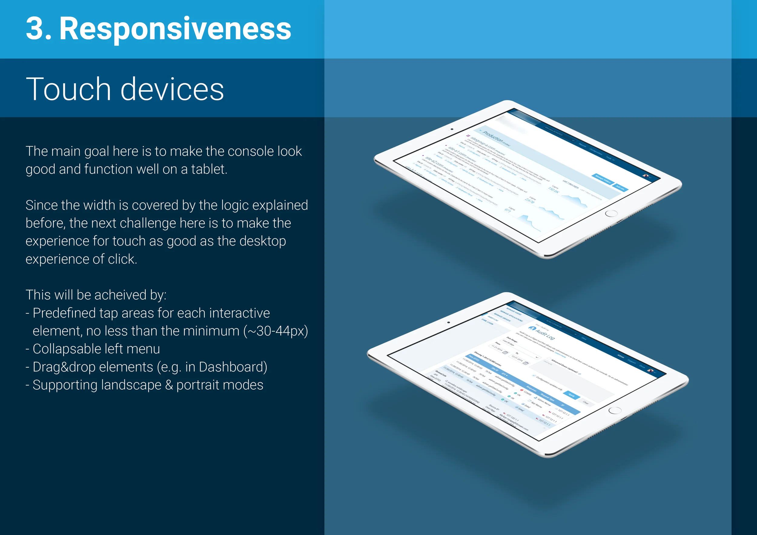
Project: B2B Registration System Redesign | First Responsive Implementation
Role: Lead Product Designer
Impact: Featured on Yahoo | First responsive B2B tool | User-validated improvements
Skills: Responsive Design | B2B SaaS | User Testing | UI Builder Design
—
⚡ Responsive, modernised registration system
I redesigned 20+ screens and complex flows so the product finally worked beautifully across desktop, tablet, and mobile.
🧩 Smoother UX with clear patterns
By introducing responsive layouts and minimal UI components, I made a tool that felt way more intuitive and less fragmented - for both clients and their end users.
🔍 Insight‑driven improvements
Remote user testing exposed subtle pain points in real tasks. Acting on those, I refined key flows and interactions that genuinely elevated usability.
📣 Featured recognition
The updated interface and its UI building tool were spotlighted on Yahoo as a standout example of a flexible B2B tool that clients can tailor to their contexts.
🧠 Built for scale and reuse
What I designed wasn’t just a one‑off. I laid a foundation with reusable patterns and clear behaviour specs that made future work easier for both design and development.
—
GIGYA’s RaaS product required a flexible, end-to-end B2B registration system across web and mobile platforms, including user validation, profile management, and responsive design.
Redesigning its 20+ screens and multiple user flows of a “tool within a tool” came with key challenges:
- introducing responsiveness for the first time
- modernising the UI, and
- delivering a smoother, more engaging user experience.
I started by establishing two core breakpoints to handle layout transitions: desktop to tablet (horizontal to vertical), and a full-width mobile layout. Large, flat, minimal UI components were used to ensure visual consistency and usability across all devices.
Following development and QA, I ran remote user testing with unbiased participants via UserTesting. Despite the interface’s simplicity, the sessions surfaced valuable UX insights - several of which led to meaningful improvements across key flows.
The updated product, including its UI building tool (mock #2), was featured on Yahoo, as an example of a successful B2B tool for clients to customise the registration experience for their end users.
Project: Employer Brand & Careers Page Redesign
Role: Lead UX/UI Designer
Impact: Reframed Gigya’s careers page to highlight culture, mission, and teams before roles, making the experience more emotionally engaging for candidates.
Skills: Employer Branding | Responsive Web Design | Information Architecture | Visual Storytelling | Design Handover
—
💼 Stronger candidate engagement
I redesigned the careers experience to tell Gigya’s story first and job listings second - which helped reframe the brand as a place people want to work, not just apply.
🎨 Culture front and centre
By weaving team stories, values, and visual narrative up front, I made the page more emotionally engaging and aligned with how top talent evaluates opportunities.
📈 Clearer paths to conversion
I structured the journey so that exploration naturally leads into openings and applications, helping reduce friction and boost meaningful clicks.
🧠 Modular, scalable design
I built the page with flexible content blocks and thoughtful mobile responsiveness, giving the internal team future work, growth and storytelling room.
🤝 Reinforced employer brand
This wasn’t just a page - it strengthened Gigya’s recruiting narrative in a competitive talent market by making mission, culture and opportunities easy to understand at a glance.
—
Problem to Solve
Gigya needed a careers page that felt modern, engaging, and aligned with its brand narrative - current recruitment content was plain, unfocused, and failed to emotionally connect with potential candidates.
The goal was to craft a page that communicates company culture, values, and opportunity in a way that resonates and converts.
Ideation & Discovery
I began by reviewing top-tier tech and SaaS career pages, and mapped out essential candidate journeys - from landing on the page to exploring open roles, team stories, and company impact. Through stakeholder interviews and benchmarking exercises, I identified the need to highlight culture first, followed by visual stories of teams, leadership, and value proposition before candidates see openings.
Design Phase
The visual approach places Gigya’s brand voice front and centre: large imagery, clean typography, persuasive headlines, and fluid transitions that weave narrative and job info together.
I structured hidden navigation for simplicity and clarity, layered modular content blocks for scalability, and applied a bold color palette and iconography that feels polished but approachable.
High‑fidelity designs incorporated consistent layouts for mobile and desktop and include full spec documentation for handoff.
Business Benefit
This purposefully designed careers site has amplified Gigya’s ability to attract top talent - by instantly conveying a vibrant culture, mission alignment, and clarity about opportunities, it positioned Gigya as a forward-thinking, intentional employer, boosting candidate engagement, increasing application conversions, and reinforcing brand alignment in a competitive recruiting market.